Exploring Machine Learning Models: From Iris Classification to Diabetes Regression Analysis
An In-Depth Comparative Study of Machine Learning Models and Techniques
 Comparative view of different classification/regression models on the iris/diabetes dataset
Preface
In an ever-evolving field like machine learning, the pursuit of understanding and mastery is a continuous journey. This comprehensive guide is a testament to that journey, drawing inspiration from Mark Fenner’s accessible work “Machine Learning for Everyone,” yet going beyond to rework, enhance, and expand these concepts to suit a broader understanding.
Through tireless research, collaboration with intelligent tools such as ChatGPT, and leveraging my own domain knowledge, I’ve crafted a narrative that delves into the intricacies of machine learning. From classification tasks with the Iris dataset to in-depth linear regression analyses on the diabetes dataset, this guide is a thorough exploration of essential and advanced concepts.
Featuring 44 meticulously crafted images, each available for closer inspection, the visuals serve to clarify and enhance the textual content. Click to zoom in, navigate through the arrows, and immerse yourself in a detailed understanding of the subject matter.
A labor of love, this guide represents countless hours of study, writing, and editing. While I’ve done my utmost to ensure accuracy and clarity, the process of learning is an iterative one, and your engagement and feedback are highly valued. At an estimated read time of 153 minutes (approximately 2.55 hours), this guide is both a deep dive and a valuable resource.
Whether you are a seasoned professional or a curious enthusiast, I invite you to embark on this exploratory journey through the world of machine learning. Your understanding, insights, and innovations await.
Introduction: A Comprehensive Exploration of Machine Learning Models
1. Starting with a Classic: Iris Dataset: We initiate our exploration with the well-known Iris dataset, a starting point for many in the world of machine learning. By applying different classification algorithms, we set the stage for more complex analyses, building foundational knowledge, and understanding.
2. Main Focus: Diabetes Dataset: The core of our investigation lies in the exploration of the diabetes dataset. This investigation leads us into the world of regression modeling, emphasizing the following key aspects:
- Linear Regression Analysis: Simple yet powerful, linear regression serves as our benchmark, demonstrating strength in its simplicity.
- Ensemble Methods: A deeper dive into more sophisticated ensemble methods allows us to explore complexity and the potential for overfitting.
- Model Metrics: A thorough understanding of Mean Absolute Error (MAE), Mean Squared Error (MSE), Median Absolute Error, and R-squared, guides our evaluation process.
- Hyperparameter Tuning: By leveraging nested cross-validation, we optimize model performance.
- Normalization: We delve into the impact of data scaling and normalization, investigating how preprocessing affects model efficiency and interpretability.
- Visualizations and Comparative Analysis: Utilizing various visualization techniques, including residual plots and comparative error bar plots, we gain visual insights into model performance.
3. Comprehensive Approach: This investigation is more than a series of individual analyses; it’s a holistic exploration of machine learning models, where classification and regression, simple models and complex ensembles, model evaluation, and hyperparameter tuning all come together.
4. A Guided Journey: Join me as I embark on this multifaceted journey, where I start with the basics and move towards more intricate analyses. My comprehensive examination of the diabetes dataset, supplemented by the Iris dataset’s exploration, presents an opportunity to engage with the art and science of machine learning. From understanding key metrics like MAE, MSE, and R-squared to exploring model complexity and optimization, this study offers a glimpse into the dynamic and nuanced field of data analytics.
Understanding Errors in Iris Flower Classification
In predictive modeling for flower classification, particularly using the Iris dataset, understanding the various types of errors is vital. The dataset consists of 150 samples from three species of Iris flowers, and four features are recorded for each sample: the lengths and widths of the sepals and petals. From these features, we aim to classify the species of the Iris flower.
In a flower, the sepal and petal are both essential parts but they serve different functions.
-
Sepal: The sepals are the small, leaf-like parts growing at the base of the petals. They are typically green and resemble leaves. Their primary function is to protect the flower before it blooms. In the bud stage, the sepals enclose the petals and keep them safe from insects, weather, and other potential threats.
-
Petal: The petals are often the most noticeable part of a flower due to their bright and varied colors. They serve two main functions. Firstly, their vibrant colors and patterns are designed to attract pollinators (like bees, butterflies, and birds). Secondly, some petals have lines called nectar guides that guide pollinators to the nectar and pollen at the center of the flower.
In the context of the Iris dataset, these terms refer to the length and the width of the petal and sepal, which are four key features used to identify different types of Iris flowers. These features are continuous numerical values, which makes this dataset suitable for various types of machine learning algorithms, especially classification algorithms.
Sources of Errors
Below is a summary of potential sources of errors in our Iris flower classification model:
-
Measurement Errors: Inaccuracies in the measurements of sepal and petal sizes can affect classification.
-
Mismatch Between Model and Reality: If the assumed mathematical relationship between inputs (sepal and petal dimensions) and outputs (species) doesn’t match reality, predictions will be inaccurate.
Understanding Data Variance in Predictive Modeling
Inaccuracies in predictions, like incorrect species classification, may stem from various factors, including inherent randomness between input features and target output, over which we may have limited control.
Real-World Randomness in Iris Classification
Two Iris flowers with the same sepal and petal dimensions might not necessarily be of the same species. This inherent randomness is a crucial distinction between mathematical functions and real-world data modeling.
Unraveling Random Processes: Variance in Iris Classification
When classifying an Iris flower based on its features, the output is not a single value but a probability distribution over the possible species, reflecting the inherent variability or “variance” in the data.
Taming the Variance in Our Models
In machine learning systems, certain sources of error can be controlled. The choice of model, training/testing data split, and handling of outliers are examples of areas where we can manage variance.
Unmasking Bias in Our Models
The model’s alignment with the relationship between inputs and outputs is another source of error. High-bias models may fail to capture complex patterns, leading to systematic errors, while low-bias models can follow intricate patterns, potentially providing more accurate classification.
Assembling the Pieces: The Bias-Variance Decomposition
- The bias of our model,
- The variability introduced during the model training process, and
- The inherent variability in our data.
This reordering corresponds to the components in your equation:
$ \text{Error} = \text{Bias}_{\text{Learner}} + \text{Variance}_{\text{Learner}}(\text{Training}) + \text{Variance}_{\text{Data}} $
- $\text{Bias}_{\text{Learner}}$ corresponds to the bias of our model.
- $\text{Variance}_{\text{Learner}}(\text{Training})$ corresponds to the variability introduced during the model training process.
- $\text{Variance}_{\text{Data}}$ corresponds to the inherent variability in our data.
By understanding the individual contributions of bias and variance in our models, we can better diagnose potential challenges and optimize performance, particularly in complex tasks like Iris classification.
Interactions between Data and Learner
The interaction between training data and learning algorithm is essential. If the training data doesn’t represent the full diversity of Iris flowers, our model may not generalize well.
In conclusion, understanding these sources of error is essential for building robust Iris flower classification models. By focusing on these aspects, researchers can develop models that classify Iris species accurately and reliably.
Variations in Data Relationships
The accuracy of our model’s classification ability could be affected if the data has inconsistencies, such as errors in measuring the sepal and petal lengths. Moreover, the relationships between the different data features and the chosen classification algorithm’s mathematical functions play a significant role in classification accuracy.
Delving into the Complexity of Classification
The concept of classification in machine learning may seem intuitive, but there’s a great depth and complexity behind it. When working with a dataset like the Iris dataset, where the objective is to classify flowers into different species based on their features, we need to consider several aspects:
1. Establishing the Boundaries
In the context of the Iris dataset, boundaries help to distinguish between the different species based on their petal length and petal width. These boundaries could be linear or nonlinear, depending on the algorithm used. Is there a distinct demarcation between species, or do they overlap? The nature of these boundaries is often defined by the algorithm and its underlying mathematics.
2. Evaluation of the Boundaries
The effectiveness of the classification boundaries needs to be evaluated. How well do the boundaries separate the different species? Do species overlap in certain areas? If so, is this due to the nature of the data or the algorithm’s limitations?
The Mathematical Underpinnings of Classification
Each classification algorithm, such as decision trees, support vector classifiers, and logistic regression, has unique mathematical principles that guide how it establishes and evaluates boundaries. These principles determine how well the algorithm can segment the Iris species based on petal length and petal width.
Making Decisions with Established Boundaries
With the Iris dataset, classification involves questions like:
- Is this flower’s petal length and petal width indicative of Iris setosa?
- Is Iris virginica more likely than Iris versicolor, given the petal measurements?
- Among the three species, which one is most probable for this flower?
Broadening Our Classification Toolbox: A Case Study with the Iris Dataset
In the pursuit of classifying Iris species, we’ll begin with the technique of decision trees. Through this example, we understand the power and simplicity of decision trees. Such models are highly valuable in various fields and applications, turning the challenging task of classification into a series of manageable and logical questions.
Constructing a Decision Tree: An Introduction
Among many available machine learning models, the decision tree stands out for its interpretability and efficiency. Let’s explore how to classify Iris flowers based on petal length and petal width using a decision tree.
Our decision tree might start with the root question: “Is the petal length less than 2.5 cm?”. Depending on the response, the tree probes further, asking more specific questions until it reaches a prediction for the species of the Iris.
Tree-Building Algorithms
There are a number of major tree-building algorithms. ID3, C4.5, and C5.0 were made by Quinlan. CART was developed independently.
Steps in Tree-Building
In general, the tree-building algorithms use the following steps:
- Evaluate the set of features and splits and pick a “best” feature-and-split.
- Add a node to the tree that represents the feature-split.
- For each descendant, work with the matching data and either:
- If the targets are similar enough, return a predicted target.
- If not, return to step 1 and repeat.
Constraints in Tree-Building
The algorithms control what splits and partitions are allowed, how feature-splits are evaluated, what makes targets in a group similar enough to form a leaf, and other limits.
The constraints commonly include an absolute limit on the depth of the tree and the minimum number of examples at a leaf to make a prediction, regardless of similarity. These constraints help prevent overfitting.
Imperfections and Overfitting in Decision Trees
While constructing a decision tree offers many advantages, we must be aware of potential pitfalls:
- Inherent randomness: External factors not included in the model may affect the classification of the species. This randomness can introduce noise into our predictions.
- Measurement errors: Any inaccuracies in measuring petal lengths or widths could lead to incorrect predictions. Precise measurements are crucial to building a reliable model.
- Overfitting: Decision trees may perform exceptionally well on training data but fail to generalize to unseen data. Care must be taken to avoid overfitting by potentially limiting the tree’s depth or employing pruning techniques.
By understanding these challenges, we can take proactive measures to mitigate them, ensuring a more robust and accurate decision tree model.
Preventing Overfitting in Decision Trees
When dealing with decision trees, the model can become excessively complex, leading to overfitting, if it is left unconstrained. Overfitting results in high variance and poor generalization capabilities to new data. However, we can adopt several strategies to prevent overfitting, hence reducing the variance:
-
Limiting Tree Depth: By setting a maximum depth for the tree, we limit the number of questions the model can ask before making a prediction. This constraint simplifies the model, making it less likely to overfit the training data.
-
Setting a Minimum Number of Samples at Leaves: By requiring a certain number of examples in each leaf node, we force the model to make broader generalizations. This approach can prevent overfitting by not allowing the model to create rules for very specific or rare cases present in the training data.
-
Limiting the Number of Considered Features: By constraining the number of features the model considers when making splits, we not only simplify the model but also speed up the training process. This method can prevent the model from relying too heavily on potentially noisy or less relevant features.
These strategies introduce some bias into the model (making it less flexible and more general) in order to reduce its variance (improving its generalization capabilities). This approach reflects the trade-off between bias and variance that is inherent to all machine learning models.
How Decision Trees Work
The tree-building algorithm partitions the entire space of data (e.g., a plot with petal length on the x-axis and petal width on the y-axis) into smaller regions. It repeats this process until meeting a specific stopping criterion. This criterion might be reaching a maximum depth or a point where further splits contain too few examples to be meaningful.
Mathematically, the partitioning can be expressed as:
$$\text{target} = \sum_{R \in P} C_R I(\text{example} \in R)$$
Explaining the Equation
- $R$ is a region of our graph
- $P$ is the group of all of the regions
- $C_R$ is the predicted class for the region $R$ (for example, one of the types of irises)
- $I$ is an indicator function which gives us a value of one if an example is in $R$ and zero otherwise
The indicator function and the predicted class together give us $C_R$ when an example is in $R$ and give us zero everywhere else.
Each region mostly contains points (flowers) of the same class, allowing for meaningful separations between classes.
In summary, tree-building algorithms work by recursively partitioning the data into smaller regions, creating a decision tree where each path from the root to a leaf node corresponds to a specific sequence of decisions that lead to a class prediction. Different decision tree methods can vary in the way they perform these partitions and in their stopping criteria, focusing on aspects like petal length and petal width to create regions with meaningful separations between classes.
Understanding Decision Tree Depth
The depth of a decision tree is a crucial factor that significantly influences its performance and complexity.
The Role of max_depth
The max_depth parameter in the DecisionTreeClassifier determines the maximum depth to which the tree can grow, thereby limiting the number of splits it can make.
Observing Decision Trees at Different Depths
By experimenting with trees of depths 1, 2, and 3, we can witness the changes in decision boundaries and complexity.
-
max_depth=1: At this level, the tree is allowed to make just one split, bifurcating the feature space into two regions. -
max_depth=2: This allows three splits, one for the root node, and another split for each of its two child nodes, leading to a total of four regions in the feature space.
The Default Setting: max_depth=None
In the default setting, max_depth=None, the tree has the freedom to grow indefinitely. The depth is only constrained by the number of samples in the leaves or by meeting a particular stopping condition. This behaves as if max_depth is set to infinity, allowing the tree to make unlimited splits until it perfectly classifies the training data or reaches a stopping condition.
Understanding Impurity Measures in Decision Trees: Gini Value, Entropy, and Information Gain
The Gini index and entropy are both measures used in the construction of decision trees to evaluate the “quality” of a potential split. The goal of both measures is to quantify the uncertainty or disorder within a set of items. In the context of decision trees, these items are the data instances within a node.
The quality of the splits in a decision tree is usually evaluated using measures such as the Gini Index, Entropy, and Information Gain.
-
Gini Index: This measure gives an indication of the impurity of a dataset. A Gini Index of 0 denotes perfect purity, where all items belong to a single class, while a Gini index of 0.5 in a binary classification problem indicates maximum impurity.
-
Entropy: Entropy measures the disorder in the dataset. An entropy value of 0 means the set contains instances from a single class, whereas a value of 1 indicates that the instances are evenly split between two classes in a binary classification problem.
-
Information Gain: Information gain is based on entropy. It measures the reduction in entropy achieved by a split. The attribute with the highest information gain is chosen as the splitting attribute at the node.
In the context of Extreme Random Forests, which we get to later, these measures help to evaluate the quality of the randomly selected split points.
Gini Value and Gini Index
Gini Value measures the impurity of a node in a decision tree. A value of 0 indicates perfect purity, while a value of 0.5 in binary classification indicates maximum impurity.
Gini Index quantifies the likelihood of misclassification of a randomly chosen element from the dataset. It’s expressed using the formula:
$$ Gini(p) = 1 - \sum (p_i)^2 $$
where $p_i$ is the probability of an object being classified to a particular class.
Entropy
Entropy measures the information disorder within a set of items. It’s 0 when all instances belong to one class and 1 when instances are evenly split between two classes in binary classification.
The formula for entropy is:
$$ Entropy(p) = - \sum p_i \log_2(p_i) $$
where $ p_i $ is the proportion of instances that are of class i.
Information Gain
This concept is based on entropy and signifies the reduction in entropy due to a split. It helps in choosing the splitting attribute at a node and measures the relative change in entropy with respect to the independent variables.
Comparative Insights
Both the Gini Index and Entropy are potent measures of impurity and are often interchangeable. Gini Index is generally faster to compute, making it preferable for large datasets. In contrast, Entropy can create a more balanced tree and may be more reliable with noisy data.
However, it’s crucial to recognize that these measures alone cannot prevent overfitting. Proper hyperparameter tuning and tree-pruning strategies must be employed to build a robust decision tree model.
The choice between Gini and Entropy may not significantly affect a decision tree’s performance, but understanding both concepts is valuable for various applications in machine learning and data analysis.
# Import necessary libraries
from sklearn.tree import DecisionTreeClassifier
from sklearn.model_selection import cross_val_score
from sklearn.datasets import load_iris

# Load iris dataset
iris = load_iris()

# Initialize Decision Tree Classifier with default parameters
decision_tree_classifier = DecisionTreeClassifier()

# Define the cross-validation strategy
# In this case, it's k-fold cross-validation with k=3
cv_strategy = 3

# Define the scoring metric for evaluation, in this case, accuracy
scoring_metric = 'accuracy'

print(f"Performing {cv_strategy}-Fold Cross Validation...")

# Perform cross-validation and store the scores
cv_scores = cross_val_score(decision_tree_classifier,
                                 iris.data,
                                 iris.target,
                                 cv=cv_strategy,
                                 scoring=scoring_metric)

print(f"Cross validation scores: {cv_scores}")

# Compute the mean accuracy and print
mean_accuracy = cv_scores.mean()
print(f"Mean accuracy: {mean_accuracy}")
Performing 3-Fold Cross Validation...
Cross validation scores: [0.98 0.92 0.98]
Mean accuracy: 0.96
Decision Boundaries
Decision Trees create blocky, regions of colored space from our features.
Forming the Boundaries
The partition, or the shapes of the regions, is formed from overlaid rectangles where only the topmost rectangle counts. Imagine neatly spreading out a few decks of cards on a rectangular table. The cards can overlap. When cards of the same suit are touching one another, they form a larger region for that suit.
To create these regions from points in space, we create simple yes/no answers by thresholding. For example, we test a feature Temp against a value 55. Choosing the values to split on is the trickiest aspect of implementing decision trees by hand.
plot_decision_boundary Function
The following code is responsible for visualizing the decision boundaries formed by the decision tree classifier. By plotting the boundaries in the feature space (e.g., petal length vs. petal width), we can observe how the decision tree algorithm partitions the data into different regions, each corresponding to a particular class. This graphical representation provides intuitive insights into the model’s decision-making process, allowing us to understand how the features are being utilized to distinguish between the different classes. It also aids in identifying potential areas of overfitting or underfitting, enhancing our ability to interpret and fine-tune the model.
def plot_decision_boundary(ax, data, tgt, model, dims, class_labels, colors, grid_step=.01):
    """
    This function plots the decision boundary of a classification model.

    Parameters:
    ax: matplotlib Axes object
    data: 2D numpy array
    tgt: 1D numpy array
    model: sklearn model object
    dims: list of two indices
    class_labels: dict of class numbers mapped to class names
    colors: list of colors for each class
    grid_step: float (default is 0.01)
    """
    # Select two dimensions from data
    twoD = data[:, list(dims)]

    # Calculate the minimum and maximum values for each dimension
    min_x1, min_x2 = np.min(twoD, axis=0) + 2 * grid_step
    max_x1, max_x2 = np.max(twoD, axis=0) - grid_step

    # Create a grid of points within the range of the data
    xs, ys = np.mgrid[min_x1:max_x1:grid_step, min_x2:max_x2:grid_step]
    grid_points = np.c_[xs.ravel(), ys.ravel()]

    # Fit the model to the data if it's not already fitted
    if not check_fitted(model):
        model = model.fit(twoD, tgt)

    # Make predictions at each point on the grid
    preds = model.predict(grid_points).reshape(xs.shape)

    # Create a pseudocolor plot of the predictions at the grid points
    ax.pcolormesh(xs, ys, preds, cmap=plt.cm.coolwarm)
    ax.set_xlim(min_x1, max_x1)
    ax.set_ylim(min_x2, max_x2)
    ax.set_title(f'Decision Boundary for {get_model_name(model)}')

    # Scatter plot the original data
    for i, (class_num, name) in enumerate(class_labels.items()):
        ax.scatter(*twoD[tgt==class_num].T, label=name, color=colors[i])

    # Set legend below the plot
    ax.legend(loc='upper center', bbox_to_anchor=(0.5, -0.15), fancybox=True, shadow=True, ncol=len(class_labels))

def check_fitted(model):
    """
    Returns True if model estimator has been fitted.

    Parameters:
    model: sklearn model object
    """
    return hasattr(model, "classes_")

# Define a function to get the name of a model
def get_model_name(model):
    """
    This function returns the name of a model's class as a string.

    Parameters:
    model: sklearn model object
    """
    return str(model.__class__).split('.')[-1][:-2]
The following code snippet loads the Iris dataset and splits it into training and testing sets for classification purposes. Additionally, it creates one-class variants for each species (Setosa, Versicolor, Virginica) within the dataset, transforming the problem into a one-versus-all binary classification. These steps enable both multi-class and binary classification, allowing for targeted analysis and prediction of individual Iris species.
# Import necessary libraries
from sklearn import datasets
from sklearn.model_selection import train_test_split

# Load the standard iris dataset
iris_dataset = datasets.load_iris()

# Split the full iris dataset into training and testing sets
X_train_iris_full, X_test_iris_full, y_train_iris_full, y_test_iris_full = train_test_split(
    iris_dataset.data, iris_dataset.target, test_size=0.33, random_state=21)

# Create one-class variants of the iris dataset
# Class 'setosa' vs others
X_train_setosa, X_test_setosa, y_train_setosa, y_test_setosa = train_test_split(
    iris_dataset.data, iris_dataset.target == 0, test_size=0.33, random_state=21)

# Class 'versicolor' vs others
X_train_versicolor, X_test_versicolor, y_train_versicolor, y_test_versicolor = train_test_split(
    iris_dataset.data, iris_dataset.target == 1, test_size=0.33, random_state=21)

# Class 'virginica' vs others
X_train_virginica, X_test_virginica, y_train_virginica, y_test_virginica = train_test_split(
    iris_dataset.data, iris_dataset.target == 2, test_size=0.33, random_state=21)
import matplotlib.pyplot as plt
import seaborn as sns

# Function to plot distribution
def plot_distribution(y, title):
    sns.countplot(x=y)
    plt.title(title)
    plt.show()

# Distributions of the target variables for each dataset
plot_distribution(y_train_iris_full, 'Full Iris Dataset')
plot_distribution(y_train_setosa, 'Setosa vs Others')
plot_distribution(y_train_versicolor, 'Versicolor vs Others')
plot_distribution(y_train_virginica, 'Virginica vs Others')


Applying the Concepts: Simplified Iris Problem
For demonstration purposes, we’ll use a simplified version of the iris problem. This version results in a single split, providing us with a clear understanding of how decision trees operate.
Setosa vs. Versicolor/Virginica
import pandas as pd
import seaborn as sns
import matplotlib.pyplot as plt

# Convert the features to a dataframe
iris_setosa_data_df = pd.DataFrame(X_train_setosa[:, 2:], columns=iris_dataset.feature_names[2:])

# Add the target to the dataframe
iris_setosa_data_df['target'] = y_train_setosa

# Mapping the target values to their specific class names
target_names_dict = {True: 'setosa', False: 'versicolor & virginica'}

# Apply the mapping to the 'target' column
iris_setosa_data_df['target'] = iris_setosa_data_df['target'].map(target_names_dict)

palette_dict = {
    'setosa': (0.2980392156862745, 0.4470588235294118, 0.6901960784313725),  # Blue color
    'versicolor & virginica': (0.8666666666666667, 0.5176470588235295, 0.3215686274509804) # Orange color
}

# Plot using seaborn's pairplot function with the custom palette
sns.pairplot(iris_setosa_data_df, hue='target', palette=palette_dict)

# Add a title
plt.suptitle('Pairplot for the Setosa vs Versicolor & Virginica Classification Problem', y=1.02)

# Show the plot
plt.show()

The pairplot shows the relationship between petal length and petal width for Iris setosa compared to other species. It helps in visually identifying how well these features can distinguish Iris setosa from the other species.
# Import required libraries
import pydotplus
from sklearn import tree
from IPython.display import Image
import os

# Initialize the DecisionTreeClassifier
dtc_one_class = tree.DecisionTreeClassifier(random_state=42)

# Fit the model to the one-class variant of the iris dataset
# Use only the first two features
dtc_one_class.fit(X_train_setosa[:, 2:], y_train_setosa)

# Generate the DOT data for the tree
dot_data_setosa = tree.export_graphviz(dtc_one_class, out_file=None,
                                       feature_names=iris_dataset.feature_names[2:],
                                       class_names=["versicolor & virginica", "setosa"],
                                       filled=True, rounded=True)

# Check if the output directory exists
if not os.path.exists('outputs'):
    # If it doesn't exist, create it
    os.makedirs('outputs')

# Use pydotplus to generate a graph from the DOT data
graph_setosa = pydotplus.graph_from_dot_data(dot_data_setosa)

# Add a title to the graph
graph_setosa.set_label('Decision Tree for the Setosa vs Versicolor/Virginica Problem')
graph_setosa.set_fontsize('20')

# Define the output path
output_path_setosa = "outputs/iris_setosa_vs_others.png"

# Write the PNG to a file
graph_setosa.write_png(output_path_setosa)

# Create an Image object using the correct file path, and display it
Image(output_path_setosa)

import numpy as np
fig, ax = plt.subplots(figsize=(6,6))
plot_decision_boundary(ax=ax, data=X_train_setosa[:, :], tgt=y_train_setosa, model=dtc_one_class,
                       class_labels={0: 'Versicolor/Virginica', 1:'Setosa'}, dims=[2,3], colors=['red','blue'])

# Add x and y labels
ax.set_xlabel('Petal Length (cm)')
ax.set_ylabel('Petal Width (cm)')
Text(0, 0.5, 'Petal Width (cm)')

Versicolor vs. Setosa/Virginica
# Import necessary libraries
import pandas as pd
import seaborn as sns
import matplotlib.pyplot as plt

# Convert the features to a dataframe
iris_versicolor_features_df = pd.DataFrame(X_train_versicolor[:, 2:], columns=iris_dataset.feature_names[2:])

# Add the target to the dataframe
iris_versicolor_features_df['target'] = y_train_versicolor

# Define a dictionary to map the target values to their respective class names
target_names_dict = {True: 'versicolor', False: 'setosa & virginica'}

# Apply the mapping to the 'target' column
iris_versicolor_features_df['target'] = iris_versicolor_features_df['target'].map(target_names_dict)

# Define the custom palette using the RGB values
palette_dict = {
    'versicolor': (0.2980392156862745, 0.4470588235294118, 0.6901960784313725),  # Blue color
    'setosa & virginica': (0.8666666666666667, 0.5176470588235295, 0.3215686274509804) # Orange color
}

# Use seaborn's pairplot function to visualize the pairwise relationships in the dataset with the custom palette
sns.pairplot(iris_versicolor_features_df, hue='target', palette=palette_dict)

# Add a title
plt.suptitle('Pairplot for the Versicolor vs Setosa/Virginica Classification Problem', y=1.02)

# Show the plot
plt.show()

# Initialize the DecisionTreeClassifier for versicolor
dtc_versicolor = tree.DecisionTreeClassifier(random_state=42)

# Fit the model to the one-class variant of the iris dataset
dtc_versicolor.fit(X_train_versicolor[:, 2:], y_train_versicolor)

# Generate the DOT data for the tree
dot_data_versicolor = tree.export_graphviz(dtc_versicolor, out_file=None,
                                           feature_names=iris_dataset.feature_names[2:],
                                           class_names=["setosa/virginica", "versicolor"],
                                           filled=True, rounded=True)

# Use pydotplus to generate a graph from the DOT data
graph_versicolor = pydotplus.graph_from_dot_data(dot_data_versicolor)

graph_versicolor.set_label('Decision Tree for the Versicolor vs Setosa/Virginica Classification Problem')
graph_versicolor.set_fontsize('20')

# Define the output path
output_path_versicolor = "outputs/iris_versicolor_vs_others.png"

# Write the PNG to a file
graph_versicolor.write_png(output_path_versicolor)

# Display the Image
Image(output_path_versicolor)

fig, ax = plt.subplots(figsize=(6,6))
plot_decision_boundary(ax=ax, data=X_train_versicolor[:, :], tgt=y_train_versicolor, model=dtc_versicolor,
                       class_labels={0: 'Setosa/Virginica', 1:'Versicolor'}, dims=[2,3], colors=['red','blue'])

# Add x and y labels
ax.set_xlabel('Petal Length (cm)')
ax.set_ylabel('Petal Width (cm)')
Text(0, 0.5, 'Petal Width (cm)')

Virginica vs. Versicolor/Setosa
# Import necessary libraries
import pandas as pd
import seaborn as sns

# Convert the features to a dataframe
iris_virginica_train_features_df = pd.DataFrame(X_train_virginica[:, 2:], columns=iris_dataset.feature_names[2:])

# Add the target to the dataframe
iris_virginica_train_features_df['target'] = y_train_virginica

# We'll use a dictionary to map the target values to their respective class names
target_names_dict = {True: 'virginica', False: 'setosa/versicolor'}

# Apply the mapping to the 'target' column
iris_virginica_train_features_df['target'] = iris_virginica_train_features_df['target'].map(target_names_dict)

# Use seaborn's pairplot function to visualize the pairwise relationships in the dataset
sns.pairplot(iris_virginica_train_features_df, hue='target')

plt.suptitle('Pairplot for the Virginica vs Setosa/Versicolor classification problem', y=1.02)
Text(0.5, 1.02, 'Pairplot for the Virginica vs Setosa/Versicolor classification problem')

# Initialize the DecisionTreeClassifier for virginica
dtc_virginica = tree.DecisionTreeClassifier(random_state=42)

# Fit the model to the one-class variant of the iris dataset
dtc_virginica.fit(X_train_virginica[:, 2:], y_train_virginica)

# Generate the DOT data for the tree
dot_data_virginica = tree.export_graphviz(dtc_virginica, out_file=None,
                                          feature_names=iris_dataset.feature_names[2:],
                                          class_names=["setosa/versicolor", "virginica"],
                                          filled=True, rounded=True)

# Use pydotplus to generate a graph from the DOT data
graph_virginica = pydotplus.graph_from_dot_data(dot_data_virginica)

graph_virginica.set_label('Decision Tree for the Virginica vs Versicolor/Setosa Classification Problem')
graph_virginica.set_fontsize('20')
# Define the output path
output_path_virginica = "outputs/iris_virginica_vs_others.png"

# Write the PNG to a file
graph_virginica.write_png(output_path_virginica)

# Display the Image
Image(output_path_virginica)

fig, ax = plt.subplots(figsize=(6,6))
plot_decision_boundary(ax=ax, data=X_train_virginica[:, :], tgt=y_train_virginica, model=dtc_virginica,
                       class_labels={0: 'Setosa/Versicolor', 1:'Virginica'}, dims=[2,3], colors=['red','blue'])

# Add x and y labels
ax.set_xlabel('Petal Length (cm)')
ax.set_ylabel('Petal Width (cm)')
Text(0, 0.5, 'Petal Width (cm)')

# Import necessary libraries
import pandas as pd
import seaborn as sns
import matplotlib.pyplot as plt

# Convert the features to a dataframe
iris_full_features_df = pd.DataFrame(X_train_iris_full[:, 2:], columns=iris_dataset.feature_names[2:])

# Add the target to the dataframe
iris_full_features_df['target'] = y_train_iris_full

# We'll use a dictionary to map the target values to their respective class names
target_names_dict = {0: 'setosa', 1: 'versicolor', 2: 'virginica'}

# Apply the mapping to the 'target' column
iris_full_features_df['target'] = iris_full_features_df['target'].map(target_names_dict)

# Define a color palette as a dictionary with specific RGB values
palette_dict = {
    'setosa': (0.8666666666666667, 0.5176470588235295, 0.3215686274509804),  # Orange color
    'versicolor': (0.2980392156862745, 0.4470588235294118, 0.6901960784313725), # Blue color
    'virginica': (0.3333333333333333, 0.6588235294117647, 0.40784313725490196)
}

# Use seaborn's pairplot function to visualize the pairwise relationships in the dataset with the custom palette
sns.pairplot(iris_full_features_df, hue='target', palette=palette_dict)

# Add a title
plt.suptitle('Pairplot for the Multi-class Iris Classification Problem', y=1.02)

# Show the plot
plt.show()

# Import necessary libraries
from sklearn import tree
from IPython.display import Image
import pydotplus

# Initialize the DecisionTreeClassifier for multi-class classification
dtc_iris_full = tree.DecisionTreeClassifier(random_state=42)

# Fit the model to the full iris dataset
dtc_iris_full.fit(X_train_iris_full[:, 2:], y_train_iris_full)

# Generate the DOT data for the tree
dot_data_iris_full = tree.export_graphviz(dtc_iris_full, out_file=None,
                                          feature_names=iris_dataset.feature_names[2:],
                                          class_names=iris_dataset.target_names,
                                          filled=True, rounded=True)

# Use pydotplus to generate a graph from the DOT data
graph_iris_full = pydotplus.graph_from_dot_data(dot_data_iris_full)

# Define the output path
output_path_iris_full = "outputs/iris_full.png"

# Write the PNG to a file
graph_iris_full.write_png(output_path_iris_full)

# Display the Image
Image(output_path_iris_full)

fig, ax = plt.subplots(figsize=(6,6))
plot_decision_boundary(ax=ax, data=X_train_iris_full, tgt=y_train_iris_full, model=dtc_iris_full,
                       class_labels={0: 'Setosa', 1: 'Versicolor', 2:'Virginica'}, dims=[2,3], colors=['red', 'blue', 'grey'])

# Add x and y labels
ax.set_xlabel('Petal Length (cm)')
ax.set_ylabel('Petal Width (cm)')
Text(0, 0.5, 'Petal Width (cm)')

# Import necessary libraries
from sklearn.svm import SVC
from sklearn.linear_model import LogisticRegression
from sklearn.datasets import load_iris
from sklearn.tree import DecisionTreeClassifier
import matplotlib.pyplot as plt
import numpy as np

# Load the iris dataset
iris = load_iris()

# Prepare class labels and colors
class_labels = {i: name for i, name in enumerate(iris.target_names)}
colors = ['red', 'green', 'blue']

# A dictionary to hold the classifiers
# Here, only a Decision Tree Classifier (DTC) with a maximum depth of 3 is used
tree_classifiers = {'DTC': DecisionTreeClassifier(max_depth=3)}

# Create a figure and a set of subplots
fig, ax = plt.subplots(1, 1, figsize=(6, 5))

# Loop through the items in the dictionary
for name, mod in tree_classifiers.items():
    # plot_decision_boundary is a function that you have defined elsewhere in your code
    plot_decision_boundary(ax, iris.data, iris.target, mod, [0, 1], class_labels, colors)

    # Set the title of the plot to be the name of the classifier
    ax.set_title("Decision Boundary for " + name)

# Create legend handlers manually
handlers = [plt.Line2D([0], [0], marker='o', color='w', markerfacecolor=c, markersize=5) for c in colors]
# Put a legend below current axis

# Add a figure text
fig.text(0.1, 0.01, "Decision boundary plot of a decision tree classifier trained on the first two features of the iris dataset.", ha='left')

# Automatically adjust subplot parameters to give specified padding
plt.tight_layout(rect=[0, 0.08, 1, 0.96])  # leaving space at the bottom for the legend

# Display the plot
plt.show()

# Import required libraries
import pydotplus
import os
from sklearn import tree
from IPython.display import Image
from sklearn.datasets import load_iris
from sklearn.model_selection import train_test_split

# Load the iris dataset
iris_dataset = load_iris()

# Split the data into train and test sets
iris_train_features, iris_test_features, iris_train_target, iris_test_target = train_test_split(
    iris_dataset.data, iris_dataset.target, test_size=0.3, random_state=42)

# Initialize the DecisionTreeClassifier
dtc = tree.DecisionTreeClassifier()

# Fit the model to the iris dataset
dtc.fit(iris_train_features, iris_train_target)

# Generate the DOT data
dot_data = tree.export_graphviz(dtc, out_file=None,
                                feature_names=iris_dataset.feature_names,
                                class_names=iris_dataset.target_names,
                                filled=True, rounded=True)

# Use pydotplus to generate a graph from the DOT data
graph = pydotplus.graph_from_dot_data(dot_data)

# Define the output path
output_path = "outputs/iris_full.png"

# Check if the output directory exists
if not os.path.exists('outputs'):
    # If it doesn't exist, create it
    os.makedirs('outputs')

# Write the PNG to a file
graph.write_png(output_path)

# Create an Image object using the correct file path, and display it
Image(output_path, width=600, height=600)

Understanding the Diabetes Dataset: Features and Target Variable
The diabetes dataset included in sklearn is a collection of various biometric and demographic features, utilized for regression analysis. Each feature in this dataset has been standardized, meaning that the mean has been subtracted and the result divided by the standard deviation for each column.
Standardization, also referred to as z-scoring, transforms the features so that each one has a mean of 0 and a standard deviation of 1. This process ensures that differences in the ranges of the features don’t disproportionately influence the model’s behavior. It neutralizes the effect of varying scales among features, like height measured in inches or income in dollars.
In the case of the diabetes dataset, even categorical values such as sex have been numerically recorded and then standardized. This process results in values that may seem unconventional, like negative ages, or gender coded as numerical values rather than “M” or “F.” The ultimate goal of standardization is to prepare the data for efficient use in machine learning models by creating uniformity in the feature scales.
Preprocessing the Diabetes Dataset
The diabetes dataset includes ten baseline variables such as age, sex, body mass index, average blood pressure, and six blood serum measurements. These features are used to model the progression of the disease after one year. To make the data ready for machine learning models, it’s often preprocessed with the following steps:
-
Standardization: Each feature variable is scaled to have a mean of zero and a standard deviation of one. The standardized value is calculated using the formula:
$$ x_{\text{standardized}} = \frac{{x - \mu}}{{\sigma}} $$
- $ x_{\text{standardized}} $: This is the standardized value of the feature, representing the transformed value after applying the standardization process.
- $ x $: The original value of the feature that you want to standardize.
- $ \mu $: The mean of the feature across all instances in the dataset. It represents the average value of that particular feature.
- $ \sigma $: The standard deviation of the feature across all instances in the dataset. It represents how much the values of that particular feature deviate from the mean.
Understanding Standardization in Data Normalization
Normalization is a crucial step in preprocessing data, especially in machine learning. A common method of normalization is standardization. This process involves two main steps:
- Centering: Adjusting the mean of the data to zero.
- Scaling: Scaling the data to have a standard deviation of 1.
Let’s dive into an example using a one-dimensional dataset.
# Importing necessary libraries
import numpy as np
import pandas as pd
import seaborn as sns
import matplotlib.pyplot as plt

# Creating 1D data for standardization (evenly spaced values)
values = np.linspace(-5, 10, 20)
data_df = pd.DataFrame(values, columns=['original_values'])

# Applying standardization (centering around mean and scaling by standard deviation)
mean_original = data_df['original_values'].mean()
std_original = data_df['original_values'].std()
data_df['standardized_values'] = (data_df['original_values'] - mean_original) / std_original

# Plotting original and standardized data
fig, ax = plt.subplots(1, 1, figsize=(6, 3)) # Increased figure width
sns.stripplot(data=data_df, ax=ax)

# Rotating x-axis labels for better visibility
plt.xticks(rotation=45, ha='right')

# Optional: moving the x-axis labels slightly down for better alignment
plt.subplots_adjust(bottom=0.2)

plt.show()

display(data_df.describe().loc[['mean', 'std']])

| original_values | standardized_values | |
|---|---|---|
| mean | 2.500000 | 4.440892e-17 |
| std | 4.670589 | 1.000000e+00 |
import numpy as np
import pandas as pd
import seaborn as sns
import matplotlib.pyplot as plt
from sklearn.preprocessing import StandardScaler

# Generate random diabetes-like data for demonstration
original = np.random.uniform(-5, 5, 100)

# Apply standardization: centering the mean to 0 and scaling the standard deviation to 1
scaler = StandardScaler()
scaled = scaler.fit_transform(original.reshape(-1,1))[:,0]

# Create bins for visualization
bins = np.floor(original).astype(np.uint8) + 5

# Create a DataFrame to store original and scaled data
df = pd.DataFrame({'original': original,
                   'scaled': scaled,
                   'bin': bins})

# Melt the DataFrame to long format for seaborn plotting
df_melted = pd.melt(df, id_vars='bin', var_name='scale', value_name='value')

# Define a color palette with distinct colors for each bin
palette = sns.color_palette("tab10", n_colors=len(df['bin'].unique()))

# Map the colors to the bins
df_melted['color'] = df_melted['bin'].map(dict(zip(df['bin'].unique(), palette)))

# Create subplots for histograms and swarmplot
fig, axes = plt.subplots(2, 1, figsize=(4, 6))

# Plot histograms for original and scaled data
sns.histplot(df['original'], bins=20, color='blue', alpha=0.5, ax=axes[0], kde=True)
axes[0].set_title('Original Data Distribution')
axes[0].set_xlabel('Value')
axes[0].set_ylabel('Frequency')

sns.histplot(df['scaled'], bins=20, color='green', alpha=0.5, ax=axes[0], kde=True)
axes[0].legend(['Original', 'Scaled'])

# Create the swarmplot with distinct colors for each bin
sns.swarmplot(x='scale', y='value', data=df_melted, hue='bin', palette=palette, ax=axes[1]).legend_.remove()
axes[1].set_title('Original and Scaled Data Swarmplot')

plt.tight_layout()
plt.show()

Standardization is a process that adjusts the scale of data without altering its shape. It centers the data by subtracting the mean, and then scales it by dividing by the standard deviation, transforming the data into units of standard deviation. Mathematically, the standardization formula is given by:
$$\text{scaled} = \frac{{\text{original} - \text{mean(original)}}}{\text{stddev(original)}}$$
This process leaves the overall shape of the data unchanged. If the original data had a uniform distribution, the standardized data will still be uniform, but with a mean of zero. The sides may appear more compressed or stretched, but the fundamental shape remains intact. Even if the original data had multiple peaks (like a two-humped camel), standardizing it would still preserve those peaks.
In practical terms, standardization is used with tools such as MinMaxScaler and StandardScaler in data preprocessing. This can be useful in machine learning applications where different features may be measured on vastly different scales, and it is necessary to bring them to a common scale for modeling.
import numpy as np
import matplotlib.pyplot as plt
import seaborn as sns
from sklearn.preprocessing import StandardScaler

# Create two normal distributions to form the two-humped camel shape
hump1 = np.random.normal(loc=-2, scale=1, size=500)
hump2 = np.random.normal(loc=2, scale=1, size=500)

# Concatenate the two distributions
two_humped_camel_data = np.concatenate((hump1, hump2)).reshape(-1, 1)

# Apply standardization using StandardScaler from scikit-learn
scaler = StandardScaler()
standardized_data = scaler.fit_transform(two_humped_camel_data)

# Plot the original and standardized data
fig, axes = plt.subplots(2, 1, figsize=(6, 10))

sns.histplot(two_humped_camel_data, bins=20, color='blue', alpha=0.5, ax=axes[0], kde=True, label='Original')
sns.histplot(standardized_data, bins=20, color='green', alpha=0.5, ax=axes[0], kde=True, label='Standardized')
axes[0].set_title('Original and Standardized Two-Humped Camel Data')
axes[0].set_xlabel('Value')
axes[0].set_ylabel('Frequency')
axes[0].legend()

sns.swarmplot(x=two_humped_camel_data[:, 0], ax=axes[1], size=3, color='blue', label='Original')
sns.swarmplot(x=standardized_data[:, 0], ax=axes[1], size=3, color='green', label='Standardized')
axes[1].set_title('Original and Standardized Data Swarmplot')
axes[1].set_xlabel('Value')
axes[1].legend()

plt.tight_layout()
plt.show()

-
Normalization: The dataset is further processed so that each instance (or feature vector) has a squared length of 1. This means that the sum of the squared values for each instance equals 1:
$$ \sum x_i^2 = 1 $$
- $ x_i $: The standardized value of the $i$-th feature of a particular instance.
- The sum symbol $ \sum $: Represents the summation of the squared standardized values across all features in a particular instance.
- The equation ensures that the sum of the squared standardized values for each instance equals 1, a process that scales the data to a specific range suitable for certain machine learning algorithms.
from sklearn.datasets import load_diabetes
import pandas as pd

# Load the diabetes dataset
diabetes_data = load_diabetes()

# Convert to DataFrame
diabetes_df = pd.DataFrame(diabetes_data['data'], columns=diabetes_data['feature_names'])

# Calculate the sum of squares for each feature across the rows
sum_of_squares = diabetes_df.apply(lambda column: (column**2).sum(), axis=0)

# Print the sum of squares for each feature
print(sum_of_squares)
age    1.0
sex    1.0
bmi    1.0
bp     1.0
s1     1.0
s2     1.0
s3     1.0
s4     1.0
s5     1.0
s6     1.0
dtype: float64
The standardization process scales the features so that they all have the same mean and standard deviation, making them directly comparable. The normalization to have a squared length of 1 further scales the data instances in a way that makes them suitable for models sensitive to the scale of the features.
These preprocessing steps are critical when applying machine learning models to the diabetes dataset. The transformed data can be effectively used for regression analysis, allowing us to predict the continuous outcome of disease progression based on the ten feature variables. Moreover, it provides a practical opportunity to delve into more advanced concepts like feature selection and optimization techniques in machine learning.
Feature Variables
The dataset contains ten baseline variables, age, sex, body mass index, average blood pressure, and six blood serum measurements:
- Age: Age in years.
- Sex: A binary variable indicating gender.
- BMI (Body Mass Index): It’s a measure that quantifies an individual’s body weight in relation to their height. It’s an indicator of body fatness and often used to categorize individuals into weight classes that may lead to health problems.
- Average Blood Pressure: This represents the patient’s average blood pressure.
- S1: Total serum cholesterol.
- S2: Low-density lipoproteins (LDL cholesterol).
- S3: High-density lipoproteins (HDL cholesterol).
- S4: Total cholesterol / HDL cholesterol ratio.
- S5: Log of serum triglycerides level.
- S6: Blood sugar level.
Target Variable
- Progression of the disease: The target variable in the diabetes dataset is a quantitative measure of the progression of diabetes one year after the baseline, based on the response of interest.
# Import necessary libraries
from sklearn.datasets import load_diabetes
from sklearn.model_selection import train_test_split
from sklearn.neighbors import KNeighborsRegressor
import pandas as pd

# Load diabetes dataset
diabetes = load_diabetes()
diabetes_df = pd.DataFrame(diabetes.data, columns=diabetes.feature_names)

# Adding the target variable (disease progression) to the DataFrame
diabetes_df['Disease Progression'] = diabetes.target

# Renaming the columns with the provided names
column_names = {
    'age': 'Age',
    'sex': 'Sex',
    'bmi': 'BMI (Body Mass Index)',
    'bp': 'Average Blood Pressure',
    's1': 'Total Serum Cholesterol',
    's2': 'Low-Density Lipoproteins (LDL Cholesterol)',
    's3': 'High-Density Lipoproteins (HDL Cholesterol)',
    's4': 'Total Cholesterol / HDL Cholesterol Ratio',
    's5': 'Log of Serum Triglycerides Level',
    's6': 'Blood Sugar Level'
}

diabetes_df.rename(columns=column_names, inplace=True)

diabetes_df.head()
| Age | Sex | BMI (Body Mass Index) | Average Blood Pressure | Total Serum Cholesterol | Low-Density Lipoproteins (LDL Cholesterol) | High-Density Lipoproteins (HDL Cholesterol) | Total Cholesterol / HDL Cholesterol Ratio | Log of Serum Triglycerides Level | Blood Sugar Level | Disease Progression | |
|---|---|---|---|---|---|---|---|---|---|---|---|
| 0 | 0.038076 | 0.050680 | 0.061696 | 0.021872 | -0.044223 | -0.034821 | -0.043401 | -0.002592 | 0.019907 | -0.017646 | 151.0 |
| 1 | -0.001882 | -0.044642 | -0.051474 | -0.026328 | -0.008449 | -0.019163 | 0.074412 | -0.039493 | -0.068332 | -0.092204 | 75.0 |
| 2 | 0.085299 | 0.050680 | 0.044451 | -0.005670 | -0.045599 | -0.034194 | -0.032356 | -0.002592 | 0.002861 | -0.025930 | 141.0 |
| 3 | -0.089063 | -0.044642 | -0.011595 | -0.036656 | 0.012191 | 0.024991 | -0.036038 | 0.034309 | 0.022688 | -0.009362 | 206.0 |
| 4 | 0.005383 | -0.044642 | -0.036385 | 0.021872 | 0.003935 | 0.015596 | 0.008142 | -0.002592 | -0.031988 | -0.046641 | 135.0 |
from sklearn.datasets import load_diabetes
import pandas as pd

# Load the diabetes dataset
diabetes_data = load_diabetes()

# Convert to DataFrame
diabetes_df = pd.DataFrame(diabetes_data['data'], columns=diabetes_data['feature_names'])

# Verify the mean is close to 0 for each feature column
mean_values = diabetes_df.mean()

# Set a threshold under which values will be considered zero
threshold = 1e-15

# Force values below the threshold to be exactly zero
mean_values_zeroed = mean_values.apply(lambda x: 0 if abs(x) < threshold else x)

print("Mean values (forced to zero):")
print(mean_values_zeroed)

from sklearn.preprocessing import StandardScaler

# Standardize the data
scaler = StandardScaler()
diabetes_df_standardized = pd.DataFrame(scaler.fit_transform(diabetes_df), columns=diabetes_df.columns)

# Calculate the standard deviation for the standardized data
standard_deviations_standardized = diabetes_df_standardized.std()
print("Standard deviations (standardized):")
print(standard_deviations_standardized)

# Calculate the sum of squares for each feature across the rows
sum_of_squares = diabetes_df.apply(lambda column: (column**2).sum(), axis=0)

# Print the sum of squares for each feature
print("Sum of squares:")
print(sum_of_squares)
Mean values (forced to zero):
age    0
sex    0
bmi    0
bp     0
s1     0
s2     0
s3     0
s4     0
s5     0
s6     0
dtype: int64
Standard deviations (standardized):
age    1.001133
sex    1.001133
bmi    1.001133
bp     1.001133
s1     1.001133
s2     1.001133
s3     1.001133
s4     1.001133
s5     1.001133
s6     1.001133
dtype: float64
Sum of squares:
age    1.0
sex    1.0
bmi    1.0
bp     1.0
s1     1.0
s2     1.0
s3     1.0
s4     1.0
s5     1.0
s6     1.0
dtype: float64
# Import necessary libraries
import seaborn as sns
import pandas as pd
from sklearn.datasets import load_diabetes

# Renaming the target column to represent Disease Progression
column_names['Disease Progression'] = 'Disease Progression (One Year After Baseline)'

# Apply the renaming
diabetes_df.rename(columns=column_names, inplace=True)

unique_values = diabetes_df['Sex'].unique()

palette = sns.color_palette('husl', len(unique_values))

custom_palette = dict(zip(unique_values, palette))

g = sns.pairplot(diabetes_df, hue='Sex', palette=custom_palette, height=2.5, aspect=1)

# Adjust x-axis labels
for ax in g.axes[-1, :]:
    label = ax.get_xlabel()
    ax.set_xlabel(label, rotation=45, ha='center')  # 'ha' sets the horizontal alignment
    ax.xaxis.labelpad = 10  # Adds padding to move the label away from the axis

# Adjust y-axis labels
for ax in g.axes[:, 0]:
    label = ax.get_ylabel()
    ax.set_ylabel(label, rotation=0, va='center')  # 'va' sets the vertical alignment
    ax.yaxis.labelpad = 125  # Adds padding to move the label away from the axis

# Show the plot
plt.show()

Linear Regression
Linear Regression (LR) is a fundamental statistical technique used to model the relationship between a dependent variable and one or more independent variables by fitting a linear equation to the observed data. Despite its simplicity, LR has a broad application across various fields, from mathematics to science.
Evaluating Model Performance with Scikit-Learn’s Metrics
When building machine learning models, the choice of evaluation metrics is vital. It guides the optimization and gives insights into how well the model is performing. Scikit-learn, a popular machine learning library, provides a comprehensive set of metrics for different machine learning tasks, such as classification, regression, and clustering.
Classification Metrics
For classification tasks, the following metrics are often employed:
- Accuracy: Measures the proportion of correctly classified instances.
- F1 Score: Harmonic mean of precision and recall, a balanced measure.
- Precision: Ratio of true positive predictions to the total predicted positives.
- Recall: Ratio of true positive predictions to the total actual positives.
- ROC AUC: Area under the Receiver Operating Characteristic Curve, a comprehensive measure of model’s ability to distinguish between classes.
Regression Metrics
In regression, the following metrics provide different perspectives on error and fit:
- R-squared: Explains how well the independent variables explain the variability of the dependent variable.
- Mean Squared Error (negated): Average squared difference between predicted and actual values.
- Mean Absolute Error (negated): Average absolute difference between predicted and actual values.
Note: The negation in some metrics aligns them with scikit-learn’s convention where higher scores are better.
Clustering Metrics
Clustering tasks may utilize metrics such as:
- Adjusted Rand Index: Measures the similarity of two assignments, ignoring permutations.
- Homogeneity Score: Checks whether the clustering algorithm assigns only those data points that are members of a single class to the same cluster.
Accessing Available Scorers
You can access a complete list of available scorers in scikit-learn using the following code snippet:
from sklearn import metrics

# List of available scorers
scorers = metrics.get_scorer_names()

# Print the available scorers
for scorer in scorers:
    print(scorer)
accuracy
adjusted_mutual_info_score
adjusted_rand_score
average_precision
balanced_accuracy
completeness_score
explained_variance
f1
f1_macro
f1_micro
f1_samples
f1_weighted
fowlkes_mallows_score
homogeneity_score
jaccard
jaccard_macro
jaccard_micro
jaccard_samples
jaccard_weighted
matthews_corrcoef
max_error
mutual_info_score
neg_brier_score
neg_log_loss
neg_mean_absolute_error
neg_mean_absolute_percentage_error
neg_mean_gamma_deviance
neg_mean_poisson_deviance
neg_mean_squared_error
neg_mean_squared_log_error
neg_median_absolute_error
neg_negative_likelihood_ratio
neg_root_mean_squared_error
normalized_mutual_info_score
positive_likelihood_ratio
precision
precision_macro
precision_micro
precision_samples
precision_weighted
r2
rand_score
recall
recall_macro
recall_micro
recall_samples
recall_weighted
roc_auc
roc_auc_ovo
roc_auc_ovo_weighted
roc_auc_ovr
roc_auc_ovr_weighted
top_k_accuracy
v_measure_score
Scikit-learn’s rich set of evaluation metrics offers flexibility in assessing models across various tasks. By understanding and wisely choosing the right metrics, you can align the model’s optimization with your specific objectives and gain deeper insights into its performance.
def print_default_scorer(model):
    """Prints the default scoring metric for a given scikit-learn model."""
    try:
        default_scorer_description = model.score.__doc__.splitlines()[0]
        print(f"Default scorer for {type(model).__name__}: {default_scorer_description}")
    except AttributeError:
        print(f"{type(model).__name__} does not have a 'score' method.")

# Example usage
from sklearn.linear_model import LinearRegression

linear_regression = LinearRegression()
print_default_scorer(linear_regression)
Default scorer for LinearRegression: Return the coefficient of determination of the prediction.
Understanding Regression Metrics: A Closer Look at R², MAE, MSE, and Median Absolute Error
When working with regression models, understanding the different evaluation metrics is essential for interpreting the performance of the model. Let’s delve into four key metrics and examine how they impact our model assessments.
1. R² (R-squared)
$R^2$ is the default metric for all regressors in many machine learning libraries, such as scikit-learn. Representing the coefficient of determination, R² measures how well the predictions of the model fit the actual observed values. It provides a score between 0 and 1, where higher values indicate a more accurate model. Let’s peel back the layers and understand what $ R^2 $ represents.
Two Models, One Metric
Imagine two models:
-
Our Model: This is the predictive model we’ve built. We’ll measure its performance by calculating the sum of squared differences between our predictions and the actual values:
$$ \text{ErrorsModel} = \sum_i (\text{Predictions}_i - \text{TrueValues}_i)^2 $$
-
Baseline Model: A simple model that only predicts the mean of the target variable. The sum of squared differences for this model is:
-
$$ \text{ErrorsBaseline} = \sum_i (\text{MeanPredictions}_i - \text{TrueValues}_i)^2 $$
# Sample predictions from our model
predictions = np.array([1, 2, 3])
print("Predictions from our model:", predictions)

# Baseline predictions using the mean value
mean_predictions = np.array([2, 2, 2])
print("Baseline predictions (using mean):", mean_predictions)

# Actual observed values
true_values = np.array([2, 3, 4])
print("Actual observed values:", true_values)

# Calculating the errors for our model
errors_our_model_array = (predictions - true_values)**2
print("Squared errors for our model:", errors_our_model_array)

# Summing the squared errors for our model
errors_our_model = np.sum(errors_our_model_array)
print("Sum of squared errors for our model:", errors_our_model)

# Calculating the errors for the baseline model
errors_baseline_array = (mean_predictions - true_values)**2
print("Squared errors for the baseline model:", errors_baseline_array)

# Summing the squared errors for the baseline model
errors_baseline = np.sum(errors_baseline_array)
print("Sum of squared errors for the baseline model:", errors_baseline)

# You can further compare these two values to see how well your model is performing compared to a simple baseline.
Predictions from our model: [1 2 3]
Baseline predictions (using mean): [2 2 2]
Actual observed values: [2 3 4]
Squared errors for our model: [1 1 1]
Sum of squared errors for our model: 3
Squared errors for the baseline model: [0 1 4]
Sum of squared errors for the baseline model: 5
What Does $ R^2 $ Tell Us?
The $ R^2 $ value is computed using:
$ R^2 = 1 - \frac{\text{ErrorsOurModel}}{\text{ErrorsBaseline}} $
This metric illustrates how much better our predictive model is compared to a simplistic model that only predicts the mean. A higher $ R^2 $ value (closer to 1) suggests a more effective model in capturing the underlying data patterns.
In our journey through machine learning, the $ R^2 $ metric stands as a valuable tool in interpreting the performance of regression models. It puts our model’s errors into perspective by comparing them with a basic baseline, providing a normalized measure of how well our model fits the data. This understanding helps us make informed decisions in selecting and fine-tuning our models, striving for a balance between simplicity and predictive power.
Understanding $ R^2 $ - Coefficient of Determination
The $ R^2 $ value, also known as the coefficient of determination, is a popular metric used to evaluate the performance of a regression model. In simple terms, $ R^2 $ tells us how well our model is doing compared to a naive baseline model that always predicts the mean target value. Here’s a breakdown of how it’s calculated:
- Compute the Sum of Squared Errors for Our Model: This is the sum of the squares of the differences between the predicted values and the actual values.
- Compute the Sum of Squared Errors for the Baseline Model: This baseline model always predicts the mean target value, and we calculate its sum of squared errors.
- Calculate the Ratio of Errors: Divide the sum of squared errors of our model by the sum of squared errors of the baseline model.
- Compute $ R^2 $: The final $ R^2 $ value is given by $ 1 $ minus the above ratio.
The $ R^2 $ value ranges from 0 to 1. A value of 1 indicates perfect predictions, while a value of 0 suggests that the model is no better than the baseline model.
Let’s illustrate this with a code example:
import numpy as np

# Sample predictions and true values
predictions = np.array([1, 2, 3])
print("Predictions from our model:", predictions)

true_values = np.array([2, 3, 4])
print("Actual observed values:", true_values)

mean_predictions = np.array([2, 2, 2]) # Assuming mean as constant prediction
print("Baseline predictions (using mean):", mean_predictions)

# Errors for our model
errors_our_model_array = (predictions - true_values)**2
print("Squared errors for our model:", errors_our_model_array)

# Sum of squared errors for our model
errors_our_model = np.sum(errors_our_model_array)
print("Sum of squared errors for our model:", errors_our_model)

# Errors for the baseline (mean) model
errors_baseline_array = (mean_predictions - true_values)**2
print("Squared errors for the baseline model:", errors_baseline_array)

# Sum of squared errors for the baseline (mean) model
errors_baseline = np.sum(errors_baseline_array)
print("Sum of squared errors for the baseline model:", errors_baseline)

# Calculating R^2
r_2 = 1 - (errors_our_model / errors_baseline)
print("Calculated R^2 value: {:.2f}".format(r_2))
Predictions from our model: [1 2 3]
Actual observed values: [2 3 4]
Baseline predictions (using mean): [2 2 2]
Squared errors for our model: [1 1 1]
Sum of squared errors for our model: 3
Squared errors for the baseline model: [0 1 4]
Sum of squared errors for the baseline model: 5
Calculated R^2 value: 0.40
In this example, the calculated $ R^2 $ value is $ 0.40 $.
Delving into $ R^2 $: Beyond Linear Regression
The $ R^2 $ metric is generally well understood within the context of linear regression. However, it’s essential to explore how it behaves with models other than linear regression, especially when it leads to negative values.
Properties in Linear Regression
-
Range of Values: In linear regression, the $\frac{\text{SSE}_{\text{OurModel}}}{{\text{SSE}_{\text{mean}}}} $ term will always be between 0 and 1.
-
Interpretation: When the model is identical to the mean (constant term), the value is 1. When the model makes no errors, the value is 0. Linear regression, when fit on training data, can’t perform worse than the mean model.
When Using Non-linear Models
- Negative $ R^2 $ Values: If a non-linear model performs worse than the mean, the $ R^2 $ value could become negative. This is counterintuitive, as squared numbers are typically positive.
- Normalization by Baseline Model: The ratio between the SSEs provides a normalized performance comparison against a standard baseline model. This can be seen as a comparison between the mean squared errors (MSE) of the models.
- Generalized Understanding: $ R^2 $ can be viewed as a measure of the MSE that is normalized by the MSE obtained from a simple baseline model predicting the mean. It provides a way to compare different models by analyzing the ratios of their MSEs or SSEs.
In essence, while the $ R^2 $ value has a clear interpretation within linear regression, it may be more complex with other types of models. The key insight is that it serves as a normalized measure of error, allowing comparison between models based on their performance relative to a baseline.
The $ R^2 $ value’s flexibility and ability to capture complex relationships make it a powerful metric for evaluating regression models, even when the underlying relationships are not linear. It’s a reminder that the understanding and application of statistical measures often require considering the specific context and nature of the data and models being used.
Manually Computing $ R^2 $ Values: A Comparison with Sklearn
In this section, we explore how to compute the $ R^2 $ value both manually and using the Scikit-learn library. By doing this, we gain a deeper understanding of the calculations involved and ensure that our manual computation aligns with the function provided by the library.
The Experiment
The experiment being conducted here is comparing the performance of a baseline model, which predicts the mean of the targets, with the performance of a more complex model trained on the training data.
1. Using Sklearn’s DummyRegressor
The DummyRegressor provides a simple baseline model that always predicts the mean. This can be used to calculate the $ R^2 $ value for our test set.
2. Manual Computations
We can also manually compute the sum of squared errors (SSE) using the mean values of the training and test targets, and compare these values with the SSE calculated by the sklearn model.
The Calculation
The following calculations are performed:
- Calculate $ R^2 $ using Sklearn: This value is stored in
base_r2_sklearn. - Compute $ R^2 $ manually using SSE: The manual calculation uses the Sum of Squared Errors (SSE) of the baseline predictions (
sse_base_preds) and the SSE of the mean test (sse_mean_test). The ratio of these SSEs is subtracted from 1 to get the manual $ R^2 $.
Code Explanation
sse_base_preds/sse_mean_test: The ratio of the SSE of the baseline predictions to the SSE of the mean of the test targets.1-(sse_base_preds/sse_mean_test): The manual calculation of $ R^2 $, subtracting the ratio from 1.
The Counterintuitive Result
The result is that the manual calculation of $ R^2 $ is very close to the value computed by Sklearn, which might be surprising.
Why is this Happening?
Sklearn’s $ R^2 $ is calculating its base model using the mean of the true values we are testing against. This means that the comparison is not between my_model.fit(train) and mean_model.fit(train), but rather between my_model.fit(train) and mean_model.fit(test). This might be considered counterintuitive since you might expect that the mean model would be fit on the training data.
from sklearn.dummy import DummyRegressor
from sklearn.metrics import r2_score
from sklearn.datasets import load_diabetes
import numpy as np

diabetes = load_diabetes()

# Split into training and testing sets
X_train_diabetes, X_test_diabetes, y_train_diabetes, y_test_diabetes = train_test_split(
    diabetes.data, diabetes.target, test_size=0.2, random_state=42
)

# Fit the DummyRegressor to the training data
baseline_model = DummyRegressor(strategy='mean')
baseline_model.fit(X_train_diabetes, y_train_diabetes)
baseline_predictions = baseline_model.predict(X_test_diabetes)

# Calculate R2 using Sklearn
base_r2_sklearn = r2_score(y_test_diabetes, baseline_predictions)

# Manual computations
base_errors = baseline_predictions - y_test_diabetes
sse_baseline_predictions = np.dot(base_errors, base_errors)

train_mean_errors = np.mean(y_train_diabetes) - y_test_diabetes
sse_mean_train = np.dot(train_mean_errors, train_mean_errors)

test_mean_errors = np.mean(y_test_diabetes) - y_test_diabetes
sse_mean_test = np.dot(test_mean_errors, test_mean_errors)

print("Sklearn train-mean model SSE (on test):", sse_baseline_predictions)
print("Manual train-mean model SSE (on test):", sse_mean_train)
print("Manual test-mean model SSE (on test):", sse_mean_test)

ratio_sse = sse_baseline_predictions / sse_mean_test
manual_r2 = 1 - ratio_sse

print("Ratio of SSE (baseline predictions to mean test):", ratio_sse)
print("Manual R2:", manual_r2)
print("R2 score using Sklearn:", base_r2_sklearn)
Sklearn train-mean model SSE (on test): 477176.4776942276
Manual train-mean model SSE (on test): 477176.4776942276
Manual test-mean model SSE (on test): 471535.5056179775
Ratio of SSE (baseline predictions to mean test): 1.0119629847785423
Manual R2: -0.011962984778542296
R2 score using Sklearn: -0.011962984778542296
This exercise demonstrates how the manual computation of the $ R^2 $ value can give us insight into the behavior of the metric, allowing us to understand what’s happening behind the scenes when we call a library function. It also illustrates a nuanced point about how $ R^2 $ is computed in Sklearn, specifically how the baseline model is determined using the mean of the test targets, not the training targets. This detail leads to the counterintuitive result observed.
from sklearn.dummy import DummyRegressor
from sklearn.metrics import mean_squared_error, r2_score
from sklearn.neighbors import KNeighborsRegressor
from sklearn.linear_model import LinearRegression
import pandas as pd
from collections import defaultdict

# WARNING! Don't try this at home, boys and girls!
# We are fitting on the *test* set... to mimic the behavior of sklearn R^2.

# Fit DummyRegressor on the test set
test_base = DummyRegressor(strategy='mean')
test_base.fit(X_test_diabetes, y_test_diabetes)
test_base_preds = test_base.predict(X_test_diabetes)
test_base_mse = mean_squared_error(test_base_preds, y_test_diabetes)

# Models to evaluate
models = [KNeighborsRegressor(n_neighbors=3), LinearRegression()]

results = defaultdict(dict)

# Train and test each model
for m in models:
    preds = (m.fit(X_train_diabetes, y_train_diabetes).predict(X_test_diabetes))
    mse = mean_squared_error(preds, y_test_diabetes)
    r2 = r2_score(y_test_diabetes, preds)
    model_name = type(m).__name__
    results[model_name]['R^2'] = r2
    results[model_name]['MSE'] = mse

# Create a DataFrame with the results
df = pd.DataFrame(results).T
df['Norm_MSE'] = df['MSE'] / test_base_mse
df['1-R^2'] = 1 - df['R^2']

display(df)
| R^2 | MSE | Norm_MSE | 1-R^2 | |
|---|---|---|---|---|
| KNeighborsRegressor | 0.364987 | 3364.393258 | 0.635013 | 0.635013 |
| LinearRegression | 0.452603 | 2900.193628 | 0.547397 | 0.547397 |
- Fitting on Test Set: A
DummyRegressoris fit on the test set using the mean strategy. This is done to mimic the behavior of Sklearn’s $ R^2 $ computation, and it’s not a common practice (hence the warning comment). - Model Evaluation: Two models (
KNeighborsRegressorandLinearRegression) are trained on the training set and evaluated on the test set. For each model, the Mean Squared Error (MSE) and $ R^2 $ are computed. - Normalized MSE: The MSE for each model is normalized by the MSE of the
DummyRegressorthat was fit on the test set. - Results Display: A Pandas DataFrame is used to display the results, including the normalized MSE and $ 1 - R^2 $.
The code illustrates that the $ R^2 $ computed by Sklearn is equivalent to the MSE of the model normalized by the fit-to-the-test-sample mean model. If we knew the mean of our test targets, the value tells us how well we would perform in comparison to predicting that known mean.
This exercise showcases an uncommon and counterintuitive practice of fitting a model on the test set to mimic the behavior of Sklearn’s $ R^2 $. It is valuable as an illustration but is not a typical approach in practice.
Recommendations on $ R^2 $
The coefficient of determination, $ R^2 $, is a commonly used metric in regression analysis, but it comes with some nuances and complexities that may make it less desirable for certain applications. Below, we summarize the key points:
-
Scientific and Statistical Baggage:
- $ R^2 $ has a lot of scientific and statistical interpretations that may not be directly applicable.
- Terms like “percent”, “linear”, or “explained” should be viewed with skepticism when applied to Sklearn’s implementation of $ R^2 $.
- Some interpretations are true under specific circumstances but not universally.
-
Multiple Formulas for $ R^2 $:
- Sklearn uses one particular formula, but there are multiple formulas for $ R^2 $.
- These formulas are equivalent for linear models with an intercept, but not always in other scenarios.
- This inconsistency can lead to confusion.
-
Relationship to a Normalized MSE:
- $ R^2 $ has a simple relationship to a very unusual thing: a normalized MSE computed on a test-sample-trained mean model.
- This relationship can create misunderstandings about what $ R^2 $ actually represents.
Considering the complexities associated with $ R^2 $, the recommendation is to use Mean Squared Error (MSE) or Root Mean Squared Error (RMSE) instead. If normalization is desired, you can compare the regression model with a training-set-trained mean model. This approach avoids the ambiguity and potential misconceptions associated with $ R^2 $.
2. Mean Absolute Error (MAE)
MAE calculates the average absolute difference between predicted and actual values. It treats errors equally, so an error of 10 has a penalty of 10. This metric is ideal when you want to give equal weight to all errors and are less concerned with outliers.
3. Mean Squared Error (MSE)
MSE takes the differences between predicted and actual values, squares them, and then averages the results. This leads to larger errors being penalized more severely—an error of 10 results in a penalty of 100. If your analysis requires putting significant emphasis on larger errors, MSE may be the right choice.
4. Median Absolute Error
The Median Absolute Error offers a robust approach, focusing on the median of the errors rather than the mean. It protects against extreme outliers, making it suitable for scenarios where you are willing to tolerate some large errors, provided the overall trend is consistent.
Choosing the appropriate regression metric depends on the specific requirements of your project. While MAE provides a balanced view, treating all errors equally, MSE is more sensitive to larger discrepancies. Median Absolute Error offers protection against extreme outliers.
These metrics offer different perspectives on the model’s performance, and understanding their nuances helps in selecting the right one for your needs. Whether you are interested in penalizing larger errors more harshly or need a more balanced view, these metrics provide valuable insights into the quality and reliability of your regression models.
Residual Plots
Residual plots are graphical techniques for evaluating regressors, serving as a regression analog of confusion matrices. Here, we will look into two types of plots:
-
Error Plots: This consists of plotting actual (true) target values against predicted values. A perfect prediction would result in points along the line (y = x). Any deviation from this line represents an error.
-
Regression Errors Plot: A plot showing the difference between predicted and actual values, highlighting where the model is predicting too high (positive error) or too low (negative error). Connecting bars from data points to the perfect line are used to visualize the errors.
Let’s proceed to create these plots using a simple example:
import pandas as pd
import matplotlib.pyplot as plt
import itertools as it

# Sample data
ape_df = pd.DataFrame({'predicted': [4, 2, 9],
                       'actual': [3, 5, 7]})
ape_df['error'] = ape_df['predicted'] - ape_df['actual']
ape_df.index.name = 'example'
display(ape_df)

# Function to plot regression errors
def regression_errors(figsize, predicted, actual, errors='all'):
    fig, axes = plt.subplots(1, 2, figsize=figsize, sharex=True, sharey=True)
    df = pd.DataFrame({'actual': actual, 'predicted': predicted})

    for ax, (x, y) in zip(axes, it.permutations(['actual', 'predicted'])):
        ax.plot(df[x], df[y], '.', label='data') # Plotting data points
        ax.plot(df['actual'], df['actual'], '-', label='perfection') # Line of perfection
        ax.legend()
        ax.set_xlabel('{} Value'.format(x.capitalize()))
        ax.set_ylabel('{} Value'.format(y.capitalize()))
        ax.set_aspect('equal')

    axes[1].yaxis.tick_right()
    axes[1].yaxis.set_label_position("right")

    # Show connecting bars from data to perfect line
    if errors == 'all':
        errors = range(len(df))
    if errors:
        acts = df.actual.iloc[errors]
        preds = df.predicted.iloc[errors]
        axes[0].vlines(acts, preds, acts, 'r') # Vertical lines for errors
        axes[1].hlines(acts, preds, acts, 'r') # Horizontal lines for errors

    plt.show()

# Usage
regression_errors((6, 3), ape_df.predicted, ape_df.actual)
| predicted | actual | error | |
|---|---|---|---|
| example | |||
| 0 | 4 | 3 | 1 |
| 1 | 2 | 5 | -3 |
| 2 | 9 | 7 | 2 |

Interpretation of Residual Plots
In the context of regression analysis, residual plots help provide insights into the performance of a model by visualizing the discrepancies between predicted values and actual values.
Left-hand Graph: In this plot, with actual values on the x-axis and predicted values on the y-axis, the differences between prediction and reality are represented vertically. The orange line (y = x) symbolizes the ideal case where the predicted value equals the true actual value, meaning an error of zero. Any deviation from this line is an error.
Right-hand Graph: By swapping the axes, the differences between prediction and reality become horizontal. This graph answers the question: “For a given prediction, how do we perform?”
Example Usage with Diabetes Dataset & Linear Regression
Let’s apply this visualization method to a diabetes dataset using Linear Regression:
from sklearn.linear_model import LinearRegression

lr = LinearRegression()
preds = (lr.fit(X_train_diabetes, y_train_diabetes).predict(X_test_diabetes))
regression_errors((8, 4), preds, y_test_diabetes, errors=[-20])

Insights:
- When the actual value ranges from 200 to 250, the model seems to consistently predict low.
- When the predicted value is near 200, real values vary widely, ranging from 50 to 300.
This observation illustrates the ability to identify patterns and biases in the predictions, allowing for improvements in model tuning.
Introduction to Residual Plots
Residual plots are used to visualize the residuals, which are the differences between the actual values and the predicted values. They are different from error plots, where the error is calculated as the difference between the predicted values and the actual values. In residual plots, the calculation is reversed: $ \text{residuals} = \text{actual} - \text{predicted} $
Understanding Residuals in Predictive Modeling
In predictive modeling, two terms often arise: error and residual. Both are related but have distinct interpretations:
-
Error: The difference between the predicted value and the actual value. An error of 2 means our prediction was over by 2. It reflects what happened in our prediction, whether we overestimated or underestimated the value.
-
Residual: The adjustment needed to correct our prediction to match the actual value. A residual of 2 means we need to subtract 2 to arrive at the correct value. It signifies what adjustment is needed to align with reality.
This can be made concrete by considering the following example:
import pandas as pd

# Create a DataFrame with actual and predicted values
prediction_data = pd.DataFrame({
    'Actual Values': [3, 5, 7],
    'Predicted Values': [4, 2, 9]
})

# Calculate error as (Predicted - Actual)
prediction_data['Error (Predicted - Actual)'] = prediction_data['Predicted Values'] - prediction_data['Actual Values']

# Calculate residuals as (Actual - Predicted)
prediction_data['Residuals (Actual - Predicted)'] = prediction_data['Actual Values'] - prediction_data['Predicted Values']

# Set the index name
prediction_data.index.name = 'Example'

# Display the DataFrame
display(prediction_data)
| Actual Values | Predicted Values | Error (Predicted - Actual) | Residuals (Actual - Predicted) | |
|---|---|---|---|---|
| Example | ||||
| 0 | 3 | 4 | 1 | -1 |
| 1 | 5 | 2 | -3 | 3 |
| 2 | 7 | 9 | 2 | -2 |
Understanding the difference between residuals and errors is key when interpreting residual plots. While errors highlight the discrepancies between predictions and reality, residuals provide the mirror image, showing how reality deviates from the model’s predictions. Both perspectives can offer unique insights into the model’s behavior.
Residual Plots
Residual plots graph the predicted value against the residual for that prediction. These plots are helpful for understanding what adjustments are needed to improve predictions. In essence, they highlight what’s left over (the residue) after a prediction.
The two primary graphs in this context are:
- Actual against Predicted: This shows the relationship between the actual values and the predicted values by the model.
- Predicted against Residual: This plots the predicted values against the residuals, allowing you to see where the model is overestimating or underestimating.
By comparing these graphs, you can identify systematic patterns in your residuals, which can lead to insights into potential biases or inconsistencies in your model. Such analysis plays a vital role in refining the model for better performance.
def regression_residuals(ax, predicted, actual, show_errors=None, right=False):
    '''Plot regression residuals.

    Parameters:
    ax : matplotlib.axes.AxesSubplot
        The axes to plot on.
    predicted : array-like
        The predicted values.
    actual : array-like
        The actual values.
    show_errors : str or sequence of indices, optional
        If 'all', it shows vertical lines for all residuals. If a sequence, only for those indices.
    right : bool, optional
        If True, positions the y-axis tick marks to the right.
    '''

    # Create DataFrame to hold actual and predicted values
    df = pd.DataFrame({'actual': actual, 'predicted': predicted})
    # Calculate the error for each prediction
    df['error'] = df.actual - df.predicted

    # Plot predicted vs. error as dots
    ax.plot(df.predicted, df.error, '.')
    # Plot zero line for reference
    ax.plot(df.predicted, np.zeros_like(predicted), '-')

    # Optional setting for y-axis on the right
    if right:
        ax.yaxis.tick_right()
        ax.yaxis.set_label_position("right")

    ax.set_xlabel('Predicted Value')
    ax.set_ylabel('Residual')

    # If specified, show vertical lines to visualize the errors
    if show_errors == 'all':
        show_errors = range(len(df))
    if show_errors:
        preds = df.predicted.iloc[show_errors]
        errors = df.error.iloc[show_errors]
        ax.vlines(preds, 0, errors, 'r')

    # Debugging print statements
    # print("DataFrame with actual, predicted, and error values:")
    # print(df.head())

# Example usage
fig, (ax1, ax2) = plt.subplots(1, 2, figsize=(8, 4))
ax1.plot(ape_df.predicted, ape_df.actual, 'r.', # pred vs actual
         [0, 10], [0, 10], 'b-') # perfect line
ax1.set_xlabel('Predicted')
ax1.set_ylabel('Actual')
regression_residuals(ax2, ape_df.predicted, ape_df.actual, 'all', right=True)

The following code segment demonstrates how to compare the residual plots of two different regression models: a Linear Regression model and a k-Nearest Neighbors (k-NN) Regressor. The comparison is done using the same training and testing data for both models. Residual plots are a powerful way to visualize the discrepancies between predicted and actual values, helping to understand how the models might be over- or under-predicting.
from sklearn import linear_model, neighbors
from sklearn.datasets import load_diabetes
from sklearn.model_selection import train_test_split
import matplotlib.pyplot as plt

# Load the diabetes dataset
diabetes = load_diabetes()
X = diabetes.data
y = diabetes.target

# Split the data into training and testing sets
X_train_diabetes, X_test_diabetes, y_train_diabetes, y_test_diabetes = train_test_split(X, y, test_size=0.2, random_state=42)

# Define models: Linear Regression and k-NN Regressor
models = [
    (linear_model.LinearRegression(), 'Linear Regression Residuals'),
    (neighbors.KNeighborsRegressor(), 'k-NN Regressor Residuals')
]

# Create subplots to plot the residual plots side by side
fig, axes = plt.subplots(1, 2, figsize=(10, 5), sharex=True, sharey=True)
fig.tight_layout()

# Loop through the models and plot the residual plots
for (model, title), ax in zip(models, axes):
    # Fit the model and predict the test data
    predicted_values = model.fit(X_train_diabetes, y_train_diabetes).predict(X_test_diabetes)

    # Call the regression_residuals function (defined earlier) to plot
    regression_residuals(ax, predicted_values, y_test_diabetes, show_errors=range(1, 21), right=True)

    # Set the title for each subplot
    ax.set_title(title)

plt.show()

Here, both models are trained on a diabetes dataset and then used to predict the target values for the test data. Residual plots are drawn for each model, with the residuals referred to as “predictive residuals.” This indicates that they are computed from the test set, aligning with the common practice of evaluating models based on unseen data. The section underscores the significance of residual plots not just for conventional statistical analyses but also for practical insights into model performance, failures, and potential improvements. Through standardization, we make our data more compatible for various machine learning algorithms, enabling better learning and prediction.
Understanding Linear Combinations
Linear combinations are a mathematical way of describing how different elements combine together, each multiplied by a certain amount, and then summed. This concept is present in many daily situations.
Recipe Example
Imagine you are baking a cake, and the recipe calls for specific quantities of different ingredients. You can think of the recipe as a linear combination of these ingredients:
- Flour: 2 cups at $0.50 per cup
- Sugar: 1 cup at $0.75 per cup
- Eggs: 3 eggs at $0.25 per egg
- Butter: 1 stick at $1.00 per stick
The total cost of the ingredients can be calculated as a linear combination:
$ (2 \times 0.50) + (1 \times 0.75) + (3 \times 0.25) + (1 \times 1.00) = 3.50 $
In this example, the quantities of the ingredients are like the “weights,” and the cost per unit is what gets multiplied by each weight. The total cost is the sum of these products.
quantity = np.array([2, 1, 3, 1])
costs = np.array([.50, .75, .25, 1.00])

np.sum(quantity * costs)
3.5
You can use np.dot to calculate the same result.
print(quantity.dot(costs))
print(np.dot(quantity, costs))
print(quantity @ costs)
3.5
3.5
3.5
Grocery Receipt Example
Consider a simple grocery receipt as an alternative example containing three items: wine, oranges, and muffins. The total cost can be calculated as a linear combination of the quantities and unit costs:
- Wine: 2 bottles at $12.50 per bottle
- Oranges: 12 oranges at $0.50 per orange
- Muffins: 3 muffins at $1.75 per muffin
The total cost is calculated as follows:
$ (2 \times 12.50) + (12 \times 0.50) + (3 \times 1.75) = 36.25 $
In this scenario, the quantities of each item act like the “weights,” and the unit costs are what gets multiplied by each weight. The final cost is the sum of these individual products, demonstrating a real-world example of a linear combination.
quantity = np.array([2, 12, 3])
costs = np.array([12.50, 0.50, 1.75])

np.sum(quantity * costs)
36.25
print(quantity.dot(costs), np.dot(quantity, costs), quantity @ costs)
36.25 36.25 36.25
Dot Product in Linear Combination
The concept of a linear combination can be expressed using a dot product, a fundamental operation in linear algebra. It consists of two main parts:
- Pairwise Multiplication: Each corresponding pair of elements from two sequences is multiplied together. In a shopping context, this can be thought of as multiplying the quantity of each item by its cost to get a series of subtotals.
- Summation: The subtotals obtained from the pairwise multiplication are added up to get the final result.
In mathematical notation, if you have quantities $ q $ and costs $ c $, the dot product is expressed as: $ \sum_{i} q_i c_i $
- The symbol $ \Sigma $ (a capital Greek sigma) indicates the summation.
- The expression $ q_i c_i $ represents the multiplication of corresponding elements.
- The index $ i $ ties the pieces together, iterating through each element in sequence.
In simpler terms, the dot product is the “sum product” of the quantities and costs. In programming, libraries like NumPy provide functions to easily calculate the dot product, allowing for efficient computation of linear combinations.
for q_i, c_i in zip(quantity, costs):
  print(f"{q_i} {c_i:5.2f} --> {q_i * c_i:5.2f}")

print("Total:", sum(q*c for q,c in zip(quantity,costs)))
2 12.50 --> 25.00
12  0.50 -->  6.00
3  1.75 -->  5.25
Total: 36.25
Normally we use NumPy, via np.dot, to do the work for us.
Understanding Simple Averages and Weighted Averages
When we talk about a simple average (often called the mean), we’re referring to the central value derived from summing up all the numbers in a set and then dividing by the count of those numbers. For instance, to find the average of the numbers $10$, $20$, and $30$, we’d sum them up and divide by $3$, which is the count.
Mathematically, for values $10$, $20$, and $30$: $ \text{Simple Average} = \frac{10 + 20 + 30}{3} $
This method inherently assumes that each value contributes equally, or has equal “weight”, to the average.
In contrast, a weighted average provides the flexibility to assign different importance or “weights” to each value. Instead of treating each value equally, we multiply each value by its respective weight, sum up the products, and then divide by the sum of the weights.
import numpy as np

# Define the values and calculate the number of elements
values = np.array([10.0, 20.0, 30.0])
num_elements = len(values)

# Create a weights array filled with equal weights (1/number of elements)
weights = np.full_like(values, 1/num_elements)

# Display values and weights
print("Values:", values)
print("Weights:", weights)

# Compute the mean of the values using the numpy mean function
print("Mean via numpy mean function:", np.mean(values))

# Compute the weighted average using the dot product of weights and values
print("Weighted average via dot product:", np.dot(weights, values))
Values: [10. 20. 30.]
Weights: [0.33333333 0.33333333 0.33333333]
Mean via numpy mean function: 20.0
Weighted average via dot product: 20.0
Weighted Sums and Weighted Averages
The mean of a set of numbers can be interpreted as a special case of a weighted sum—where each value is multiplied by an equal weight. When we assign different weights to these values, we delve into the realm of weighted averages.
In a basic average, each value has an equal contribution, which can be thought of as each value having an equal “weight”. However, in real-world scenarios, we often encounter situations where certain values have more significance or importance than others. This is where weighted averages come into play.
For instance, consider three options with values: 10, 20, and 30. If we decide to assign weights of 0.5, 0.25, and 0.25 to these options respectively, it indicates:
- The first option holds twice the significance as the other two.
- The latter two options are of equal significance.
Such weightage can arise from various factors:
- Value Importance: The first option might have twice the impact or value as the other two in a given context.
- Probability: The weights could signify that the first option is twice as likely to occur in a random event compared to the other two.
Interestingly, these interpretations—value importance and probability—are closely related. When applied to costs or quantities, the distinctions often blur, and we can view them as two sides of the same coin.
import numpy as np

# Define the values
values = np.array([10, 20, 30])

# Assign weights to each value
weights = np.array([.5, .25, .25])

# Compute the weighted average using dot product
weighted_average = np.dot(weights, values)

# Display the result
print(f"Given values: {values}")
print(f"Assigned weights: {weights}")
print(f"Weighted average: {weighted_average}")
Given values: [10 20 30]
Assigned weights: [0.5  0.25 0.25]
Weighted average: 17.5
Expected Value in a Game of Chance
A powerful application of the weighted average concept is in the realm of probability, particularly when calculating the expected value. In probabilistic terms, the expected value gives us the long-run average value of repetitions of the same experiment or scenario.
Imagine a simple dice game:
- You roll a standard six-sided die.
- If it lands on an odd number, you earn $1.00.
- If it lands on an even number, you lose $0.50.
The expected value is computed by multiplying each outcome (earn or lose) by its probability, then summing these products. Mathematically, the expected value $ E(game) $ is represented as: $ E(game) = \sum_{i} p_i v_i $ Where:
- $ p_i $ are the probabilities of the respective outcomes.
- $ v_i $ are the corresponding payouts (or values) of those outcomes.
If you were to play this dice game 100 times, the amount you’d expect to earn on average would be the expected value multiplied by 100. Over a small number of games, your earnings might vary, but as you play more games, your average earnings will gravitate towards the expected value.
import numpy as np

# Define the payoffs and probabilities
payoffs = np.array([1.0, -0.5])  # [odd (win), even (loss)]
probs = np.array([0.5, 0.5])     # Equal probability for both outcomes

# Compute expected value
expected_value = np.dot(payoffs, probs)

print(f"Expected value per game: ${expected_value:.2f}")

# Simulate the game for 10,000 rounds
def is_even(num):
    """Check if a number is even."""
    return int(num % 2 == 0)  # Convert to 1 for even and 0 for odd

total_winnings = 0.0
num_games = 10000

for _ in range(num_games):
    die_roll = np.random.randint(1, 7)
    total_winnings += payoffs[is_even(die_roll)]  # Add if even, subtract if odd

print(f"Total winnings after {num_games} games: ${total_winnings:.2f}")
Expected value per game: $0.25
Total winnings after 10000 games: $2491.00
Sum of Squares
The “sum of squares” refers to the total sum obtained by squaring each element of a set of numbers individually and then adding those squared values together. Mathematically, if you have a set of numbers $ a_1, a_2, a_3, \dots, a_n $, the sum of squares is:
$ \sum_{i=1}^{n} a_i^2 $
It’s called “sum of squares” because each element is multiplied by itself, resulting in its square.
To compute the sum of squares in Python using NumPy, we can simply square the array element-wise and then sum the squared values. This is efficient as it utilizes vectorized operations. Here’s an example:
import numpy as np

# Define an array of values
values = np.array([5, -3, 2, 1])

# Compute the squares of each value
squared_values = values ** 2

# Sum the squared values to obtain the sum of squares
sum_of_squares = np.sum(squared_values)

# Alternatively, the sum of squares can be computed using the dot product
dot_product_result = np.dot(values, values)

print("Squared values:", squared_values)
print("Sum of squares:", sum_of_squares)
print("Using dot product:", dot_product_result)
Squared values: [25  9  4  1]
Sum of squares: 39
Using dot product: 39
In the above code, the “sum of squares” is computed in two ways:
- By squaring each element and then summing the result.
- Using the dot product of the array with itself.
Both approaches yield the same result, as the dot product of a vector with itself essentially computes the sum of the squares of its elements.
Sum of Squared Errors (SSE)
When we’re making predictions using models or algorithms, there will inevitably be some disparity between our predicted values and the actual values. This difference is called an “error”. Errors can be positive (overestimation) or negative (underestimation). To quantify these errors without having them cancel each other out, we square each error. The aggregate of these squared values is known as the “sum of squared errors”.
Given actual values $a$ and predicted values $p$, the error $e$ for an individual data point is: $ e = p - a $
The squared error $e^2$ is: $ e^2 = (p - a)^2 $
The sum of squared errors (SSE) for all data points is: $ SSE = \sum (p_i - a_i)^2 $ where the summation is over all data points.
import numpy as np
import pandas as pd

# Given errors
errors = np.array([5, -5, 3.2, -1.1])

# Squared errors
squared_errors = errors ** 2

# Displaying errors and squared errors
df = pd.DataFrame({'Errors': errors, 'Squared Errors': squared_errors})

# Adding a total row for squared errors
total_squared_errors = squared_errors.sum()
total_row = pd.DataFrame({'Errors': ['Total'], 'Squared Errors': [total_squared_errors]})
df = pd.concat([df, total_row], ignore_index=True)

display(df)

# Sum of squared errors using dot product
sse = np.dot(errors, errors)
print("\nSum of Squared Errors using np.dot:", sse)
| Errors | Squared Errors | |
|---|---|---|
| 0 | 5.0 | 25.00 |
| 1 | -5.0 | 25.00 |
| 2 | 3.2 | 10.24 |
| 3 | -1.1 | 1.21 |
| 4 | Total | 61.45 |
Sum of Squared Errors using np.dot: 61.45
Relation to Distances
You might find this reminiscent of the Pythagorean theorem: $c^2 = a^2 + b^2$. Here, $a$ and $b$ are like our errors - they’re the “distances” between actual and predicted values. In essence, when we talk about errors in predictive modeling, we’re referring to the “distance” or “discrepancy” between our predictions and reality.
In sum, understanding the concept of sum of squared errors is pivotal, as it’s a foundational stone in numerous machine learning algorithms. It offers a systematic way to measure and optimize the performance of models.
Finding the ‘Best’ Line: The Essence of Linear Regression
The task of linear regression is analogous to drawing a straight line through a set of dots on a piece of paper. While this concept might seem simple, multiple lines can be drawn through more than two dots, leading to the question: which line is the “best”?
The term “best” here needs definition. In the context of linear regression, the best line is the one that minimizes the vertical distance between the dots (data points) and the line itself. This concept can be visualized by imagining the line as an Olympic high-jump bar that can be raised or lowered while staying parallel to the ground.
Finding the best line becomes a matter of seeking a “happy medium” where the line is neither too high nor too low, balancing the vertical distance to all the points. Mathematically, this can be represented as lines of the form $ y = c $, where $ c $ is a constant that defines the height of our “bar.”
This intuitive understanding leads to a systematic and calculable way to compare different lines, determining which one best fits the data. The idea of finding the best-fitting line is foundational to linear regression and forms the basis for understanding more complex models in machine learning.
import numpy as np
from pprint import pprint
import pandas as pd
import matplotlib.pyplot as plt

def axis_helper(ax, lims):
    ax.set_xlim(lims)
    ax.set_xticks([])
    ax.set_ylim(lims)
    ax.set_yticks([])
    ax.set_aspect('equal')

def visualize_errors():
    # Sample data: two (x, y) points
    D = np.array([[3, 5], [4, 2]])
    x, y = D[:, 0], D[:, 1]

    #print("\nSample Data (x, y):")
    #pprint(D) # Using pprint to print aligned data

    # Define horizontal lines to represent predictions
    horizontal_lines = np.array([1, 2, 3, 3.5, 4, 5])
    results = []
    fig, axes = plt.subplots(1, 6, figsize=(10, 5))

    for h_line, ax in zip(horizontal_lines, axes.flat):
        #print("\n" + "-"*40) # Divider for easier viewing
        #print(f"Predicting with horizontal line (y = {h_line})") # Debugging print statement

        # Apply styling
        axis_helper(ax, (0, 6))
        ax.set_title(f"Prediction: y = {h_line}")

        # Plot the data
        red_dots = ax.plot(x, y, 'ro')[0]
        ax.set_xlabel('X Values') # X-axis label
        ax.set_ylabel('Y Values') # Y-axis label

        # Plot the prediction line
        yellow_line = ax.axhline(h_line, color='y')

        # Plot the errors
        predictions = h_line
        error_lines = ax.vlines(x, predictions, y, color='g') # Store error lines

        # Calculate the errors and their sum of squares
        errors = y - predictions
        #print("Errors (y - prediction):", errors) # Debugging print statement
        sse = np.dot(errors, errors)
        #print("Sum of Squared Errors (SSE):", sse) # Debugging print statement
        distance = np.sqrt(sse)
        #print("Distance (Square Root of SSE):", distance) # Debugging print statement for distance

        # Store results, including original points
        results.append((f"y = {h_line}", D.tolist(), errors.tolist(), errors.sum(), sse, distance))

    # Add a single legend for all subplots
    fig.legend([red_dots, yellow_line, error_lines], ['Data Points', 'Prediction Line', 'Errors'], loc='center left', bbox_to_anchor=(1, 0.5))

    col_labels = "Prediction Line", "Original Points", "Errors", "Sum", "SSE", "Distance"
    plt.tight_layout() # Adjust layout to prevent overlap
    plt.show()
    display(pd.DataFrame.from_records(results, columns=col_labels, index="Prediction Line"))

# Call the function to visualize
visualize_errors()

| Original Points | Errors | Sum | SSE | Distance | |
|---|---|---|---|---|---|
| Prediction Line | |||||
| y = 1.0 | [[3, 5], [4, 2]] | [4.0, 1.0] | 5.0 | 17.0 | 4.123106 |
| y = 2.0 | [[3, 5], [4, 2]] | [3.0, 0.0] | 3.0 | 9.0 | 3.000000 |
| y = 3.0 | [[3, 5], [4, 2]] | [2.0, -1.0] | 1.0 | 5.0 | 2.236068 |
| y = 3.5 | [[3, 5], [4, 2]] | [1.5, -1.5] | 0.0 | 4.5 | 2.121320 |
| y = 4.0 | [[3, 5], [4, 2]] | [1.0, -2.0] | -1.0 | 5.0 | 2.236068 |
| y = 5.0 | [[3, 5], [4, 2]] | [0.0, -3.0] | -3.0 | 9.0 | 3.000000 |
Expanding Linear Regression to Sloped Lines
In the exploration of linear regression, the restriction of drawing only horizontal lines is lifted, allowing the drawing of sloped lines. This development recognizes that a sloped line can represent a cluster of data points better if there is an overall growth or descent, akin to a plane taking off or landing.
The equation for the sloped line takes the classic form $ y = mx + b $, where the variables $ m $ (slope) and $ b $ (intercept) are adjusted to minimize the distance between the line and the data points. The distance from a point to the line can be represented as $ \text{distance}(m \cdot x + b, y) $, and the total distance across all data is the sum of these individual distances.
Even though a sloped line is considered, there may still be scenarios where a horizontal line is the best fit for the data. In that case, the slope $ m $ would be set to zero.
def process(D, model, ax):
    # Extracting x (input) and y (actual output) from the data
    x, y = D[:, 0], D[:, 1]
    m, b = model # Slope and intercept of the model

    # Model equation as a string
    model_str = f"y = {m} * x + {b}"
    ax.set_title(model_str) # Setting the model equation as the title

    # Other styling and plotting settings
    axis_helper(ax, (0, 8))
    red_dots = ax.plot(x, y, 'ro')[0] # Plotting the data points

    # Plotting the prediction line
    helper_xs = np.array([0, 8])
    helper_line = m * helper_xs + b
    yellow_line = ax.plot(helper_xs, helper_line, color='y')[0]

    # Calculating and plotting the errors
    predictions = m * x + b
    errors = y - predictions # Calculating errors
    error_lines = ax.vlines(x, predictions, y, color='g')

    # Calculating sum of squared errors (SSE) and distance
    sse = np.dot(errors, errors)
    distance = np.sqrt(sse)

    # Returning the results including the original data points and model equation
    return (D, model_str, errors, errors.sum(), sse, distance), (red_dots, yellow_line, error_lines)

# Data and models definition
D = np.array([[3, 5], [4, 2]])
lines_mb = np.array([[1, 0], [1, 1], [1, 2], [-1, 8], [-3, 14]])

# Column labels for the result DataFrame including original data points and model equation
col_labels = ("Original Points", "Model", "Raw Errors", "Sum", "SSE", "Total Distance")

# Results collection and handle collection
results = []
handles = []
fig, axes = plt.subplots(1, 5, figsize=(12, 6))
records = [process(D, mod, ax) for mod, ax in zip(lines_mb, axes.flat)]
results, handle_list = zip(*records)
handles = handle_list[0]  # Assuming all handles are the same for all subplots

# Add a single legend for all subplots with all three handles
fig.legend(handles, ['Data Points', 'Prediction Line', 'Errors'], loc='center left', bbox_to_anchor=(0.85, 0.5))

# Adjust layout to prevent overlap
plt.tight_layout(rect=[0, 0, 0.85, 1])

# Displaying the result DataFrame
df = pd.DataFrame.from_records(results, columns=col_labels)
display(df)
| Original Points | Model | Raw Errors | Sum | SSE | Total Distance | |
|---|---|---|---|---|---|---|
| 0 | [[3, 5], [4, 2]] | y = 1 * x + 0 | [2, -2] | 0 | 8 | 2.828427 |
| 1 | [[3, 5], [4, 2]] | y = 1 * x + 1 | [1, -3] | -2 | 10 | 3.162278 |
| 2 | [[3, 5], [4, 2]] | y = 1 * x + 2 | [0, -4] | -4 | 16 | 4.000000 |
| 3 | [[3, 5], [4, 2]] | y = -1 * x + 8 | [0, -2] | -2 | 4 | 2.000000 |
| 4 | [[3, 5], [4, 2]] | y = -3 * x + 14 | [0, 0] | 0 | 0 | 0.000000 |

There is a progression in calculating our mjeasure of success:
-
Prediction: A linear model is used to predict the values based on the input $ x $. The line’s equation is $ y = mx + b $, where $ m $ is the slope and $ b $ is the intercept. This gives the predicted values for a given set of inputs.
-
Error: The error for each data point is the difference between the predicted value and the actual value. It’s expressed as $ \text{error} = (mx + b) - \text{actual} = \text{predicted} - \text{actual} $.
-
Sum of Squared Errors (SSE): The sum of the squares of the errors. It’s a common measure to quantify the difference between the predicted and actual values. The mathematical expression is: $ \text{SSE} = \sum ((mx + b) - \text{actual})^2 , \text{for} , x,\text{actual} , \text{in data} $
-
Total Distance: The total distance is the square root of the SSE, representing the overall magnitude of the error: $ \text{TotalDistance} = \sqrt{\text{SSE}} $
Notice that when the line precisely intersects both data points, the predictions are 100% accurate. The vertical distances (errors) between the actual and predicted values are zero, meaning the model fits the data perfectly.
This progression illustrates the steps in linear regression to find the line that best fits the data, according to the least squares method. It starts with the predictions, calculates the errors, sums the squared errors, and finally calculates the total distance as a measure of how well the line fits the data.
Multiple Linear Regression: Incorporating Multiple Features
In simple linear regression, we model the relationship between a single independent feature (or predictor) and the dependent variable. But when we’re equipped with multiple predictors, multiple linear regression becomes our tool of choice. In this approach, each feature gets its distinct weight (or coefficient), enabling us to discern the contribution of each feature towards the predicted outcome.
Mathematically
Given a set of features $X = [x_1, x_2, …, x_n]$ and weights $W = [w_1, w_2, …, w_n]$, the prediction $y_{pred}$ is: $ y_{pred} = w_1x_1 + w_2x_2 + … + w_nx_n + b $ where $b$ is the intercept.
Let’s manifest this concept using the LinearRegression model from scikit-learn on a hypothetical ‘diabetes’ dataset.
import numpy as np
from sklearn import datasets, linear_model, metrics
from sklearn.model_selection import train_test_split

# Split into training and testing sets
X_train_diabetes, X_test_diabetes, y_train_diabetes, y_test_diabetes = train_test_split(
    diabetes.data, diabetes.target, test_size=0.2, random_state=42
)

# Initialize the linear regression model
lr = linear_model.LinearRegression()

# Fit the model to training data
fit = lr.fit(X_train_diabetes, y_train_diabetes)

# Predict on the test data
preds = fit.predict(X_test_diabetes)

# Calculate mean squared error of our predictions
mse = metrics.mean_squared_error(y_test_diabetes, preds)
print(f"Mean Squared Error: {mse:.2f}")
Mean Squared Error: 2900.19
The mean squared error (MSE) furnishes an average of the squared differences between the predicted and actual values. A lower MSE signals a better fit to the data, though it’s essential to remain vigilant against overfitting. This metric becomes our compass, directing us to the model’s efficacy on unseen datasets.
By employing multiple linear regression, we can seamlessly integrate multiple features, thereby furnishing a holistic understanding and modeling of intricate real-world interdependencies.
Root Mean Squared Error (RMSE): A Deeper Understanding
After assessing the performance of our regression models, we often encounter the mean squared error (MSE). While MSE provides us valuable insights, sometimes it’s more intuitive to understand errors in the same scale as our original data points. That’s where the Root Mean Squared Error (RMSE) comes into play.
What is RMSE?
RMSE is the square root of the MSE. By taking this root, we essentially revert the squared error back to its original scale. The benefit of this is to provide a clearer, more tangible understanding of the error magnitude.
Mathematically
$ \text{RMSE} = \sqrt{\text{MSE}} $
For instance, if we have errors of +3 and -3, the MSE would be $(3^2 + (-3)^2) / 2 = 9$. Taking the square root, the RMSE becomes 3, which, in this scenario, matches the exact magnitude of each error.
A Relatable Analogy
Imagine two statisticians out hunting. The first one takes aim at a duck and shoots, missing the duck by six inches too high. The second statistician takes his shot and misses by six inches too low. If you average out their shots, it might seem like they hit the duck perfectly. This humorous analogy underlines the pitfalls of solely relying on averages, which is what the RMSE seeks to circumvent.
Why use RMSE?
The RMSE serves as a magnifying glass, accentuating the model’s average error magnitude. While an MSE might suggest decent model performance, an RMSE can provide a more palpable sense of how far off our predictions are, on average, from the actual values.
As we navigate the complex realm of regression predictions, metrics like RMSE provide a beacon of clarity, guiding our comprehension of model performance. It’s crucial to remember that while averages offer insights, they can sometimes mask individual discrepancies. So, RMSE acts as a balance, offering a holistic view of the model’s accuracy.
Learning Performance
Let’s compare k-NN-R and LR on the diabetes dataset.
import numpy as np
from sklearn.datasets import load_diabetes
from sklearn.neighbors import KNeighborsRegressor
from sklearn.model_selection import train_test_split
from sklearn.linear_model import LinearRegression
from sklearn.metrics import mean_squared_error

# Load the diabetes dataset
diabetes = load_diabetes()

# Split the dataset into training and testing sets
X_train_diabetes, X_test_diabetes, y_train_diabetes, y_test_diabetes = train_test_split(
    diabetes.data, diabetes.target, test_size=0.25)

# Define the models to fit: kNN and Linear Regression
models = {
    'kNN': KNeighborsRegressor(n_neighbors=3),
    'Linear Regression': LinearRegression()
}

# Fit each model and calculate their RMSE
for name, model in models.items():
    # Fit the model
    fit = model.fit(X_train_diabetes, y_train_diabetes)

    # Predict on the test set
    preds = fit.predict(X_test_diabetes)

    # Calculate the RMSE (Root Mean Squared Error)
    rmse = np.sqrt(mean_squared_error(y_test_diabetes, preds))

    # Print the RMSE for each model
    print("{:>17s} RMSE: {:0.2f}".format(name, rmse))
              kNN RMSE: 64.26
Linear Regression RMSE: 57.08
Understanding Regularization in Linear Regression
1. Concept of Regularization
Goodness of a Model
-
A model’s performance can be conceptualized into two distinct parts:
- Loss: This pertains to the errors or mistakes made by the model. Ideally, a high accuracy model will exhibit a low loss.
- Complexity: Refers to the intricacy of the model. A model with fewer features or parameters is simpler and has a low complexity, while the reverse is true for more elaborate models.
-
The overall error or cost of the model can be thought of as the cumulative value of these components: $ \text{cost} = \text{loss} + \text{complexity} $.
Overfitting & Underfitting
-
Overfitting: This occurs when a model aligns too closely with the training data, to the point of even accounting for noise or minute variations. Such models present a low training loss but are high on complexity.
-
Underfitting: This is when a model is overly basic and doesn’t account for the data’s patterns. These models display a high training loss but are low on complexity.
-
The best model is one that finds the right balance, minimizing both training loss and complexity.
Regularization
-
Regularization is the method of adding a penalty to the complexity, ensuring the model doesn’t become overly intricate, thereby preventing overfitting.
-
The main goal is to ensure the model is more generalized, avoiding excessive fluctuations or “wiggliness”.
2. Linear Regression and Regularization
Understanding Simplicity in Lines
-
The most basic form of a line can be expressed as $y = mx + b$, where:
- $m$ is the gradient or slope.
- $b$ is the y-intercept.
-
Removing $m$ (by setting $m$ to zero) results in a horizontal line, represented by $y = b$. While this line is more straightforward, it doesn’t adapt well to different data points.
-
Reducing a line’s complexity can involve either setting the slope $m$ to zero or the intercept $b$ to zero, but this significantly reduces the model’s adaptability.
Linear Regression with Multiple Features
-
When working with more than one input feature, the equation evolves to look like this: $y = w_2x_2 + w_1x_1 + w_0$.
-
An aggressive way to simplify this model is to zero out some weights, for instance, $w_1$ and $w_0$, effectively making it less complex. However, this might be a bit drastic.
Gradual Simplification
-
Rather than nullifying certain weights, we can encourage them to remain small, ensuring the model is simplified but not overly so.
-
One method to achieve this is by capping the overall magnitude or size of the weights. This is accomplished by adding penalties to large weights in the loss function. Two prevalent techniques are:
- L2 Regularization: Penalizes the squared values of weights. This technique generally keeps all weights small but doesn’t necessarily drive them to zero.
- L1 Regularization: Penalizes the absolute values of weights. This method can push some weights to become exactly zero, resulting in a more straightforward model.
In summary, regularization is a strategic method to deter overfitting by imposing penalties on complex models, guaranteeing they remain generalized and perform optimally on unseen data.
Exploring Regularization through Simulated Data
Next, we aim to understand the effect of errors on linear regression and visualize the difference between the true data (without noise) and the noisy data (with introduced errors).
-
Weights and their Norms:
- We begin by initializing an array of weights and computing their L1 and L2 norms. L1 norm represents the sum of absolute values, while L2 norm represents the sum of squared values.
-
Simulated Data Generation:
- A sequence of x-values is generated from 0 to 9.
- Using a slope (
m) and an intercept (b), we calculate the true y-values (y_true) using the equation of a straight line. - To simulate noisy measurements, we introduce specific errors to the true y-values to get
y_msr.
-
Visualization:
- Finally, we plot both the true y-values and the noisy y-values against the x-values to visually see the difference and the introduced errors.
By looking at the graph, one can appreciate the deviations the errors introduce, highlighting the significance of noise in real-world data and the importance of regularization in handling such issues.
import numpy as np
import matplotlib.pyplot as plt

# Initializing weights
weights = np.array([3.5,-2.1, 0.7])

# Printing L1 and L2 norm of weights
print("L1 norm:", np.sum(np.abs(weights)))
print("L2 norm:", np.sum(weights**2))

# Data Generation
x_1 = np.arange(10)
m, b = 3, 2
w = np.array([m, b])
x = np.c_[x_1, np.ones(10)]  # incorporating the bias term
errors = np.tile([0.0, 1.0, 1.0, 0.5, 0.5], 2)

print("Squared errors:", errors**2)
print("Sum of squared errors:", np.dot(errors, errors))

y_true = np.dot(x, w)  # True y-values without error
y_msr = y_true + errors  # Measured y-values with error

# Plotting
plt.plot(x_1, y_true, 'r', label='True Data')
plt.plot(x_1, y_msr, 'b', label='Noisy Data')
plt.legend()
plt.xlabel('x values')
plt.ylabel('y values')
plt.title('True vs Noisy Data')
plt.show()
L1 norm: 6.3
L2 norm: 17.15
Squared errors: [0.   1.   1.   0.25 0.25 0.   1.   1.   0.25 0.25]
Sum of squared errors: 5.0

Introducing Regularization to Linear Regression
Next, we aim to understand the role of regularization in linear regression and explore the trade-offs involved.
-
Prediction Errors:
- Using the previously generated design matrix (
x) and the weights (w), we calculate our predictions. - The error is computed as the squared difference between these predictions and the noisy measurements (
y_msr).
- Using the previously generated design matrix (
-
Regularization in Practice:
- Regularization introduces a penalty on the model’s coefficients to prevent overfitting.
- Two common regularization techniques are:
- L1 Regularization (Lasso): Penalizes the absolute magnitude of coefficients.
- L2 Regularization (Ridge): Penalizes the squared magnitude of coefficients.
- The total cost of the model is computed as a sum of the prediction errors and the regularization penalty.
-
Trade-offs:
- Regularization involves making a crucial decision: prioritizing fit against simplicity.
- Balancing this trade-off ensures the model generalizes well to unseen data.
import numpy as np

# Function to calculate squared difference
def sq_diff(a, b):
    return (a - b)**2

# Generating predictions using the defined weights and x values
predictions = np.dot(x, w)

# Computing loss: Sum of squared differences between predictions and noisy data
loss = np.sum(sq_diff(predictions, y_msr))

# L1 and L2 complexities
complexity_1 = np.sum(np.abs(weights))
complexity_2 = np.sum(weights**2)

# Costs after adding complexities
cost_1 = loss + complexity_1
cost_2 = loss + complexity_2

print("Sum(abs) complexity:", cost_1)
print("Sum(sqr) complexity:", cost_2)
Sum(abs) complexity: 11.3
Sum(sqr) complexity: 22.15
Performing Regularized Regression with Scikit-Learn
Regularized linear regression offers a twist to the classic Good Old-Fashioned (GOF) linear regression, incorporating a mechanism to penalize overly complex models.
Key Concepts:
-
Coefficient of Regularization, $ C $ (or $ \alpha $):
- Both Lasso (L1 regularization) and Ridge (L2 regularization) in scikit-learn use a parameter named
alphato set the weight of the complexity penalty. This is essentially $ C $ or the inverse of regularization strength. - An increased $ \alpha $ means more regularization, potentially leading to simpler models.
- Common terminologies you might come across in literature are $ C $, $ \lambda $, and $ \alpha $. These often serve similar purposes but may differ slightly depending on the context. It’s vital to recognize the terminology in use and understand its role in the specific algorithm.
- Both Lasso (L1 regularization) and Ridge (L2 regularization) in scikit-learn use a parameter named
-
Implementation in Scikit-learn:
- Scikit-learn’s
linear_model.Lassois used for L1 regularized regression andlinear_model.Ridgefor L2 regularized regression. - By default, both these methods set $ \alpha = 1.0 $.
- The provided code demonstrates fitting both Lasso and Ridge models on diabetes data and evaluating their Mean Squared Error (MSE) on training and test sets.
- Scikit-learn’s
-
Model Selection and Regularization:
- Regularization can be useful when dealing with potential overfitting. By incorporating regularization, we might be able to achieve better generalization on unseen data.
- The ideal value for $ \alpha $ isn’t always evident upfront. It’s beneficial to explore different values, possibly using cross-validation, to determine the optimal value. Scikit-learn offers tools to aid in this search, which we’ll dive into later.
- Remember, very noisy data can tempt us to adopt complex models. Regularization acts as a restraint, preventing overfitting by tolerating some errors while simplifying the model. On the other hand, for nearly perfect data following a linear trend, classic GOF linear regression might suffice.
By incorporating regularization into linear regression, we get an additional knob to tune, providing us a way to trade-off between fit and model simplicity. This makes regularized regression a powerful tool, especially in scenarios with high-dimensional data or where overfitting is a concern.
# Necessary imports
import numpy as np
from sklearn import datasets, neighbors, model_selection, linear_model, metrics

# Load the diabetes dataset
diabetes = datasets.load_diabetes()

# Split the dataset into training and testing sets
diabetes_train, diabetes_test, y_train_diabetes, y_test_diabetes = model_selection.train_test_split(
    diabetes.data, diabetes.target, test_size=0.25, random_state=42, shuffle=True)

# Define the models to fit: kNN, Linear Regression, Lasso, and Ridge
models = {
    'kNN': neighbors.KNeighborsRegressor(n_neighbors=3),
    'Linear Regression': linear_model.LinearRegression(),
    'Lasso': linear_model.Lasso(alpha=1.0),  # you can modify the alpha parameter for Lasso
    'Ridge': linear_model.Ridge(alpha=1.0)   # you can modify the alpha parameter for Ridge
}

# Fit each model and calculate their RMSE for both training and testing sets
for name, model in models.items():
    # Fit the model
    fit = model.fit(diabetes_train, y_train_diabetes)

    # Predict on the training set
    train_preds = fit.predict(diabetes_train)

    # Predict on the test set
    test_preds = fit.predict(diabetes_test)

    # Calculate the RMSE (Root Mean Squared Error) for training and testing
    train_rmse = np.sqrt(metrics.mean_squared_error(y_train_diabetes, train_preds))
    test_rmse = np.sqrt(metrics.mean_squared_error(y_test_diabetes, test_preds))

    # Print the RMSE for both training and testing for each model
    print("{:>17s} Train RMSE: {:0.2f} | Test RMSE: {:0.2f}".format(name, train_rmse, test_rmse))
              kNN Train RMSE: 47.34 | Test RMSE: 58.92
Linear Regression Train RMSE: 53.92 | Test RMSE: 53.37
            Lasso Train RMSE: 62.83 | Test RMSE: 58.59
            Ridge Train RMSE: 58.84 | Test RMSE: 55.73
Overfitting Analysis
Overfitting occurs when a model learns the details and noise in the training data to the extent that it performs poorly on unseen data. We can observe this by examining the difference in RMSE (Root Mean Squared Error) between the training and test sets.
-
k-Nearest Neighbors (kNN): $\text{Difference} = 58.92 - 47.34 = 11.58$ This difference indicates that the model may be learning the complexities in the training data, leading to a lower performance on the test data.
-
Linear Regression: $\text{Difference} = 53.37 - 53.92 = -0.55$ Interestingly, the Linear Regression model has a slightly higher training RMSE compared to the test RMSE, suggesting that it might not be overfitting.
-
Lasso Regression: $\text{Difference} = 58.59 - 62.83 = -4.24$ Similar to Linear Regression, Lasso doesn’t show a sign of overfitting.
-
Ridge Regression: $\text{Difference} = 55.73 - 58.84 = -3.11$ Ridge also doesn’t display an overfitting pattern.
Comparison between Lasso and Ridge vs. kNN and Linear Regression
Comparing Lasso and Ridge Regression with kNN and Linear Regression, we see that the overfitting is more pronounced in kNN. The other models, particularly Linear, Lasso, and Ridge, seem to have less difference between their training and testing RMSE, which could be an indication that they are generalizing better to unseen data.
The differences between the training and test RMSE for Lasso and Ridge compared to kNN and Linear Regression verify that the overfitting issue seems to be more related to the kNN model in this specific case on the diabetes dataset.
In practice, strategies such as cross-validation, hyperparameter tuning, or utilizing more complex regularization techniques could be applied to mitigate overfitting, especially for models like kNN that appear to be more susceptible to this issue in the given dataset.
Support Vector Regression (SVR)
SVR is an extension of support vector machine (SVM) to the regression problem. Just as SVM seeks to find the optimal hyperplane that separates two classes, SVR aims to find a function that best fits the data, within a certain tolerance (epsilon, often depicted as a tube around the prediction line).
Hinge Loss
The hinge loss, in the context of SVR, is a method for quantifying the prediction errors. However, instead of punishing every error equally (as in the mean squared error for linear regression), the hinge loss only punishes errors that exceed a certain threshold. This threshold is often defined by epsilon, the tolerance mentioned earlier.
Mathematically, for a single data point, the hinge loss $ L $ given an error $ e $ is:
$
L(e) =
\begin{cases}
0 & \text{if } |e| \leq \epsilon \
|e| - \epsilon & \text{otherwise}
\end{cases}
$
SVR and Hinge Loss
In SVR, the objective is not just to minimize the hinge loss. Instead, it balances two objectives:
- Fit Errors: Minimize the cumulative hinge loss across all data points.
- Complexity Control: Minimize the complexity of the model.
This dual objective mirrors the trade-off in most machine learning models between fitting the data well and avoiding overly complex models (overfitting).
The combination of these two objectives is often represented as:
$ \text{Cost} = C \times (\text{Hinge Loss}) + \text{Model Complexity} $
Where $ C $ is a regularization parameter that determines the trade-off between the two objectives. A higher value of $ C $ gives more importance to fitting the data (reducing hinge loss), while a lower value emphasizes a simpler model.
Insights
-
Epsilon-Insensitive Tube: The use of the hinge loss leads to what’s known as an “epsilon-insensitive tube”. Predictions that fall within this tube (i.e., the errors are less than
epsilon) have zero loss. This is why SVR can be robust to outliers or noise. -
Support Vectors: In SVR, the data points that lie outside this epsilon-insensitive tube or on its boundaries are called the “support vectors”. Only these vectors determine the regression function; data points inside the tube don’t affect it.
-
Kernel Trick: Just like SVM for classification, SVR can employ the kernel trick to handle non-linear data. By transforming the input space, SVR can fit complex, non-linear functions.
SVR provides a powerful regression technique, especially when the assumption of constant variance in linear regression (homoscedasticity) is violated or when dealing with non-linear data. The hinge loss introduces robustness against small errors, allowing the model to focus on significant deviations. This combination of features, along with the potential for kernel-based transformations, makes SVR a versatile tool in a data scientist’s toolkit.
From Linear Regression to Regularized Regression to Support Vector Regression
In the world of regression analysis, there is a logical progression from the basic Generalized Ordinary Least Squares (GOF) linear regression to more complex models like regularized regression, and finally to Support Vector Regression (SVR). Let’s embark on a brief journey through this continuum:
-
GOF Linear Regression:
- Loss: It uses the squared error loss (L2 loss). Mathematically, this can be represented as: $$ \sum_{i} (y_i - w \cdot x_i)^2 $$
- Complexity: There’s no penalty term. It simply minimizes the residuals.
-
Regularized Regression:
- Lasso (L1-penalized):
- Loss: Uses L2 loss, the same as GOF.
- Complexity: Applies an L1 penalty on the model weights. It has the tendency to set some coefficients to zero, leading to feature selection. Mathematically: $$ \sum_{i} (y_i - w \cdot x_i)^2 + C \sum_{j} |w_j| $$
- Ridge (L2-penalized):
- Loss: Uses L2 loss.
- Complexity: Uses an L2 penalty, which shrinks coefficients but doesn’t set them to zero. Formula: $$ \sum_{i} (y_i - w \cdot x_i)^2 + C \sum_{j} w_j^2 $$
- Lasso (L1-penalized):
-
Support Vector Regression (SVR):
- Loss: Incorporates the hinge loss, which only penalizes errors that are larger than a certain threshold (often denoted by ε). Essentially, SVR is more lenient with errors as long as they are within a certain margin. The formula for the hinge loss is: $$ \sum_{i} \max(|y_i - w \cdot x_i| - \epsilon, 0) $$
- Complexity: Just like Ridge regression, SVR uses an L2 penalty on the weights. $$ \sum_{i} \max(|y_i - w \cdot x_i| - \epsilon, 0) + C \sum_{j} w_j^2 $$
Key Takeaways
-
GOF Linear Regression is the most basic and doesn’t involve any penalty. It’s often a good starting point or baseline model.
-
Regularized Regression (Lasso and Ridge) introduces penalties to avoid overfitting, with Lasso also offering the advantage of feature selection.
-
SVR further enhances the modeling by introducing the hinge loss. This makes the model robust against small errors, focusing more on significant deviations.
In practice, the choice among these models depends on the dataset and the problem at hand. While GOF might be a basic model, regularized regressions can handle complex datasets with many features. SVR, with its unique loss function, might be more suited for datasets where we expect a lot of noise or where we wish to be more lenient with errors within a certain margin. Always remember, cross-validation is a practical tool to compare and select the best model for your specific dataset.
Support Vector Regression Implementation
Support Vector Machines (SVM) are versatile models that can be used for both classification and regression tasks. For regression, the variant is called Support Vector Regression (SVR). There are two main types of SVR in scikit-learn:
-
ε-SVR (Epsilon-SVR): In this model, the error band tolerance is set by the hyperparameter epsilon (often represented by the Greek letter ε). The proportion of support vectors, denoted as $\nu$ (nu), is determined implicitly by the ε choice. By default, ε is set to 0.1 in scikit-learn’s SVR.
-
ν-SVR (Nu-SVR): Here, you set the proportion of kept support vectors $\nu$ with respect to the total number of examples. ε, the error band tolerance, is determined implicitly by this $\nu$ choice. The default value for $\nu$ in scikit-learn’s NuSVR is 0.5.
Both SVRs aim to fit the best line (or hyperplane in higher dimensions) within an ε-insensitive tube. Any errors larger than ε are penalized, but errors within the ε-tube are not.
Now, let’s incorporate these SVR models into our analysis of the diabetes dataset.
# Necessary imports
import numpy as np
from sklearn import datasets, neighbors, model_selection, linear_model, metrics, svm

# Load the diabetes dataset
diabetes = datasets.load_diabetes()

# Split the dataset into training and testing sets
diabetes_train, diabetes_test, y_train_diabetes, y_test_diabetes = model_selection.train_test_split(
    diabetes.data, diabetes.target, test_size=0.25)

# Define the models to fit: kNN, Linear Regression, Lasso, Ridge, ε-SVR, and ν-SVR
models = {
    'kNN': neighbors.KNeighborsRegressor(n_neighbors=3),
    'Linear Regression': linear_model.LinearRegression(),
    'Lasso': linear_model.Lasso(alpha=1.0),
    'Ridge': linear_model.Ridge(alpha=1.0),
    'ε-SVR': svm.SVR(),  # default epsilon=0.1
    'ν-SVR': svm.NuSVR()  # default nu=0.5
}

# Fit each model and calculate their RMSE for both training and testing sets
for name, model in models.items():
    # Fit the model
    fit = model.fit(diabetes_train, y_train_diabetes)

    # Predict on the training set
    train_preds = fit.predict(diabetes_train)

    # Predict on the test set
    test_preds = fit.predict(diabetes_test)

    # Calculate the RMSE (Root Mean Squared Error) for training and testing
    train_rmse = np.sqrt(metrics.mean_squared_error(y_train_diabetes, train_preds))
    test_rmse = np.sqrt(metrics.mean_squared_error(y_test_diabetes, test_preds))

    # Print the RMSE for both training and testing for each model
    print("{:>17s} Train RMSE: {:0.2f} | Test RMSE: {:0.2f}".format(name, train_rmse, test_rmse))
              kNN Train RMSE: 44.85 | Test RMSE: 60.26
Linear Regression Train RMSE: 53.72 | Test RMSE: 53.11
            Lasso Train RMSE: 61.73 | Test RMSE: 60.49
            Ridge Train RMSE: 58.66 | Test RMSE: 56.12
            ε-SVR Train RMSE: 71.07 | Test RMSE: 68.88
            ν-SVR Train RMSE: 70.96 | Test RMSE: 68.58
In the above code, both ε-SVR and ν-SVR models have been added to the models dictionary, and their performance metrics (RMSE) are calculated similarly to the other models.
Piecewise Constant Regression: A Gentle Introduction
All regression techniques, especially linear ones, are founded on a core principle: small changes in the input variables translate to proportionally small changes in the output. This characteristic is commonly associated with the idea of smoothness. Simply put, there’s no abrupt change or “jump” in the output, even if the input values change.
Contrast this with classification tasks. Here, even minuscule alterations in the input can switch the output category entirely. For instance, imagine a model that predicts whether a given image is of a dog or a cat. At a particular threshold, changing just one pixel might flip the prediction from “dog” to “cat”. Logistic regression, a popular classification technique, ensures a smooth transition between classes. However, a decision tree classifier is more absolute, distinctly categorizing outputs.
In technical parlance, if the output of a regression model isn’t smooth or exhibits jumps, it’s termed as having a discontinuous target.
To further elucidate, consider a quirky example: a hotdog vendor wants to go cash-only but loathes the hassle of coins. They adopt a straightforward rule — always round up the total to the nearest dollar. If you owe $2.75 for a hotdog, you’re billed $3.00. This behavior can be visualized with a simple graph that maps the raw bill amount to the rounded-off total.
Let’s improve and clarify the given code for this scenario:
import numpy as np
import matplotlib.pyplot as plt

# Generate an array of raw bill amounts ranging from $0.5 to $10.0
raw_bill = np.linspace(0.5, 10.0, 100)

# For each raw bill amount, round up to the nearest whole number to represent the collected bill
collected_bill = np.ceil(raw_bill)

# Plotting
plt.figure(figsize=(5, 4))
plt.scatter(raw_bill, collected_bill, color='blue', marker='.')
plt.title("Raw Bill vs. Rounded-off Bill")
plt.xlabel("Raw Cost ($)")
plt.ylabel("Rounded-off Cost ($)")
plt.grid(True)
plt.show()

This code will visualize the piecewise constant nature of the hotdog vendor’s billing policy. Small changes in the raw bill lead to discontinuous jumps in the rounded-off bill, highlighting the essence of piecewise constant regression.
Delving into Piecewise Constant Regression
Visualize a staircase: each step represents a distinct value or outcome. It’s immediately apparent that smooth regression lines would fail to capture the intricate steps of such a pattern. If you try to fit a single straight line to represent this dataset, it’s bound to be imperfect. Whether you attempt to connect the step fronts, middles, or backs, the result is the same – inadequate fitting. Linear regression, in essence, is limited in capturing such relationships due to its inherent bias towards smoothness.
You may argue that a decision tree could segment inputs, and you’re spot on! That’s a topic we’ll explore soon. But for now, let’s find a middle path – one that treads between linear regression and decision trees adapted for regression. This path is called piecewise constant regression.
In piecewise constant regression, we partition the input features into specific regions, and for each of those, we predict a flat horizontal line, or in other words, a constant value. The raw bill vs. rounded-off bill scenario we discussed earlier perfectly exemplifies this approach.
Let’s now look at a slightly more complex example. Instead of a consistent upward trend as with the bill rounding, let’s imagine a scenario where the output moves both upwards and downwards as the input (x) increases. We’ll begin by specifying certain split points. Say you wish to have four distinct horizontal lines or regions; you’d then define three split points (akin to having two sections when you cut a rope once). If we denote these split points as $a$, $b$, and $c$, the corresponding regions would be:
- From the smallest value to $a$
- From $a$ to $b$
- From $b$ to $c$
- From $c$ to the largest value
For illustrative purposes, let’s set $a=3$, $b=8$, and $c=12$. The following Python code will help visualize this:
import matplotlib.pyplot as plt

# Define split points and the corresponding y-values for each region
split_points = [3, 8, 12]
y_values = [0, 5, 2, 9]

# Create a plot
plt.figure(figsize=(5, 4))

# Plot horizontal lines for each region
x_ranges = [[0, 3], [3, 8], [8, 12], [12, 15]]
for x_range, y in zip(x_ranges, y_values):
    plt.plot(x_range, [y, y], lw=2)

plt.xticks(split_points)
plt.title("Piecewise Constant Regression Visualization")
plt.xlabel("X values")
plt.ylabel("Y values")
plt.grid(True)
plt.show()

Delving Deeper: Understanding Bias in Piecewise Constant Regression
In piecewise constant regression, the number of splits we make has a direct influence on the bias of the model:
-
No Splits: At one extreme, if we don’t introduce any splits, we’re essentially adopting the simplest form of regression—predicting a universal constant value based on the mean of the data. This approach will have a high bias as it oversimplifies the problem, leading to underfitting.
-
Many Splits: On the other hand, if we decide to have as many mini-lines as there are data points (minus one, to be exact), then we’re on the other end of the spectrum. Such a model will undoubtedly capture every nuance of our training data. But here’s the catch: While it’ll perform spectacularly on the training data, it’ll likely falter on unseen data. This is a classic case of overfitting.
At a glance, piecewise constant regression might remind you of k-Nearest Neighbors Regression (k-NN-R), and you’re not wrong to see similarities. However, there’s a fundamental difference in their approaches:
-
k-NN-R: The emphasis here is on relative distance. When predicting for a new data point, k-NN-R gauges similarity based on how close other data points are to this new instance. The absolute numeric values are secondary. It effectively says, “The value for this new point is similar to values of its closest neighbors in the training data.”
-
Piecewise Constant Regression: This method is more rigid. It assigns values based on predefined boundaries or splits. For instance, it’d assert, “Any data point falling between 5 and 10 will be treated similarly because they fall within this range.” Here, relative distances between points are disregarded in favor of these hard boundaries.
The essence of data science often revolves around the principle: let the data speak for itself. In the context of these regression methods:
-
k-NN-R: Truly embodies this philosophy. The boundaries it establishes for prediction are adaptive, bending, and flexing with the density and distribution of the data. In regions where data points are densely packed, more boundaries are possible.
-
Piecewise Constant Regression: Stands in contrast. The splits are predetermined, and there’s no flexibility to adjust them based on data density. While this might be beneficial when we have specific domain knowledge (e.g., tax brackets in the US, which are set based on predefined income ranges), lacking such precise background can lead to suboptimal results, especially when compared to the adaptive nature of k-NN-R.
This visualization showcases how piecewise constant regression can effectively model varying trends in data by predicting constant outputs within predefined regions.
Building Our Own Model: Piecewise Regression
Until now, we’ve mostly leveraged pre-existing models, with the slight exception of a custom-made diagonal LDA model, which was introduced but not deeply discussed. Given the absence of a piecewise regression functionality in sklearn, this presents an opportune moment to construct our very own learner.
Here’s a simplified overview of the process:
1. Reusing sklearn’s Linear Regression:
Our first step is to break down the data into smaller segments or ‘pieces’, and then run individual constant regressions on these segments. We can achieve this by utilizing sklearn’s built-in linear regression, albeit applied to a transformed version of the data.
2. Mapping Input Features to Rope Sections: This is the more complex part of our implementation. If we think of our data as a “rope” segmented into various pieces, we need a method to decide which section of the rope an input feature belongs to. This involves two key steps:
-
Locating the Segment: To determine where a particular input feature fits in, we use the
np.searchsortedfunction. In essence,searchsortedidentifies where a new element should be positioned in an already sorted sequence to maintain that order. For instance, if you’re lining up people by height,searchsortedwould tell you where a person of a certain height should stand. This mapping is essential in both training and prediction phases. -
Rope Piece as Boolean Indicators: Instead of identifying segments with numbers (like segment 3), we use a boolean system. So, if the input feature belongs to segment 3, it’d be represented as
Piece1 = False, Piece2 = False, Piece3 = True. We then train our regression model using these boolean segment indicators. For predicting new data, the input feature is first converted to the appropriate boolean format and then fed into the linear regression model. All this conversion and recoding is neatly encapsulated in the_recodemember function in the subsequent code.
In essence, we’re crafting a unique solution by creatively employing existing tools and a dash of custom coding, resulting in our very own piecewise regression model.
Implementing Custom Models with sklearn
While sklearn offers extensive documentation on creating custom models, we’ll adopt a streamlined approach here:
-
Model Inheritance:
- Our focus is on building a regressor, so the starting point is to inherit from the
BaseEstimatorandRegressorMixinclasses provided bysklearn.
- Our focus is on building a regressor, so the starting point is to inherit from the
-
Model Methods:
- We’ll design the fundamental methods for our custom regressor.
- The
__init__method is kept basic without significant modifications. - The
fit(X,y)method to train our model on data. - The
predict(X)method to make predictions based on the model. - We’ll utilize
check_X_yandcheck_arrayfunctions fromsklearnto ensure the input arguments are valid.
-
Code Specifications:
- The provided code is designed for a single feature. To handle multiple features, one would need to expand upon the code. This would be a valuable and challenging enhancement.
- In cases where no specific cut points are provided, the code opts for a default approach: it uses one cut point for every ten data points. The chosen cut points align with evenly spaced percentiles of the dataset. For instance:
- For two segments, the single split is at the 50% percentile, which is the median.
- For three and four segments, the splits are at 33–67% and 25–50–75% percentiles, respectively.
-
Percentiles in Context:
- Percentiles are a measure where a certain percentage of the data falls below a specific value. If, for example, 50% of a dataset is below a value of 5'11", then 5'11" represents the 50th percentile.
- However, there’s a potential pitfall: a single split at the 50% percentile may not always be effective. For instance, if most of the data is clustered around the median, like with human heights, such a split might be suboptimal.
In essence, while customizing a model with sklearn, one has to judiciously balance the usage of built-in functionalities and custom code to best fit the data’s peculiarities.
import numpy as np
from sklearn.base import BaseEstimator, RegressorMixin
from sklearn.utils.validation import check_X_y, check_array, check_is_fitted
from sklearn import linear_model

class PiecewiseConstantRegression(BaseEstimator, RegressorMixin):
    """
    A custom regression model that fits piecewise constant regression.

    Parameters:
    -----------
    cut_points : list or None
        Specified cut points for piecewise regression.
        If None, cut points are determined based on data percentiles.
    """

    def __init__(self, cut_points=None):
        self.cut_points = cut_points

    def fit(self, X, y):
        """
        Fit the model with training data.

        Parameters:
        -----------
        X : array-like, shape (n_samples, n_features)
            Training data.
        y : array-like, shape (n_samples,)
            Target values.
        """
        # Check and validate the arrays
        X, y = check_X_y(X, y)

        # Ensure only one feature is present in the dataset
        assert X.shape[1] == 1, "Only one feature variable allowed!"

        # Determine cut_points if not provided
        if self.cut_points is None:
            n = (len(X) // 10) + 1
            qtiles = np.linspace(0.0, 1.0, n + 2)[1:-1]
            self.cut_points = np.percentile(X, qtiles, axis=0)
        else:
            # Ensure cutpoints are in order and within the range of X
            assert np.all(self.cut_points[:-1] < self.cut_points[1:]), "Cutpoints must be in increasing order!"
            assert(X.min() < self.cut_points[0] and self.cut_points[-1] < X.max()), "Cutpoints must be within the range of X!"

        # Recode the data
        recoded_X = self._recode(X)

        # Train the inner linear regression model without intercept
        self.coeffs_ = linear_model.LinearRegression(fit_intercept=False).fit(recoded_X, y).coef_

    def _recode(self, X):
        """
        Recode the data based on cut_points.

        Parameters:
        -----------
        X : array-like, shape (n_samples, n_features)
            Input data.

        Returns:
        --------
        recoded_X : array-like, shape (n_samples, n_features)
            Recoded data based on cut_points.
        """
        n_pieces = len(self.cut_points) + 1
        recoded_X = np.eye(n_pieces)[np.searchsorted(self.cut_points, X.flatten())]
        return recoded_X

    def predict(self, X):
        """
        Predict using the trained model.

        Parameters:
        -----------
        X : array-like, shape (n_samples, n_features)
            Samples.

        Returns:
        --------
        predictions : array, shape (n_samples,)
            Returns predicted values.
        """
        # Ensure model is fitted
        check_is_fitted(self, 'coeffs_')

        # Validate the array
        X = check_array(X)

        # Recode the data and predict
        recoded_X = self._recode(X)
        return np.dot(recoded_X, self.coeffs_)
Testing the Piecewise Constant Regression
After defining our custom PiecewiseConstantRegression, it’s essential to validate its functionality on a sample dataset. We’ll illustrate this with a straightforward example.
We generated a dataset where feature values range from 0 to 9, resulting in 100 data points. To simulate the piecewise nature of the data, we established two cut points: 3 and 7. Thus, we have three segments (or ropes), and our target (tgt) identifies which segment each data point belongs to.
Visualizing the Data: The plot showcases our generated data, where each dot represents a data point. The x-axis indicates feature values, while the y-axis denotes the segment it belongs to.
Upon plotting, it’s evident how the data breaks at our predefined cut points.
Model Training & Prediction: Conforming to the scikit-learn paradigm, our custom regressor seamlessly integrates into familiar workflows. After defining our model with the same cut points used in data generation, we trained it on our dataset.
Subsequently, we tested its accuracy by comparing the model’s predictions against the original target. If everything is set up correctly, the model should perfectly capture the piecewise nature of our data.
import numpy as np
import matplotlib.pyplot as plt
from sklearn.metrics import mean_squared_error

# Generate a simple dataset for demonstration
ftr = np.random.randint(0, 10, (100, 1)).astype(np.float64)
cp = np.array([3, 7])
tgt = np.searchsorted(cp, ftr.flatten()) + 1

print("First 10 feature values:", ftr[:10].flatten())  # Displaying the first 10 generated feature values
print("First 10 target values:", tgt[:10])  # Displaying the corresponding first 10 target values

# Plot the generated data
fig, ax = plt.subplots(figsize=(4, 3))
ax.plot(ftr, tgt, '.')
ax.set_title("Generated Data")
plt.show()

# Instantiate the model and train it
model = PiecewiseConstantRegression(cut_points=np.array([3, 7]))
print("\nTraining the model...")
model.fit(ftr, tgt)

# Predict using the model
preds = model.predict(ftr)

# Display the first 10 predictions for verification
print("First 10 predictions:", preds[:10])

# Check if the predictions are accurate
is_accurate = np.allclose(preds, tgt)
print(f"\nPredictions equal target? {is_accurate}")
First 10 feature values: [9. 4. 7. 3. 0. 7. 5. 9. 7. 1.]
First 10 target values: [3 2 2 1 1 2 2 3 2 1]

Training the model...
First 10 predictions: [3. 2. 2. 1. 1. 2. 2. 3. 2. 1.]

Predictions equal target? True
Decision Trees for Regression: An Overview
Decision trees are celebrated for their adaptability. Their core idea is simple: identify regions with analogous outputs and label them consistently. In the context of regression, regions with a consistent numerical value are identified. Hence, tree leaves might predict values like 27.5 instead of categories like ‘cat’ or ‘dog’.
Regression with Trees Explained
Transitioning from piecewise constant regression to decision trees is a logical progression. Why?
- The heavy computational work with piecewise regression has set the foundation.
- Decision trees focus on pinpointing similar regions and predicting a constant for them.
- This segmentation refines as we define regions more precisely.
The real advantage of decision trees in regression is the automation in determining the number and location of split points. These determinations are made by assessing the loss when dividing the current node’s data into two parts. The chosen split minimizes the immediate squared error. Yet, one should remember:
- The tree-building process is greedy.
- It doesn’t guarantee a global optimum but is typically adequate for most applications.
# Necessary import statements
from sklearn import tree
from sklearn import metrics

# Create a list of decision tree regressors with different maximum depths
max_depths = [1, 3, 5, 10]
dtree_regressors = [tree.DecisionTreeRegressor(max_depth=md) for md in max_depths]

# Helper function to retrieve the name of the model
def get_model_name(model):
    return model.__class__.__name__

# Training and evaluating each decision tree
for dtree in dtree_regressors:
    # Train the model
    dtree.fit(X_train_diabetes, y_train_diabetes)

    # Predict using the model
    predictions = dtree.predict(X_test_diabetes)

    # Calculate the mean squared error
    mse_value = metrics.mean_squared_error(y_test_diabetes, predictions)

    # Print the model name, its max depth, and the mean squared error
    print_format = "{} (Max Depth: {:2d}) - Mean Squared Error: {:4.0f}"
    print(print_format.format(get_model_name(dtree), dtree.get_params()['max_depth'], mse_value))
DecisionTreeRegressor (Max Depth:  1) - Mean Squared Error: 5666
DecisionTreeRegressor (Max Depth:  3) - Mean Squared Error: 6379
DecisionTreeRegressor (Max Depth:  5) - Mean Squared Error: 7145
DecisionTreeRegressor (Max Depth: 10) - Mean Squared Error: 10901
The Double-Edged Sword of Tree Depth in Decision Trees:
In decision tree modeling, the depth of the tree plays a crucial role. Initially, increasing the depth can significantly improve the model by capturing more intricate patterns in the data. However, this improvement has its limits.
- Adding Depth Helps: More depth allows the model to identify more specific trends and can lead to a better fit to the training data.
- Adding Depth Hurts: Beyond a certain point, further increasing the depth leads to overfitting. When the data is split too finely, the model begins to make unnecessary distinctions. This over-specialization causes the model to perform poorly on unseen data, and the test error begins to rise.
The delicate balance between underfitting (not enough depth) and overfitting (too much depth) reflects a fundamental challenge in machine learning. Careful tuning of the tree’s depth, often through techniques like cross-validation, becomes essential to create a model that generalizes well to new data.
# RMSE function
def rms_error(actual, predicted):
    mse = metrics.mean_squared_error(actual, predicted)
    return np.sqrt(mse)
import pandas as pd
import numpy as np
import matplotlib.pyplot as plt
from sklearn import datasets, metrics
from sklearn.linear_model import LinearRegression, Lasso, Ridge
from sklearn.neighbors import KNeighborsRegressor
from sklearn.svm import SVR, NuSVR
from sklearn.tree import DecisionTreeRegressor
from sklearn.model_selection import cross_val_predict, cross_val_score

# Load the diabetes dataset
diabetes = datasets.load_diabetes()
diabetes_data = diabetes.data
diabetes_tgt = diabetes.target

# Define regression models
old_school = [LinearRegression(), KNeighborsRegressor(n_neighbors=3), KNeighborsRegressor(n_neighbors=10)]
penalized_lr = [Lasso(), Ridge()]
svrs = [SVR(), NuSVR()]
dtrees = [DecisionTreeRegressor(max_depth=md) for md in [1, 3, 5, 10]]
regression_models = old_school + penalized_lr + svrs + dtrees

# Scaler
scores = {}

# Cross-validation and scoring
for model in regression_models:
    preds = cross_val_predict(model, diabetes_data, diabetes_tgt, cv=10)
    key = (str(model.__class__.__name__) + str(model.get_params().get('max_depth', "")) + str(model.get_params().get('n_neighbors', "")))
    scores[key] = rms_error(diabetes_tgt, preds)

# Results display
df = pd.DataFrame.from_dict(scores, orient='index').sort_values(0)
df.columns = ['RMSE']
display(df)
| RMSE | |
|---|---|
| LinearRegression | 54.763505 |
| Ridge | 57.998294 |
| KNeighborsRegressor10 | 58.480764 |
| Lasso | 62.116715 |
| DecisionTreeRegressor3 | 63.243608 |
| KNeighborsRegressor3 | 64.219597 |
| DecisionTreeRegressor5 | 67.519602 |
| DecisionTreeRegressor1 | 68.919240 |
| SVR | 69.906777 |
| NuSVR | 70.037411 |
| DecisionTreeRegressor10 | 83.845441 |
# Define a custom scoring function
rms_scorer = metrics.make_scorer(rms_error, greater_is_better=False)

# Sort scores by RMSE in descending order (better models first)
sorted_scores = sorted(scores.items(), key=lambda x: x[1])

# Plot the sorted bar graph
fig, ax = plt.subplots(1, 1, figsize=(10, 4))
for model_name, error in sorted_scores:
    ax.bar(model_name, error)
ax.set_xlabel('Model')
ax.set_ylabel("RMSE")
ax.set_title("Comparative RMSE for Various Models")
plt.xticks(rotation=90)
plt.show()

# Define your figure and axis
fig, ax = plt.subplots(1, 1, figsize=(10, 4))

# Store the labels and lines for sorting
lines_labels = []

# Iterate through all models and plot
for model in regression_models:
    cv_results = cross_val_score(model, diabetes_data, diabetes_tgt, scoring=rms_scorer, cv=10)  # Changed variable name
    model_name = model.__class__.__name__
    # Include specific hyperparameters in the label if present
    hyperparams = ""
    if isinstance(model, KNeighborsRegressor):
        hyperparams = str(model.n_neighbors)
    elif isinstance(model, DecisionTreeRegressor):
        hyperparams = str(model.max_depth)
    my_lbl = "{:s} {} ({:5.3f}$\pm${:.2f})".format(model_name, hyperparams, -cv_results.mean(), cv_results.std())
    line, = ax.plot(cv_results, 'o--')
    lines_labels.append((line, my_lbl))

# Sort by mean RMSE (better models first)
lines_labels.sort(key=lambda x: float(x[1].split('(')[1].split('$')[0]))

# Add the sorted lines and labels to the legend
ax.legend(*zip(*lines_labels), bbox_to_anchor=(1.05, 1), loc='upper left', ncol=1)

ax.set_xlabel('CV-Fold #')
ax.set_ylabel("RMSE")
plt.xticks(rotation=0)
plt.tight_layout()
plt.show()
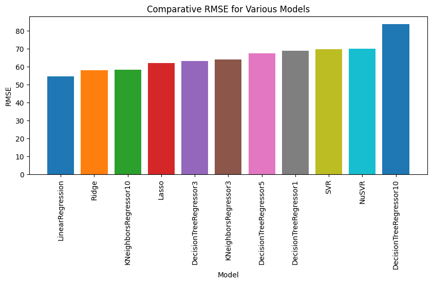

Ensemble Methods in Machine Learning
The ensemble method is a powerful concept in machine learning. It embodies the idea that diverse teams or groups can produce better results due to the diverse skills or contributions they bring.
American Football Team Analogy
Much like an American football team, where different players (quarterbacks, running backs, wide receivers, linebackers, and linemen) hold different roles and bring unique skills and strengths to the game, ensemble models operate in a similar fashion. Different algorithms are trained to be ‘experts’ in different areas of the data, contributing to the overall success of the model, much like the success of a team depends on the players' ability to work together.
Music Band Analogy
This analogy reflects the second type of ensemble method. In a band, all instruments play together throughout the entire song, adding different aspects to the overall sound. These contributions are combined to create the final piece of music. Similarly, in this type of ensemble method, every component model predicts everywhere and then those component predictions are combined into a single prediction.
Types of Ensemble Methods
Ensemble methods in machine learning fall into two main categories:
-
Component Division: Methods that divide the work into different components, each responsible for different regions. When put together, these components cover the entire prediction space.
-
Prediction Aggregation: Methods wherein every component model predicts everywhere with no regional divisions. The predictions from these models are then combined into a single prediction.
By leveraging the power of ensemble methods, we can improve the performance of machine learning models and create more robust solutions to complex problems.
Classification Problems
For classification problems, one common approach is to use a majority voting system, where the class with the most votes from all models becomes the final prediction. Alternatively, if the base classifiers can provide measures of certainty or confidence in their predictions, a weighted voting system might be used, where the votes of classifiers with higher confidence are given more weight. There’s room for creativity here in coming up with clever ways to combine classifier predictions.
In essence, the idea is to create and train multiple models, gather predictions, and then take an ‘average’ (which could mean a literal arithmetic mean, a vote, or some other type of aggregation) to get the final prediction.
Creating Individual Models
The following code snippet begins by creating three base models for the ensemble:
-
Logistic Regression: This is a statistical model used for binary classification problems. It estimates the probability that a sample belongs to a particular class. The
max_iterparameter is set to ensure that the iterative process used for optimization converges. -
Decision Tree Classifier: This model uses a tree-like graph of decisions to make predictions. The decision tree is created by splitting the dataset based on specific features, aiming to organize the data into homogenous groups. The
max_depthparameter is set to prevent overfitting by limiting the depth of the tree. -
Gaussian Naive Bayes: This is a probabilistic classifier based on applying Bayes' theorem. It makes strong independence assumptions between the features, and it is specifically used when the features follow a normal distribution.
Ensemble Model using Voting Classifier
An ensemble method combines the predictions from multiple models to improve the robustness and performance of the overall model. The VotingClassifier aggregates predictions from different base models (in this case, logistic regression, decision tree, and Gaussian Naive Bayes) and predicts the class that gets the majority of votes.
-
Scaling the Features: Standard scaling is applied to the features to standardize them. This transformation is necessary as models like logistic regression are sensitive to the scale of input features.
-
Creating the Ensemble Model: The base estimator models are combined into a list and then used to create the
VotingClassifierensemble model. -
Evaluating the Ensemble Model: The ensemble model is evaluated using cross-validation on the scaled digits dataset. This process provides an unbiased estimate of the model’s performance on unseen data.
# Function to get model name
def get_model_name(model):
    return str(model).split('(')[0]
# Importing necessary libraries
from sklearn.linear_model import LogisticRegression
from sklearn.tree import DecisionTreeClassifier
from sklearn.naive_bayes import GaussianNB
from sklearn.ensemble import VotingClassifier
from sklearn.datasets import load_digits
from sklearn.model_selection import cross_val_score
from sklearn.preprocessing import StandardScaler
from sklearn.pipeline import Pipeline
from sklearn.dummy import DummyClassifier
import matplotlib.pyplot as plt

# Load digits dataset
digits = load_digits()
X_train_digits = digits.data
y_train_digits = digits.target

# Define models including a dummy classifier
logistic_regression_model = LogisticRegression(max_iter=10000)
decision_tree_model = DecisionTreeClassifier(max_depth=3)
gaussian_nb_model = GaussianNB()
dummy_classifier_model = DummyClassifier(strategy='most_frequent')

base_estimator_models = [logistic_regression_model, decision_tree_model, gaussian_nb_model]
base_estimators = [(get_model_name(model), model) for model in base_estimator_models]

ensemble_model = VotingClassifier(estimators=base_estimators, voting='soft')

models_with_pipeline = [
    ('Logistic Regression', Pipeline([('scaler', StandardScaler()), ('lr', logistic_regression_model)])),
    ('Decision Tree', Pipeline([('scaler', StandardScaler()), ('dt', decision_tree_model)])),
    ('Gaussian NB', Pipeline([('scaler', StandardScaler()), ('gnb', gaussian_nb_model)])),
    ('Dummy Classifier', Pipeline([('scaler', StandardScaler()), ('dummy', dummy_classifier_model)])),
    ('Ensemble Model', Pipeline([('scaler', StandardScaler()), ('ensemble', ensemble_model)])),
]

# Calculating cross-validation scores for all models
cv_scores = [cross_val_score(model[1], X_train_digits, y_train_digits, cv=5) for model in models_with_pipeline]
mean_scores = [score.mean() for score in cv_scores]
std_scores = [score.std() for score in cv_scores]

# Sorting models by mean score
sorted_indexes = sorted(range(len(mean_scores)), key=lambda i: mean_scores[i])
sorted_model_names = [models_with_pipeline[i][0] for i in sorted_indexes]
sorted_cv_scores = [cv_scores[i] for i in sorted_indexes]
sorted_mean_scores = [mean_scores[i] for i in sorted_indexes]
sorted_std_scores = [std_scores[i] for i in sorted_indexes]

# Plotting the bar chart and line plot side-by-side
fig, (ax1, ax2) = plt.subplots(1, 2, figsize=[24, 8])

# Bar chart for mean cross-validation scores
for i, score in enumerate(sorted_cv_scores):
    label = f"{sorted_model_names[i]} (Mean: {sorted_mean_scores[i]:.3f}, Std: {sorted_std_scores[i]:.3f})"
    ax1.bar(i, score.mean(), yerr=score.std(), label=label)

ax1.set_xlabel('Model')
ax1.set_ylabel('Mean Accuracy')
ax1.set_title('Comparison of Cross-Validation Scores on Digits Dataset')
ax1.set_xticks(range(len(models_with_pipeline)))
ax1.set_xticklabels(sorted_model_names, rotation=45)
ax1.legend()

# Line plot for performance across different folds
for i, scores in enumerate(sorted_cv_scores):
    label = f"{sorted_model_names[i]} (Mean: {sorted_mean_scores[i]:.3f}, Std: {sorted_std_scores[i]:.3f})"
    ax2.plot(scores, label=label, marker='o')  # Line plot for each model

ax2.set_xlabel('Fold')
ax2.set_ylabel('Accuracy')
ax2.set_title('Performance of Each Model Across Different Folds on Digits Dataset')
ax2.legend(loc='best', fontsize=8)  # You may need to adjust the font size to fit the legend
ax2.grid(True, linestyle='--')
ax2.set_xticks(range(5))
ax2.set_xticklabels([f"Fold {i+1}" for i in range(5)])  # Labeling the folds

plt.tight_layout()
plt.show()

Applying Similar Approach to the Iris Dataset
You can perform similar operations on the iris dataset by loading the iris data and following the same procedure as above. Replace the digits dataset with the iris dataset, and ensure that you adjust the parameters of the individual models based on the characteristics of the iris data. The ensemble approach with the voting classifier can be equally applied to the iris dataset to aggregate predictions from multiple base models.
# Importing necessary libraries
from sklearn.linear_model import LogisticRegression
from sklearn.tree import DecisionTreeClassifier
from sklearn.naive_bayes import GaussianNB
from sklearn.ensemble import VotingClassifier
from sklearn.datasets import load_iris
from sklearn.model_selection import cross_val_score
from sklearn.preprocessing import StandardScaler
from sklearn.dummy import DummyClassifier
import matplotlib.pyplot as plt

# Load iris dataset
iris = load_iris()
X_train_iris = iris.data[:, 2:]  # Only taking the last two features (petal length and petal width)
y_train_iris = iris.target

# Scaling the features
scaler = StandardScaler()
scaled_X_train_iris = scaler.fit_transform(X_train_iris)

# Define models including a dummy classifier
logistic_regression_model = LogisticRegression(max_iter=10000)
decision_tree_model = DecisionTreeClassifier(max_depth=3)
gaussian_nb_model = GaussianNB()
dummy_classifier_model = DummyClassifier(strategy='most_frequent')

models = [logistic_regression_model, decision_tree_model, gaussian_nb_model, dummy_classifier_model, ensemble_model]
model_names = [get_model_name(model) for model in models]

# Calculate cross-validation scores for all models
cv_scores = [cross_val_score(model, scaled_X_train_iris, y_train_iris, cv=5) for model in models]
mean_scores = [score.mean() for score in cv_scores]
std_scores = [score.std() for score in cv_scores]

# Sorting models by mean score
sorted_indexes = sorted(range(len(mean_scores)), key=lambda i: mean_scores[i], reverse=True)
sorted_model_names = [model_names[i] for i in sorted_indexes]
sorted_cv_scores = [cv_scores[i] for i in sorted_indexes]
sorted_mean_scores = [mean_scores[i] for i in sorted_indexes]
sorted_std_scores = [std_scores[i] for i in sorted_indexes]

# Plotting the bar chart and line plot side-by-side
fig, (ax1, ax2) = plt.subplots(1, 2, figsize=[24, 8])

# Bar chart for mean cross-validation scores
for i, score in enumerate(sorted_cv_scores):
    label = f"{sorted_model_names[i]} (Mean: {sorted_mean_scores[i]:.3f}, Std: {sorted_std_scores[i]:.3f})"
    ax1.bar(i, score.mean(), yerr=score.std(), label=label)

ax1.set_xlabel('Model')
ax1.set_ylabel('Mean Accuracy')
ax1.set_title('Comparison of Cross-Validation Scores on Iris Dataset')
ax1.set_xticks(range(len(models)))
ax1.set_xticklabels(sorted_model_names, rotation=45)
ax1.legend()

# Line plot for performance across different folds
for i, scores in enumerate(sorted_cv_scores):
    label = f"{sorted_model_names[i]} (Mean: {sorted_mean_scores[i]:.3f}, Std: {sorted_std_scores[i]:.3f})"
    ax2.plot(scores, label=label, marker='o')  # Line plot for each model

ax2.set_xlabel('Fold')
ax2.set_ylabel('Accuracy')
ax2.set_title('Performance of Each Model Across Different Folds on Iris Dataset')
ax2.legend(loc='best', fontsize=8)  # You may need to adjust the font size to fit the legend
ax2.grid(True, linestyle='--')
ax2.set_xticks(range(5))
ax2.set_xticklabels([f"Fold {i+1}" for i in range(5)])  # Labeling the folds

plt.tight_layout()
plt.show()

Regression Problems
For regression problems, the ensemble’s prediction can be derived from the summary statistics of individual model predictions. This could be the mean, median, or some other summary statistic of the predictions. For instance, when we combine predictions from nearest neighbors, we use such summary statistics.
Combining Different Types of Models: Stacking
Combining various types of models, such as linear regression and decision tree regressors, is a powerful ensemble technique known as stacking. By leveraging different models with distinct biases, it becomes possible to create an aggregate model with reduced bias. This can often result in enhanced predictive performance.
Benefits of Stacking
-
Diverse Models: Stacking uses different models that may have distinct biases and assumptions. This diversity contributes to a more robust overall model.
-
Less Biased Aggregate Model: By leveraging the strengths of individual models, stacking can often reduce the biases that might be present in a single-model approach.
-
Enhanced Predictive Performance: Combining predictions from various models often leads to a more accurate and stable aggregate prediction, making stacking a valuable tool in machine learning.
# RMSE function
def rms_error(actual, predicted):
    mse = mean_squared_error(actual, predicted)
    return np.sqrt(mse)
# Necessary imports
import pandas as pd
import numpy as np
import matplotlib.pyplot as plt
from sklearn.ensemble import StackingRegressor
from sklearn.datasets import load_diabetes
from sklearn.linear_model import LinearRegression, Lasso, Ridge
from sklearn.neighbors import KNeighborsRegressor
from sklearn.svm import SVR, NuSVR
from sklearn.tree import DecisionTreeRegressor
from sklearn.model_selection import cross_val_score
from sklearn.metrics import make_scorer, mean_squared_error

# Load the diabetes dataset
diabetes = load_diabetes()
X_train_diabetes = diabetes.data
y_train_diabetes = diabetes.target

# Define regression models
old_school = [LinearRegression(), KNeighborsRegressor(n_neighbors=3), KNeighborsRegressor(n_neighbors=10)]
penalized_lr = [Lasso(), Ridge()]
svrs = [SVR(), NuSVR()]
dtrees = [DecisionTreeRegressor(max_depth=md) for md in [1, 3, 5, 10]]
regression_models = old_school + penalized_lr + svrs + dtrees
base_models_for_stacking = [('Linear Regression', LinearRegression()), ('KNeighborsRegressor', KNeighborsRegressor(n_neighbors=10))]
final_estimator = Lasso()
stacking_regressor = StackingRegressor(estimators=base_models_for_stacking, final_estimator=final_estimator)
regression_models.append(stacking_regressor)

# Define a custom scoring function
rms_scorer = make_scorer(rms_error, greater_is_better=False)

# Scaler
scores = {}

# Cross-validation and scoring
for model in regression_models:
    cv_results = cross_val_score(model, X_train_diabetes, y_train_diabetes, scoring=rms_scorer, cv=10)
    key = str(model.__class__.__name__) + str(model.get_params().get('max_depth', "")) + str(model.get_params().get('n_neighbors', ""))
    scores[key] = -cv_results.mean()

# Results display
df = pd.DataFrame.from_dict(scores, orient='index').sort_values(0)
df.columns = ['RMSE']
display(df)

# Define a custom scoring function
rms_scorer = make_scorer(rms_error, greater_is_better=False)

# Sort scores by RMSE in descending order (better models first)
sorted_scores = sorted(scores.items(), key=lambda x: x[1])

# Plot the sorted bar graph
fig, ax = plt.subplots(1, 1, figsize=(10, 4))
for model_name, error in sorted_scores:
    ax.bar(model_name, error)
ax.set_xlabel('Model')
ax.set_ylabel("RMSE")
ax.set_title("Comparative RMSE for Various Models")
plt.xticks(rotation=90)
plt.show()

# Define your figure and axis
fig, ax = plt.subplots(1, 1, figsize=(10, 4))

# Store the labels and lines for sorting
lines_labels = []

# Iterate through all models and plot
for model in regression_models:
    cv_results = cross_val_score(model, X_train_diabetes, y_train_diabetes, scoring=rms_scorer, cv=10)
    model_name = model.__class__.__name__
    # Include specific hyperparameters in the label if present
    hyperparams = ""
    if isinstance(model, KNeighborsRegressor):
        hyperparams = str(model.n_neighbors)
    elif isinstance(model, DecisionTreeRegressor):
        hyperparams = str(model.max_depth)
    mean_score = -cv_results.mean()
    std_score = cv_results.std()
    my_lbl = f"{model_name} {hyperparams} ({mean_score:5.3f}$\pm${std_score:.2f})"
    line, = ax.plot(cv_results, 'o--')
    lines_labels.append((line, my_lbl))

# Sort by mean RMSE (better models first)
lines_labels.sort(key=lambda x: float(x[1].split('(')[1].split('$')[0]))

# Add the sorted lines and labels to the legend
ax.legend(*zip(*lines_labels), bbox_to_anchor=(1.05, 1), loc='upper left', ncol=1)

ax.set_xlabel('CV-Fold #')
ax.set_ylabel("RMSE")
plt.xticks(rotation=0)
plt.tight_layout()
plt.show()
| RMSE | |
|---|---|
| StackingRegressor | 54.396804 |
| LinearRegression | 54.404681 |
| Ridge | 57.747608 |
| KNeighborsRegressor10 | 58.276128 |
| Lasso | 61.886130 |
| DecisionTreeRegressor3 | 63.426133 |
| KNeighborsRegressor3 | 63.882641 |
| DecisionTreeRegressor5 | 67.784123 |
| DecisionTreeRegressor1 | 68.707963 |
| SVR | 69.551804 |
| NuSVR | 69.748789 |
| DecisionTreeRegressor10 | 81.465226 |


The ensemble technique provides a flexible way to combine the strengths of various models, potentially improving prediction accuracy and robustness over individual models. By applying this approach to different datasets, including the iris dataset, you can harness the combined predictive power of different machine learning algorithms.
Random Forests and Bagging
Random forests leverage a technique known as bagging, which stands for bootstrap aggregation.
Understanding Bootstrapping
The basic idea of bootstrapping is to determine a distribution (a range of possibilities) from a single dataset. Bootstrapping and cross-validation are both instances of resampling techniques. With bootstrapping, we compute a statistic from a dataset, and while there’s a direct formula for some statistics (like mean), for other statistics, there aren’t straightforward answers or easy formulas. This is where bootstrapping comes into play.
Sampling with and without Replacement
Before delving into bootstrapping, we need to understand the concept of sampling with and without replacement.
-
Sampling without replacement: Here, we select data from our dataset and set it aside, it does not go back into the dataset. Thus, the selections are dependent on the prior choices.
-
Sampling with replacement: In this case, we select data from our dataset, note its value, and return it back to the dataset. The next selection does not depend on the prior one, giving us an independent sequence of examples.
How to Compute a Bootstrap Statistic
To compute a bootstrap statistic, we follow these steps:
- Randomly sample our source dataset, with replacement, until we generate a new bootstrap sample that has the same number of elements as our original.
- Compute our statistic of interest on that bootstrap sample.
- Repeat this process several times and then take the mean of those individual bootstrap sample statistics.
Non-Bootstrap Mean
We can start by defining a non-bootstrap formula for the mean.
# Importing required libraries
import numpy as np
import matplotlib.pyplot as plt

# Defining our dataset
dataset = np.array([1, 5, 10, 10, 17, 20, 35])

# Function to compute mean of an array
def compute_mean(data):
    """
    This function calculates the mean of a given dataset.

    Args:
    data (numpy.ndarray): The input data array.

    Returns:
    float: The mean of the input data array.
    """
    # Using numpy's sum method to add up all the values in data,
    # and then dividing it by the number of elements in data
    return np.sum(data) / data.size

# Calculating the mean of our dataset
mean_value = compute_mean(dataset)

# Plotting the dataset
plt.figure(figsize=(10, 5))
plt.plot(dataset, 'o')
plt.axhline(y=mean_value, color='r', linestyle='-', label=f"Mean value = {mean_value:.2f}")
plt.xlabel('Index')
plt.ylabel('Value')
plt.title('Dataset and Mean Value')
plt.legend()
plt.grid(True)
plt.show()

Creating Bootstrap Samples
Bootstrap sampling is a powerful statistical technique used for estimating the distribution of a statistic by resampling from the given dataset with replacement. In this code snippet, we’ll take a look at how to create a bootstrap sample, compute the mean of several bootstrap samples, and finally calculate the overall mean of those means.
Step 1: Define a Function for Bootstrap Sampling
The function bootstrap_sample(data) accepts an array of data and returns a new array, sampled with replacement from the original data. It uses the np.random.choice method to randomly select indices, thus allowing some elements to appear more than once and others not at all.
Step 2: Initialize Dataset and Bootstrap Means
We define a dataset dataset and initialize an empty list bootstrap_means to store the mean of each bootstrap sample.
Step 3: Perform Bootstrap Sampling and Compute Sample Means
We perform bootstrap sampling five times in a loop:
- For each iteration, we create a bootstrap sample using the
bootstrap_samplefunction. - The mean of each bootstrap sample is computed using a function called
compute_mean, which should be defined separately. - The computed mean is appended to the
bootstrap_meanslist.
Here’s an illustrative output for one iteration:
Bootstrap sample 1: [10, 1, 10, 35, 20, 17, 10], Mean: 14.71
Step 4: Compute the Overall Mean of Bootstrap Samples
Finally, we compute the overall mean of all the bootstrap sample means using the np.mean function. This gives us a single value, known as the mean of the means.
The overall mean of the bootstrap samples is 16.74
# Importing required library
import numpy as np

def bootstrap_sample(data):
    """
    This function generates a bootstrap sample from the given data.

    Args:
    data (numpy.ndarray): The input data array.

    Returns:
    numpy.ndarray: The bootstrap sample of the input data array.
    """

    # Calculate the length of data
    N = len(data)

    # Generate an array with indices ranging from 0 to N
    idx = np.arange(N)

    # Randomly choose indices for the bootstrap sample.
    # The 'replace=True' parameter means that we are sampling with replacement,
    # i.e., some indices can be chosen multiple times, while others might not be chosen at all.
    bs_idx = np.random.choice(idx, N, replace=True)

    # Use these indices to create the bootstrap sample
    return data[bs_idx]
# Define our dataset
dataset = np.array([1, 5, 10, 10, 17, 20, 35])

# Initialize an empty list to store bootstrap means
bootstrap_means = []

# Perform bootstrap sampling 5 times
for i in range(5):
    # Generate a bootstrap sample from the dataset
    bootstrap_sample_data = bootstrap_sample(dataset)

    # Compute the mean of the bootstrap sample
    bootstrap_sample_mean = compute_mean(bootstrap_sample_data)

    # Store the bootstrap mean
    bootstrap_means.append(bootstrap_sample_mean)

    # Print the bootstrap sample and its mean
    print(f"Bootstrap sample {i+1}: {bootstrap_sample_data}, Mean: {bootstrap_sample_mean:.2f}")

# Now 'bootstrap_means' contains the means of 5 bootstrap samples
Bootstrap sample 1: [ 1  1  5 20 20  1  1], Mean: 7.00
Bootstrap sample 2: [17  1 20 17  1 17 17], Mean: 12.86
Bootstrap sample 3: [20 20 35 10 10  1 10], Mean: 15.14
Bootstrap sample 4: [20  1 35 17  5 10 17], Mean: 15.00
Bootstrap sample 5: [10 35 10 10 35 10  5], Mean: 16.43
From the bootstrap sample means we can compute a single value–the mean of the means:
# Compute the overall mean of the bootstrap means
bootstrap_overall_mean = np.mean(bootstrap_means)

# Print the overall mean of the bootstrap samples
print(f"The overall mean of the bootstrap samples is {bootstrap_overall_mean:.2f}")
The overall mean of the bootstrap samples is 13.29
Now, let’s roll the bootstrap function up into a single statistic. We provide some intermediary print statements to help with our comprehension of the sampling techniques and computations taking place.
# Importing required libraries
import numpy as np

def compute_bootstrap_statistic(data, num_boots, statistic):
    """
    This function calculates a specified statistic over a specified number of bootstrap samples.

    Args:
    data (numpy.ndarray): The input data array.
    num_boots (int): The number of bootstrap samples to generate.
    statistic (function): The statistic function to apply to each bootstrap sample.

    Returns:
    float: The average of the calculated statistics across all bootstrap samples.
    """
    # Initialize an empty list to hold the statistics calculated on each bootstrap sample
    bootstrap_statistics = []

    for i in range(num_boots):
        # Generate a bootstrap sample
        bs_sample = bootstrap_sample(data)

        # Compute the statistic on the bootstrap sample
        bootstrap_stat = statistic(bs_sample)

        # Append the statistic to our list
        bootstrap_statistics.append(bootstrap_stat)

        # Check if statistic is a numpy array
        if isinstance(bootstrap_stat, np.ndarray):
            # Use numpy's array2string method
            bootstrap_stat_str = np.array2string(bootstrap_stat)
        else:
            # Use regular Python float formatting
            bootstrap_stat_str = f"{bootstrap_stat:.2f}"

        # Print the statistic for this bootstrap sample
        print(f"Bootstrap Sample {i+1}/{num_boots}, Computed Statistic: {bootstrap_stat_str}")

    # Calculate the mean of all the computed statistics
    mean_bootstrap_statistic = np.mean(bootstrap_statistics)

    # Return the average of the computed statistics
    return mean_bootstrap_statistic, bootstrap_statistics

# Define our dataset
dataset = np.array([1, 5, 10, 10, 17, 20, 35])

# Compute the mean over 100 bootstrap samples of the dataset
bootstrap_mean, _ = compute_bootstrap_statistic(dataset, 100, compute_mean)

# Print the computed bootstrap mean
print(f"\nFinal Bootstrap Mean over 100 Samples: {bootstrap_mean:.2f}")
Bootstrap Sample 1/100, Computed Statistic: 11.57
Bootstrap Sample 2/100, Computed Statistic: 9.14
Bootstrap Sample 3/100, Computed Statistic: 13.86
Bootstrap Sample 4/100, Computed Statistic: 16.29
Bootstrap Sample 5/100, Computed Statistic: 18.14
Bootstrap Sample 6/100, Computed Statistic: 10.43
Bootstrap Sample 7/100, Computed Statistic: 11.86
Bootstrap Sample 8/100, Computed Statistic: 12.43
Bootstrap Sample 9/100, Computed Statistic: 8.71
Bootstrap Sample 10/100, Computed Statistic: 8.71
Bootstrap Sample 11/100, Computed Statistic: 16.43
Bootstrap Sample 12/100, Computed Statistic: 13.86
Bootstrap Sample 13/100, Computed Statistic: 11.29
Bootstrap Sample 14/100, Computed Statistic: 15.14
Bootstrap Sample 15/100, Computed Statistic: 11.86
Bootstrap Sample 16/100, Computed Statistic: 7.71
Bootstrap Sample 17/100, Computed Statistic: 17.29
Bootstrap Sample 18/100, Computed Statistic: 7.57
Bootstrap Sample 19/100, Computed Statistic: 9.00
Bootstrap Sample 20/100, Computed Statistic: 10.86
Bootstrap Sample 21/100, Computed Statistic: 11.00
Bootstrap Sample 22/100, Computed Statistic: 13.29
Bootstrap Sample 23/100, Computed Statistic: 16.29
Bootstrap Sample 24/100, Computed Statistic: 12.43
Bootstrap Sample 25/100, Computed Statistic: 15.71
Bootstrap Sample 26/100, Computed Statistic: 14.86
Bootstrap Sample 27/100, Computed Statistic: 13.86
Bootstrap Sample 28/100, Computed Statistic: 10.00
Bootstrap Sample 29/100, Computed Statistic: 14.14
Bootstrap Sample 30/100, Computed Statistic: 15.00
Bootstrap Sample 31/100, Computed Statistic: 15.43
Bootstrap Sample 32/100, Computed Statistic: 18.43
Bootstrap Sample 33/100, Computed Statistic: 18.86
Bootstrap Sample 34/100, Computed Statistic: 20.57
Bootstrap Sample 35/100, Computed Statistic: 16.14
Bootstrap Sample 36/100, Computed Statistic: 13.71
Bootstrap Sample 37/100, Computed Statistic: 7.29
Bootstrap Sample 38/100, Computed Statistic: 6.00
Bootstrap Sample 39/100, Computed Statistic: 21.43
Bootstrap Sample 40/100, Computed Statistic: 9.71
Bootstrap Sample 41/100, Computed Statistic: 18.43
Bootstrap Sample 42/100, Computed Statistic: 21.43
Bootstrap Sample 43/100, Computed Statistic: 17.86
Bootstrap Sample 44/100, Computed Statistic: 12.57
Bootstrap Sample 45/100, Computed Statistic: 10.86
Bootstrap Sample 46/100, Computed Statistic: 18.86
Bootstrap Sample 47/100, Computed Statistic: 17.00
Bootstrap Sample 48/100, Computed Statistic: 13.86
Bootstrap Sample 49/100, Computed Statistic: 19.71
Bootstrap Sample 50/100, Computed Statistic: 16.14
Bootstrap Sample 51/100, Computed Statistic: 8.43
Bootstrap Sample 52/100, Computed Statistic: 14.86
Bootstrap Sample 53/100, Computed Statistic: 13.14
Bootstrap Sample 54/100, Computed Statistic: 13.00
Bootstrap Sample 55/100, Computed Statistic: 12.71
Bootstrap Sample 56/100, Computed Statistic: 8.86
Bootstrap Sample 57/100, Computed Statistic: 18.86
Bootstrap Sample 58/100, Computed Statistic: 16.14
Bootstrap Sample 59/100, Computed Statistic: 16.86
Bootstrap Sample 60/100, Computed Statistic: 17.43
Bootstrap Sample 61/100, Computed Statistic: 13.00
Bootstrap Sample 62/100, Computed Statistic: 15.86
Bootstrap Sample 63/100, Computed Statistic: 15.29
Bootstrap Sample 64/100, Computed Statistic: 17.14
Bootstrap Sample 65/100, Computed Statistic: 18.29
Bootstrap Sample 66/100, Computed Statistic: 10.14
Bootstrap Sample 67/100, Computed Statistic: 23.71
Bootstrap Sample 68/100, Computed Statistic: 12.71
Bootstrap Sample 69/100, Computed Statistic: 17.57
Bootstrap Sample 70/100, Computed Statistic: 18.00
Bootstrap Sample 71/100, Computed Statistic: 13.71
Bootstrap Sample 72/100, Computed Statistic: 14.57
Bootstrap Sample 73/100, Computed Statistic: 17.86
Bootstrap Sample 74/100, Computed Statistic: 15.57
Bootstrap Sample 75/100, Computed Statistic: 13.86
Bootstrap Sample 76/100, Computed Statistic: 17.57
Bootstrap Sample 77/100, Computed Statistic: 15.86
Bootstrap Sample 78/100, Computed Statistic: 15.86
Bootstrap Sample 79/100, Computed Statistic: 8.71
Bootstrap Sample 80/100, Computed Statistic: 15.43
Bootstrap Sample 81/100, Computed Statistic: 15.86
Bootstrap Sample 82/100, Computed Statistic: 9.43
Bootstrap Sample 83/100, Computed Statistic: 12.14
Bootstrap Sample 84/100, Computed Statistic: 9.57
Bootstrap Sample 85/100, Computed Statistic: 11.29
Bootstrap Sample 86/100, Computed Statistic: 15.86
Bootstrap Sample 87/100, Computed Statistic: 12.71
Bootstrap Sample 88/100, Computed Statistic: 19.86
Bootstrap Sample 89/100, Computed Statistic: 16.57
Bootstrap Sample 90/100, Computed Statistic: 14.29
Bootstrap Sample 91/100, Computed Statistic: 9.00
Bootstrap Sample 92/100, Computed Statistic: 18.43
Bootstrap Sample 93/100, Computed Statistic: 14.57
Bootstrap Sample 94/100, Computed Statistic: 13.14
Bootstrap Sample 95/100, Computed Statistic: 11.43
Bootstrap Sample 96/100, Computed Statistic: 14.00
Bootstrap Sample 97/100, Computed Statistic: 17.14
Bootstrap Sample 98/100, Computed Statistic: 11.86
Bootstrap Sample 99/100, Computed Statistic: 12.86
Bootstrap Sample 100/100, Computed Statistic: 12.29

Final Bootstrap Mean over 100 Samples: 14.16
Bootstrap sampling provides a way to simulate the distribution of a statistic by repeatedly sampling with replacement from the original dataset. This technique is valuable in statistical analysis, offering insights into the properties of the dataset and enhancing the robustness of estimates. The really interesting part is that we can compute just about any statistic using the same process. Let’s follow up on that idea now.
Bagged Learners as Statistics
When we talk about bagged learners, we’re essentially looking at a significantly more intricate statistic - a trained model in the form of a learner. Now, you may be wondering, how is a learner a statistic?
A statistic, in the broad sense, is any function applied to a collection of data. Common examples include the mean, median, minimum, and maximum - all of these are calculations we perform on a dataset to obtain a specific result. Therefore, they are all considered statistics.
Creating, fitting, and applying a learner to a new example, although more complex, is just another way of calculating a result from a dataset.
In the context of ensemble methods, when we create a bagged learner, we are constructing a high-level statistic in the form of a trained model. Bagging (or bootstrap aggregation) technique allows us to reduce the variance in the predictions by combining the result of multiple classifiers modeled on different sub-samples of the same data set.
Let’s now step forward into the practical realm and illustrate how a machine learning model can be viewed as a statistic.
# Importing the required library
from sklearn import neighbors

def make_knn_statistic(new_example):
    """
    This function accepts an unseen example and returns a K-Nearest Neighbors statistic function.

    Args:
    new_example (numpy.ndarray): The new unseen example to be predicted.

    Returns:
    function: A K-Nearest Neighbors statistic function.
    """

    def knn_statistic(dataset):
        """
        This function accepts a dataset, fits a K-Nearest Neighbors regression model,
        and predicts the target variable of the new example.

        Args:
        dataset (numpy.ndarray): The dataset used to train the model.

        Returns:
        numpy.ndarray: The predicted target variable of the new example.
        """

        # Splitting the dataset into features and the target variable
        features, target = dataset[:,:-1], dataset[:,-1]

        # Creating and fitting the K-Nearest Neighbors regression model
        knn = neighbors.KNeighborsRegressor(n_neighbors=3).fit(features, target)

        # Predicting the target variable of the new example
        return knn.predict(new_example)

    return knn_statistic
In this case, a programming technique known as a closure is being utilized. In this particular scenario, our statistical computation is done in reference to a specific, fixed new example. By fixing this test example, we can bring our calculation down to a singular value. With this approach, we’ve essentially crafted a calculation, knn_statistic, based on the dataset, which can be utilized exactly as we used compute_mean before. It’s an elegant way to apply the same methodology to different kinds of computations.
from sklearn.model_selection import train_test_split

# Split dataset into training set and test set

X_train_diabetes, X_test_diabetes, y_train_diabetes, y_test_diabetes = train_test_split(diabetes.data, diabetes.target, test_size=0.2, random_state=42)

# Concatenate the features and targets horizontally
diabetes_train_dataset = np.c_[X_train_diabetes, y_train_diabetes]

# Generate a statistic for the last example in the training set
compute_knn_statistic = make_knn_statistic(X_train_diabetes[-1].reshape(1,-1))

# Compute the bootstrap statistic for the given dataset
knn_bootstrap_mean, bootstrap_statistics = compute_bootstrap_statistic(diabetes_train_dataset, 100, compute_knn_statistic)
print(f"\nFinal Bootstrap Mean over 100 Samples: {knn_bootstrap_mean:.2f}")

# Regular KNN model
knn_model = KNeighborsRegressor(n_neighbors=3)
knn_model.fit(X_train_diabetes, y_train_diabetes)
regular_knn_prediction = knn_model.predict(X_train_diabetes[-1].reshape(1,-1))

# Print comparison
print(f"Regular KNN Prediction: {regular_knn_prediction[0]:.2f}")
Bootstrap Sample 1/100, Computed Statistic: [222.]
Bootstrap Sample 2/100, Computed Statistic: [129.33333333]
Bootstrap Sample 3/100, Computed Statistic: [155.66666667]
Bootstrap Sample 4/100, Computed Statistic: [302.]
Bootstrap Sample 5/100, Computed Statistic: [114.66666667]
Bootstrap Sample 6/100, Computed Statistic: [235.66666667]
Bootstrap Sample 7/100, Computed Statistic: [222.]
Bootstrap Sample 8/100, Computed Statistic: [172.66666667]
Bootstrap Sample 9/100, Computed Statistic: [222.]
Bootstrap Sample 10/100, Computed Statistic: [181.]
Bootstrap Sample 11/100, Computed Statistic: [302.]
Bootstrap Sample 12/100, Computed Statistic: [95.]
Bootstrap Sample 13/100, Computed Statistic: [59.66666667]
Bootstrap Sample 14/100, Computed Statistic: [169.33333333]
Bootstrap Sample 15/100, Computed Statistic: [106.33333333]
Bootstrap Sample 16/100, Computed Statistic: [302.]
Bootstrap Sample 17/100, Computed Statistic: [222.]
Bootstrap Sample 18/100, Computed Statistic: [262.]
Bootstrap Sample 19/100, Computed Statistic: [262.]
Bootstrap Sample 20/100, Computed Statistic: [118.]
Bootstrap Sample 21/100, Computed Statistic: [181.]
Bootstrap Sample 22/100, Computed Statistic: [182.]
Bootstrap Sample 23/100, Computed Statistic: [222.]
Bootstrap Sample 24/100, Computed Statistic: [159.]
Bootstrap Sample 25/100, Computed Statistic: [169.33333333]
Bootstrap Sample 26/100, Computed Statistic: [121.33333333]
Bootstrap Sample 27/100, Computed Statistic: [129.33333333]
Bootstrap Sample 28/100, Computed Statistic: [182.]
Bootstrap Sample 29/100, Computed Statistic: [302.]
Bootstrap Sample 30/100, Computed Statistic: [182.]
Bootstrap Sample 31/100, Computed Statistic: [302.]
Bootstrap Sample 32/100, Computed Statistic: [169.33333333]
Bootstrap Sample 33/100, Computed Statistic: [201.66666667]
Bootstrap Sample 34/100, Computed Statistic: [167.]
Bootstrap Sample 35/100, Computed Statistic: [262.]
Bootstrap Sample 36/100, Computed Statistic: [302.]
Bootstrap Sample 37/100, Computed Statistic: [132.66666667]
Bootstrap Sample 38/100, Computed Statistic: [155.66666667]
Bootstrap Sample 39/100, Computed Statistic: [224.66666667]
Bootstrap Sample 40/100, Computed Statistic: [239.]
Bootstrap Sample 41/100, Computed Statistic: [181.]
Bootstrap Sample 42/100, Computed Statistic: [182.]
Bootstrap Sample 43/100, Computed Statistic: [155.66666667]
Bootstrap Sample 44/100, Computed Statistic: [136.]
Bootstrap Sample 45/100, Computed Statistic: [239.]
Bootstrap Sample 46/100, Computed Statistic: [150.]
Bootstrap Sample 47/100, Computed Statistic: [195.66666667]
Bootstrap Sample 48/100, Computed Statistic: [195.66666667]
Bootstrap Sample 49/100, Computed Statistic: [155.66666667]
Bootstrap Sample 50/100, Computed Statistic: [235.66666667]
Bootstrap Sample 51/100, Computed Statistic: [91.66666667]
Bootstrap Sample 52/100, Computed Statistic: [91.66666667]
Bootstrap Sample 53/100, Computed Statistic: [239.]
Bootstrap Sample 54/100, Computed Statistic: [182.]
Bootstrap Sample 55/100, Computed Statistic: [195.66666667]
Bootstrap Sample 56/100, Computed Statistic: [262.]
Bootstrap Sample 57/100, Computed Statistic: [103.]
Bootstrap Sample 58/100, Computed Statistic: [235.66666667]
Bootstrap Sample 59/100, Computed Statistic: [262.]
Bootstrap Sample 60/100, Computed Statistic: [195.66666667]
Bootstrap Sample 61/100, Computed Statistic: [140.]
Bootstrap Sample 62/100, Computed Statistic: [220.33333333]
Bootstrap Sample 63/100, Computed Statistic: [199.]
Bootstrap Sample 64/100, Computed Statistic: [302.]
Bootstrap Sample 65/100, Computed Statistic: [154.66666667]
Bootstrap Sample 66/100, Computed Statistic: [302.]
Bootstrap Sample 67/100, Computed Statistic: [118.33333333]
Bootstrap Sample 68/100, Computed Statistic: [176.]
Bootstrap Sample 69/100, Computed Statistic: [77.]
Bootstrap Sample 70/100, Computed Statistic: [262.]
Bootstrap Sample 71/100, Computed Statistic: [132.66666667]
Bootstrap Sample 72/100, Computed Statistic: [169.33333333]
Bootstrap Sample 73/100, Computed Statistic: [169.33333333]
Bootstrap Sample 74/100, Computed Statistic: [114.66666667]
Bootstrap Sample 75/100, Computed Statistic: [190.66666667]
Bootstrap Sample 76/100, Computed Statistic: [159.]
Bootstrap Sample 77/100, Computed Statistic: [222.]
Bootstrap Sample 78/100, Computed Statistic: [239.]
Bootstrap Sample 79/100, Computed Statistic: [262.]
Bootstrap Sample 80/100, Computed Statistic: [169.33333333]
Bootstrap Sample 81/100, Computed Statistic: [262.]
Bootstrap Sample 82/100, Computed Statistic: [222.]
Bootstrap Sample 83/100, Computed Statistic: [262.]
Bootstrap Sample 84/100, Computed Statistic: [118.]
Bootstrap Sample 85/100, Computed Statistic: [155.66666667]
Bootstrap Sample 86/100, Computed Statistic: [109.66666667]
Bootstrap Sample 87/100, Computed Statistic: [262.]
Bootstrap Sample 88/100, Computed Statistic: [262.]
Bootstrap Sample 89/100, Computed Statistic: [109.66666667]
Bootstrap Sample 90/100, Computed Statistic: [115.66666667]
Bootstrap Sample 91/100, Computed Statistic: [222.]
Bootstrap Sample 92/100, Computed Statistic: [222.]
Bootstrap Sample 93/100, Computed Statistic: [222.]
Bootstrap Sample 94/100, Computed Statistic: [195.66666667]
Bootstrap Sample 95/100, Computed Statistic: [235.66666667]
Bootstrap Sample 96/100, Computed Statistic: [158.]
Bootstrap Sample 97/100, Computed Statistic: [155.66666667]
Bootstrap Sample 98/100, Computed Statistic: [172.66666667]
Bootstrap Sample 99/100, Computed Statistic: [243.33333333]
Bootstrap Sample 100/100, Computed Statistic: [182.]

Final Bootstrap Mean over 100 Samples: 191.93
Regular KNN Prediction: 195.67
Constructing Bagged Learners: An Overview
The concept of bagging relies on the inherent variability within a given dataset. Just as the calculation of mean, median or other statistical measures can yield different results based on the exact subset of data we utilize, the output from a predictive model (like a k-nearest neighbors model) will also vary depending on the dataset used for training.
The basic algorithm for bagging involves three key steps:
Step 1: Data Sampling
The process begins by sampling the original data with replacement. This creates a bootstrap sample which maintains the original dataset’s size, but includes some instances multiple times and excludes others.
Step 2: Model Training
Next, a model is created and trained using the bootstrap sample. This model is a single learner that has learned from a specific instance of the data.
Step 3: Iterative Learning
Steps 1 and 2 are repeated multiple times, generating a multitude of independently trained models.
When it comes to making predictions, an unseen example is fed into each of the trained models. The final output is an aggregation of the predictions from all the models. This technique, often applied with decision trees as the base learners, enhances the predictive performance by reducing the variance of the model, without increasing the bias. This makes bagging a powerful tool in the machine learning toolkit.
from sklearn.utils import resample
from scipy import stats

def bagged_learner(dataset, base_model, num_models=10):
    """
    This function creates a list of models each trained on a bootstrap sample from the original dataset.

    Args:
    dataset (tuple): The input dataset, a tuple containing features and target.
    base_model (object): The base model object to be fitted on each bootstrap sample.
    num_models (int): The number of models to be created.

    Returns:
    list: A list of trained models.
    """
    models = []
    X, y = dataset
    for _ in range(num_models):
        X_resample, y_resample = resample(X, y)
        model = base_model()
        model.fit(X_resample, y_resample)
        models.append(model)
    return models

def bagged_predict_class(models, example):
    """
    This function predicts the class of a given example by taking the mode of the predictions from all the models.

    Args:
    models (list): A list of trained models.
    example (numpy.ndarray): The new unseen example to be predicted.

    Returns:
    int: The predicted class of the new example.
    """
    preds = [model.predict(example.reshape(1, -1)) for model in models]
    return stats.mode(preds)[0][0]
Bagging and the Bias-Variance Trade-off: Bagging is a method that aids in mitigating the high variance in model predictions. It does this by training multiple models (base models), each on a different bootstrapped sample of the original dataset. These base models may overfit to their respective samples, but when their predictions are averaged (for regression) or voted upon (for classification, taking the mode), the end result is a more robust and generalizable model.
While the individual steps above are geared towards constraining and simplifying a single decision tree model, bagging is a method that operates across multiple models (an ensemble). The goal of bagging is to improve the stability and accuracy of machine learning algorithms used in statistical classification and regression. It works by creating multiple subsets of the original data with replacement (bootstrap samples), training a separate decision tree on each subset, and then aggregating their predictions.
Bagging helps to mitigate overfitting by “averaging out” the predictions from multiple models, effectively smoothing out the high variance and reducing the risk of overfitting the noise in the data. The individual models might overfit the data, but the ensemble as a whole, due to the effect of averaging, is likely to generalize better.
Furthermore, when the base learners are complex (like deep decision trees), they can have high variance and low bias. Bagging in such situations reduces variance without increasing bias, hence leading to a better performing model.
So, while strategies like limiting tree depth or setting a minimum number of samples at leaves work at the individual model level to combat overfitting, bagging operates at an ensemble level, creating multiple models from different subsets of data and combining their predictions, to reduce variance and improve generalization.
Key points:
-
Variance Reduction: Bagging is beneficial in contexts where the model has high variance (i.e., it overfits the training data). The averaging/voting process helps to smooth out the overfitting and reduce the variance in predictions.
-
Bias: Bagging does not help to reduce bias. If the base model is biased, the final model will retain this bias. Therefore, it is essential to ensure that the base model has low bias.
-
Independence of Learners: Because each base learner is trained on a sample drawn with replacement from the original dataset, they are independent of one another. This feature allows for potential parallelization in the training process - each base model could be trained on a separate machine, greatly increasing computational efficiency.
Please note, the exact reduction in variance and whether or not the base model has a low bias depends on the specifics of the model and data. These points are general rules of thumb.
from sklearn.metrics import mean_squared_error
from sklearn.neighbors import KNeighborsRegressor
import numpy as np

# Regular KNN model
knn_regular = KNeighborsRegressor(n_neighbors=3)
knn_regular.fit(X_train_diabetes, y_train_diabetes)
regular_pred = knn_regular.predict(X_test_diabetes)

# Bootstrap KNN model
bootstrap_preds = []
for _ in range(100): # 100 bootstrap samples
    resampled_dataset = diabetes_train_dataset[np.random.choice(len(diabetes_train_dataset), len(diabetes_train_dataset))]
    X_resampled, y_resampled = resampled_dataset[:,:-1], resampled_dataset[:,-1]
    knn_bootstrap = KNeighborsRegressor(n_neighbors=3).fit(X_resampled, y_resampled)
    bootstrap_preds.append(knn_bootstrap.predict(X_test_diabetes))
bootstrap_pred_mean = np.mean(bootstrap_preds, axis=0) # Averaging the predictions

# Compute the MSE
mse_regular = mean_squared_error(y_test_diabetes, regular_pred)
mse_bootstrap = mean_squared_error(y_test_diabetes, bootstrap_pred_mean)

# Print the results
print(f"Regular KNN MSE: {mse_regular}")
print(f"Bootstrap KNN MSE: {mse_bootstrap}")
Regular KNN MSE: 3364.3932584269664
Bootstrap KNN MSE: 3006.9906289637943
Random Forests: An Ensemble Learning Method
Random Forests (RFs) represent an advanced machine learning methodology that operates by constructing multiple decision trees during training, and then outputs the mode (classification) or mean prediction (regression) of the individual trees.
Random Selection of Features
Unlike standard decision trees, which evaluate all features to establish a decision node, Random Forests introduce randomness into the model by selecting a random subset of features. This step significantly reduces the influence of a single dominating feature and ensures greater diversity among the trees, resulting in an ensemble of varied and independent decision trees.
Building Individual Trees
For each decision tree, a random subset of features is selected. The best feature from this subset is then used to split the data at each node, growing the tree to its maximum extent without pruning. This approach ensures that each tree in the random forest captures different patterns present in the data, adding to the overall predictive power of the model.
Making Predictions with Random Forests
When it comes to making predictions, each tree gives its individual prediction, and the final output is determined based on these. For classification tasks, the class with the highest vote is selected, while for regression, the average prediction is used. In the sklearn implementation of Random Forests, class probabilities are extracted from each tree, and the class with the highest average probability is selected as the final prediction.
Random Forests offer a way to improve upon bagged decision trees by de-correlating the trees. This process makes the aggregate of the predictions from individual trees less overfitting and more generalized to unseen data, enhancing the model’s predictive accuracy and robustness.
As we continue to explore ensemble methods and their impact on predictive modeling, the Random Forest algorithm stands as a potent tool for dealing with complex datasets, providing both reliable performance and interpretability.
Enhancing Random Forests: Introducing Extreme Random Forests
While Random Forests are a potent tool in Machine Learning, an additional variant, the Extreme Random Forest, introduces an extra degree of randomness, thereby providing a potentially improved model.
What are Extreme Random Forests?
Extreme Random Forests (ERFs) extend the randomness in the decision tree building process even further. While standard Random Forests randomly select a subset of features for each tree, ERFs take a step further by also determining the split points randomly.
This process incorporates an extra layer of randomness, ensuring that each tree becomes even more unique, thus creating an ensemble that is very diverse. It’s a testament to the power of randomness in model creation that this technique not only works, but can work impressively well.
In scikit-learn, Extreme Random Forests are implemented as Extra Trees (Extremely Randomized Trees). We can code this in the same way we use Random Forests, by importing ExtraTreesClassifier or ExtraTreesRegressor from the ensemble module.
Here’s an example of how you might use Extra Trees for a classification problem:
The ExtraTreesClassifier works much the same way as RandomForestClassifier, and accepts the same parameters such as n_estimators, max_depth, min_samples_split, etc. You can adjust these parameters as needed to achieve the best model performance.
Similarly, for regression problems, you can use the ExtraTreesRegressor class:
Please remember to adjust the parameters of the model as per your needs. These are merely example codes and may not yield the best performance on your specific problem. Always remember to tune your models appropriately.
Evaluating the Splits
In a typical decision tree, the choice of split points is crucial. These are the points that best divide the dataset into classes based on feature values. For instance, in predicting the success of basketball players, height can be a critical feature. A split point that divides players into ‘tall’ and ‘short’ at an optimal height can provide significant information for the prediction task.
Extreme Random Forests, however, don’t consider all possible split points. They select a random subset of potential split points, evaluate the division at these points, and choose the best among them. This process introduces an additional level of stochasticity, reducing the likelihood of overfitting.
While Random Forests offer a powerful method for handling complex datasets, Extreme Random Forests extend this power through further stochasticity in the tree-building process. By selecting both features and split points randomly, ERFs construct a highly diverse ensemble of trees, potentially offering improved predictive performance. In combination with measures like the Gini Index, Entropy, and Information Gain, this provides a robust approach for dealing with complex classification tasks.
Boosting: The Gym Workout Analogy
Consider how we exercise at a gym. We don’t start with the most challenging weights or the toughest exercises. Instead, we begin with simple, more manageable exercises, building up our strength gradually.
When we start weight training, initially, we lift lighter weights. As our muscles get accustomed to these weights, they become ‘easy,’ and we move on to heavier weights, the ‘harder examples.’ We ‘boost’ our workout by focusing on the exercises that our body finds more challenging. The ‘easy’ exercises are not discarded but are given less attention as we focus more on ‘boosting’ our ability to handle the more challenging tasks.
From Gym Workout to Boosting
This gym workout process provides a fitting metaphor for understanding ‘Boosting’ in Machine Learning.
Starting with lighter weights and moving onto heavier ones is like adjusting the probability of choosing those weights: it gradually reduces for lighter weights and increases for heavier ones.
Translating this to a learning system, we start with a simple model and some data. The model will likely predict some examples incorrectly, the ‘heavier weights,’ and some correctly, the ‘lighter weights.’ We then focus on the harder examples and refine our model, just like we’d focus more on lifting heavier weights as we progress in our workout.
Boosting, then, is like a workout for our machine learning model, helping it ‘strengthen its muscles’ and improve its performance on the ‘heavier weights,’ or more complex data examples.
Boosting: The Detailed Walkthrough
Boosting is a sequential learning process where the mistakes of previous models are taken into account to improve the next models. Let’s break down the process:
Step 1: Initial Model Learning
The first step in boosting is learning a simple model from the data. This initial model could be anything from a simple linear regression to a decision stump (a decision tree with only one split point).
Step 2: Focus on Misclassified Examples
Once we have the initial model, we identify the examples our model got wrong. These ‘misclassified’ examples then become the focus of our next iteration.
Step 3: Sequential Learning
This process of learning from mistakes is repeated iteratively, creating a new model each time that focuses on the previously misclassified examples.
Dealing with Weighted Data
During this process, we effectively assign ‘weights’ to the data points. The misclassified examples get higher weights since our model needs to focus on them more in the next iterations.
But what does it mean to learn from ‘weighted’ data? There are two ways to approach it:
-
Duplicate the high weight examples: Consider that if an example ‘A’ has twice the weight of example ‘B’, we can interpret this by duplicating ‘A’ twice in our training set. This way, ‘A’ gets more representation, and the model will focus on it more.
-
Incorporate the weighting in our error measures: Another approach is to adjust our error or loss function based on these weights. We can calculate a ‘weighted error’ where the errors are multiplied by the weights of the examples. The model then optimizes based on these weighted errors instead of raw errors.
After these steps, when we want to make a prediction for a new example, we take a ‘majority vote’ from all the models we’ve trained. But instead of each model getting an equal vote, their votes are weighted based on their accuracy (lower error means higher weight).
By iteratively learning and focusing on the hard-to-classify examples, Boosting helps us build a strong model from a series of weak models. Each model improves upon the mistakes of its predecessors, leading to a robust final model capable of handling complex patterns in the data.
In the upcoming sections, we will discuss the different types of boosting algorithms and see how they can be implemented in Python.
def reweight(dataset, weights):
    """
    Create a new dataset according to the provided weights.

    Parameters:
    dataset: A tuple of 2D numpy array representing the input data and 1D numpy array representing the target values.
    weights: A 1D numpy array representing the weights of each example in the dataset.

    Returns:
    A tuple of 2D numpy array representing the reweighted input data and 1D numpy array representing the reweighted target values.
    """
    examples, targets = dataset
    indices = np.arange(len(examples))
    new_indices = np.random.choice(indices, size=len(indices), p=weights)
    return examples[new_indices], targets[new_indices]
def my_boosted_classifier(base_classifier, examples, targets, M):
    """
    Implementation of a boosting technique for classification.

    Parameters:
    base_classifier: An instance of a classifier to be boosted. Must have fit() and predict() methods.
    examples: A 2D numpy array representing the input data.
    targets: A 1D numpy array representing the target values.
    M: The number of models to be created in the boosting process.

    Returns:
    An instance of sklearn.ensemble.VotingClassifier representing the boosted ensemble.
    """
    N = len(examples)
    data_weights = np.full(N, 1/N)
    models, model_weights = [], []

    for i in range(M):
        weighted_dataset = reweight((examples, targets), data_weights)
        this_model = base_classifier().fit(*weighted_dataset)

        errors = this_model.predict(examples) != targets
        weighted_error = np.dot(data_weights, errors)

        # if all examples are classified correctly, stop early
        if weighted_error == 0:
            break

        this_model_wgt = np.log((1 - weighted_error) / weighted_error)
        data_weights *= np.exp(this_model_wgt * errors)
        data_weights /= data_weights.sum()  # normalize to 1.0

        models.append(this_model)
        model_weights.append(this_model_wgt)

    # create a VotingClassifier from our models
    model_tuples = [(f"model_{i}", model) for i, model in enumerate(models)]

    return VotingClassifier(estimators=model_tuples, voting='soft', weights=model_weights)
Understanding the Boosting Algorithm
In the implemented boosting algorithm, we fixed the number of iterations M a priori. While it provides a deterministic stopping point, we can introduce more flexibility.
For instance, popular boosting frameworks like sklearn’s AdaBoost, which is similar to our implemented model, uses an adaptive stopping criterion. The algorithm stops when the accuracy hits 100%, or when the current model performs no better than random guessing. An adaptive approach can be beneficial as it allows the algorithm to stop early when there are no gains from further iterations.
Alternatively, instead of merely reweighting examples, we could also employ a weighted bootstrap sampling technique. It’s another method to adjust the priority of some instances over others.
The Impact of Boosting on Bias and Variance
Boosting has an inherent ability to handle bias in our models. It achieves this by combining numerous simple models, each potentially having a high bias. The amalgamation of these “weak learners” results in a more robust model with reduced overall bias. Besides mitigating bias, boosting can also diminish the variance of the model, enhancing its generalization capability.
Sequential Learning: A Key Characteristic of Boosting
One vital distinction of boosting, unlike bagging, is the sequential construction of the models. We can’t create the base learners in parallel. The outcome of the current iteration influences the next one since we reweight our data based on the current model’s performance to concentrate on the more challenging examples. This sequential nature makes boosting more time-consuming but often results in more powerful models.
from sklearn.model_selection import RandomizedSearchCV

def nested_cv(model, param_grid, X, y, inner_cv, outer_cv, search_method='grid'):
    results = []

    # Outer loop for cross-validation
    for train_idx, test_idx in outer_cv.split(X, y):
        X_train, X_test = X[train_idx], X[test_idx]
        y_train, y_test = y[train_idx], y[test_idx]

        # Choose the search method based on the parameter
        if search_method == 'grid':
            search_cv = GridSearchCV(model, param_grid, cv=inner_cv, scoring=rms_scorer)
        elif search_method == 'randomized':
            search_cv = RandomizedSearchCV(model, param_grid, cv=inner_cv, scoring=rms_scorer, n_iter=10) # You can change n_iter
        else:
            raise ValueError("Invalid search method. Choose 'grid' or 'randomized'.")

        search_cv.fit(X_train, y_train)
        best_model = search_cv.best_estimator_

        # Evaluate the best model on the test fold
        score = rms_error(y_test, best_model.predict(X_test))  # Using custom rms_error function here
        results.append(score)

    return np.mean(results), search_cv.best_params_, search_cv.best_estimator_
# Import datasets, models, metrics, and other necessary tools
import pandas as pd
import numpy as np
import matplotlib.pyplot as plt

from sklearn import datasets
from sklearn.model_selection import train_test_split, GridSearchCV
from sklearn.linear_model import LinearRegression, Lasso, Ridge
from sklearn.neighbors import KNeighborsRegressor
from sklearn.svm import SVR, NuSVR
from sklearn.tree import DecisionTreeRegressor
from sklearn.ensemble import RandomForestRegressor, ExtraTreesRegressor, GradientBoostingRegressor, AdaBoostRegressor, StackingRegressor
from sklearn.dummy import DummyRegressor
from sklearn.metrics import mean_absolute_error, r2_score, mean_squared_error, median_absolute_error
from sklearn.model_selection import KFold
from sklearn import preprocessing
from sklearn import pipeline

# Load the diabetes dataset
diabetes = datasets.load_diabetes()
X_train_diabetes = diabetes.data
y_train_diabetes = diabetes.target

# Define the number of splits for inner and outer cross-validation
inner_cv = KFold(n_splits=2, shuffle=True, random_state=0)
outer_cv = KFold(n_splits=5, shuffle=True, random_state=0)

# K-Nearest Neighbors hyperparameters
knn_params = {
    'n_neighbors': [1, 2, 3, 4, 5, 6, 7, 8, 9, 10],
    'weights': ['uniform', 'distance'],
    'p': [1, 2]
}

# Perform nested CV for K-Nearest Neighbors Regression
knn_model = KNeighborsRegressor()
knn_score, knn_best_params, knn_model_best = nested_cv(knn_model, knn_params, X_train_diabetes, y_train_diabetes, inner_cv, outer_cv)

print(f"K-Nearest Neighbors Regression RMSE: {knn_score}")
print(f"Best Parameters: {knn_best_params}")
K-Nearest Neighbors Regression RMSE: 57.089967705324696
Best Parameters: {'n_neighbors': 10, 'p': 2, 'weights': 'distance'}
# Lasso hyperparameters
lasso_params = {
    'alpha': [0.0001, 0.001, 0.01, 0.1, 1, 10, 100]
}

# Perform nested CV for Lasso Regression
lasso_model = Lasso(random_state=42)
lasso_score, lasso_best_params, lasso_model_best = nested_cv(lasso_model, lasso_params, X_train_diabetes, y_train_diabetes, inner_cv, outer_cv)

print(f"Lasso Regression RMSE: {lasso_score}")
print(f"Best Parameters: {lasso_best_params}")

# Ridge hyperparameters
ridge_params = {
    'alpha': [0.0001, 0.001, 0.01, 0.1, 1, 10, 100]
}

# Perform nested CV for Ridge Regression
ridge_model = Ridge(random_state=42)
ridge_score, ridge_best_params, ridge_model_best = nested_cv(ridge_model, ridge_params, X_train_diabetes, y_train_diabetes, inner_cv, outer_cv)

print(f"Ridge Regression RMSE: {ridge_score}")
print(f"Best Parameters: {ridge_best_params}")
Lasso Regression RMSE: 54.696745840866036
Best Parameters: {'alpha': 0.01}
Ridge Regression RMSE: 54.70232937770173
Best Parameters: {'alpha': 0.1}
from sklearn.svm import SVR
import numpy as np

# Hyperparameter grid
param_grid_rbf = {
    'C': [0.1, 1, 10],
    'kernel': ['rbf'],
    'gamma': ['scale', 'auto']
}

param_grid_poly = {
    'C': [0.1, 1, 10],
    'kernel': ['poly'],
    'degree': [2, 3, 4]
}

# RBF Kernel
svr_rbf_model = SVR(kernel='rbf')
rbf_score, rbf_best_params, svm_rbf_model_best = nested_cv(svr_rbf_model, param_grid_rbf, X_train_diabetes, y_train_diabetes, inner_cv, outer_cv)
print(f"RBF Kernel Regression RMSE: {rbf_score}")
print(f"Best Parameters: {rbf_best_params}")

# Polynomial Kernel
svr_poly_model = SVR(kernel='poly')
poly_score, poly_best_params, svm_poly_model_best = nested_cv(svr_poly_model, param_grid_poly, X_train_diabetes, y_train_diabetes, inner_cv, outer_cv)
print(f"Polynomial Kernel Regression RMSE: {poly_score}")
print(f"Best Parameters: {poly_best_params}")
RBF Kernel Regression RMSE: 55.630505444116125
Best Parameters: {'C': 10, 'gamma': 'scale', 'kernel': 'rbf'}
Polynomial Kernel Regression RMSE: 61.197431992912605
Best Parameters: {'C': 10, 'degree': 3, 'kernel': 'poly'}
from sklearn.tree import DecisionTreeRegressor

# Define hyperparameter grid
param_grid_dt = {
    'max_depth': [1, 3, 5, 10],
    'min_samples_split': [2, 5, 10],
    'min_samples_leaf': [1, 2, 4]
}

# Initialize the DecisionTreeRegressor model
dt_model = DecisionTreeRegressor(random_state=42)

# Use nested cross-validation to find the optimal hyperparameters
dt_score, dt_best_params, dt_best_model = nested_cv(dt_model, param_grid_dt, X_train_diabetes, y_train_diabetes, inner_cv, outer_cv)

# Print the results
print(f"Decision Tree RMSE: {dt_score}")
print(f"Best Parameters: {dt_best_params}")
Decision Tree RMSE: 63.97082089229915
Best Parameters: {'max_depth': 3, 'min_samples_leaf': 4, 'min_samples_split': 2}
param_grid_stacking = {
    'final_estimator__alpha': [0.01, 0.1, 1],  # If the final estimator has an alpha parameter
}

# Define base models for stacking
base_models_for_stacking = [
    ('Linear Regression', LinearRegression()),
    ('KNeighborsRegressor', knn_model_best)
]

# Define the final estimator for stacking
final_estimator_model = lasso_model

# Define the stacking regressor
stacking_regressor_models = StackingRegressor(estimators=base_models_for_stacking, final_estimator=final_estimator_model)

stacking_regressor_score, stacking_regressor_params, stacking_regressor_model_best = nested_cv(stacking_regressor_models, param_grid_stacking, X_train_diabetes, y_train_diabetes, inner_cv, outer_cv)

# Print the results
print(f"Stacking Regressor RMSE: {stacking_regressor_score}")
print(f"Best Parameters: {stacking_regressor_params}")
Stacking Regressor RMSE: 53.99275124198349
Best Parameters: {'final_estimator__alpha': 0.01}
from sklearn.ensemble import RandomForestRegressor
# Define hyperparameters for Random Forest Regressor
rf_params = {
    'n_estimators': [10, 50, 100],
    'max_features': [1, 2, 3],
    'max_depth': [1, 3, 5, 10]
}

# Define random forest regressor model
random_forest_regressor_model = RandomForestRegressor(random_state=42)

random_forest_score, random_forest_best_params, random_forest_model_best = nested_cv(random_forest_regressor_model,
                                                                                rf_params,
                                                                                X_train_diabetes,
                                                                                y_train_diabetes,
                                                                                inner_cv, outer_cv)

print(f"Random Forest RMSE: {random_forest_score}")
print(f"Best Parameters: {random_forest_best_params}")
Random Forest RMSE: 56.78797675992083
Best Parameters: {'max_depth': 5, 'max_features': 3, 'n_estimators': 50}
# Define hyperparameters for AdaBoost Regressor
ada_params = {
    'n_estimators': [50, 100],
    'learning_rate': [0.01, 0.1, 1.0, 2.0]
}

ada_boost_regressor_model = AdaBoostRegressor(random_state=42)

ada_boost_regressor_score, ada_boost_regressor_params, ada_boost_regressor_model_best = nested_cv(ada_boost_regressor_model, ada_params, X_train_diabetes, y_train_diabetes, inner_cv, outer_cv)

print(f"AdaBoost RMSE: {ada_boost_regressor_score}")
print(f"AdaBoost Parameters: {ada_boost_regressor_params}")
AdaBoost RMSE: 57.42616619057524
AdaBoost Parameters: {'learning_rate': 2.0, 'n_estimators': 50}
# Define hyperparameters for Gradient Boosting Regressor
gb_params = {
    'n_estimators': [50, 100],
    'learning_rate': [0.01, 0.1, 1.0, 2.0],
    'loss': ['squared_error', 'absolute_error', 'huber', 'quantile'],
    'max_depth': [3, 5, 10]
}
gradient_boosting_regressor_model = GradientBoostingRegressor(random_state=42)
gradient_boosting_regressor_score, gradient_boosting_regressor_params, gradient_boosting_regressor_model_best = nested_cv(gradient_boosting_regressor_model, gb_params, X_train_diabetes, y_train_diabetes, inner_cv, outer_cv)

print(f"Gradient Boosting RMSE: {gradient_boosting_regressor_score}")
print(f"Gradient Boosting Parameters: {gradient_boosting_regressor_params}")
Gradient Boosting RMSE: 59.090199566964635
Gradient Boosting Parameters: {'learning_rate': 0.1, 'loss': 'absolute_error', 'max_depth': 10, 'n_estimators': 100}
param_grid_extra_trees = {
    'n_estimators': [50, 100, 200],
    'max_features': [1.0, 'sqrt', 'log2'], # Replacing 'auto' with 1.0
    'max_depth': [None, 10, 20, 30],
    'min_samples_split': [2, 5, 10],
    'min_samples_leaf': [1, 2, 4],
    'bootstrap': [True, False],
    'criterion': ['poisson', 'absolute_error', 'friedman_mse', 'squared_error']
}

# Define extra trees regressor model
extra_trees_regressor_model = ExtraTreesRegressor(n_jobs=-1, random_state=42)

extra_trees_regressor_score, extra_trees_regressor_params, extra_trees_regressor_model_best = nested_cv(extra_trees_regressor_model, param_grid_extra_trees, X_train_diabetes, y_train_diabetes, inner_cv, outer_cv, search_method='randomized')

print(f"Extra Trees Regressor RMSE: {extra_trees_regressor_score}")
print(f"Extra Trees Parameters: {extra_trees_regressor_params}")
Extra Trees Regressor RMSE: 55.59094746759058
Extra Trees Parameters: {'n_estimators': 100, 'min_samples_split': 2, 'min_samples_leaf': 2, 'max_features': 'sqrt', 'max_depth': None, 'criterion': 'poisson', 'bootstrap': False}
# Now, replace the old instances of these models in the regression_models list with the newly tuned models
from sklearn.dummy import DummyRegressor
regression_models = [DummyRegressor(strategy='mean'), LinearRegression(), knn_model_best , lasso_model_best , ridge_model_best , svm_poly_model_best , svm_rbf_model_best , dt_best_model , \
                     stacking_regressor_model_best , random_forest_model_best , ada_boost_regressor_model_best , gradient_boosting_regressor_model_best , extra_trees_regressor_model_best]

regression_models
[DummyRegressor(),
 LinearRegression(),
 KNeighborsRegressor(n_neighbors=10, weights='distance'),
 Lasso(alpha=0.01, random_state=42),
 Ridge(alpha=0.1, random_state=42),
 SVR(C=10, kernel='poly'),
 SVR(C=10),
 DecisionTreeRegressor(max_depth=3, min_samples_leaf=4, random_state=42),
 StackingRegressor(estimators=[('Linear Regression', LinearRegression()),
                               ('KNeighborsRegressor',
                                KNeighborsRegressor(n_neighbors=10,
                                                    weights='distance'))],
                   final_estimator=Lasso(alpha=0.01, random_state=42)),
 RandomForestRegressor(max_depth=5, max_features=3, n_estimators=50,
                       random_state=42),
 AdaBoostRegressor(learning_rate=2.0, random_state=42),
 GradientBoostingRegressor(loss='absolute_error', max_depth=10, random_state=42),
 ExtraTreesRegressor(criterion='poisson', max_features='sqrt',
                     min_samples_leaf=2, n_jobs=-1, random_state=42)]
from sklearn.model_selection import KFold
import matplotlib.pyplot as plt

# Lists to store lines and labels for the legends
lines_MAE = []
labels_MAE = []
lines_RMSE = []
labels_RMSE = []

kf = KFold(n_splits=5, shuffle=True, random_state=0)

fig, axes = plt.subplots(nrows=2, ncols=1, figsize=(12, 6))
# Define scoring metrics (focusing on MAE and RMSE)
scoring_metrics = ['MAE', 'RMSE']

results_list = []

for model in regression_models:
    model_name = model.__class__.__name__

    fold_results = {msr: [] for msr in scoring_metrics}

    for train_index, test_index in kf.split(X_train_diabetes):
        X_train, X_test = X_train_diabetes[train_index], X_train_diabetes[test_index]
        y_train, y_test = y_train_diabetes[train_index], y_train_diabetes[test_index]

        model.fit(X_train, y_train)
        y_pred = model.predict(X_test)

        fold_results['MAE'].append(mean_absolute_error(y_test, y_pred))
        fold_results['RMSE'].append(rms_error(y_test, y_pred)) # Custom function

    # Compute mean of the results across folds
    mean_results = {msr: np.mean(fold_results[msr]) for msr in scoring_metrics}

    # Update the model name based on specific properties
    if isinstance(model, DecisionTreeRegressor):
        model_name += f"_{model.get_depth()}" # Use depth instead of number of leaves

    if isinstance(model, KNeighborsRegressor):
        model_name += f"_{model.n_neighbors}"

    if isinstance(model, (SVR, NuSVR)): # Check if model is SVM
        model_name += f"_C{model.C}_kernel{model.kernel}" # Add hyperparameters

    mean_results['model_name'] = model_name
    results_list.append(mean_results)

    # Plotting the results
    for idx, (ax, msr) in enumerate(zip(axes, scoring_metrics)):
        msr_results = [-value for value in fold_results[msr]]
        mean_msr = -np.mean(msr_results)
        std_msr = np.std(msr_results)

        # Create a descriptive label using f-string
        descriptive_label = f"{model_name}: Mean {msr} = {mean_msr:.3f}, Std = {std_msr:.2f}"

        line, = ax.plot(msr_results, 'o--', label=descriptive_label)
        ax.set_title(msr)

        # Store lines and labels for sorting
        if msr == 'MAE':
            lines_MAE.append(line)
            labels_MAE.append(descriptive_label)
        else:
            lines_RMSE.append(line)
            labels_RMSE.append(descriptive_label)

# Sorting the legend labels by mean values
labels_MAE, lines_MAE = zip(*sorted(zip(labels_MAE, lines_MAE), key=lambda x: float(x[0].split('=')[1].split(',')[0])))
labels_RMSE, lines_RMSE = zip(*sorted(zip(labels_RMSE, lines_RMSE), key=lambda x: float(x[0].split('=')[1].split(',')[0])))

# Adding sorted legends to the right of the plots
axes[0].legend(lines_MAE, labels_MAE, loc='center left', bbox_to_anchor=(1, 0.5))
axes[1].legend(lines_RMSE, labels_RMSE, loc='center left', bbox_to_anchor=(1, 0.5))

plt.tight_layout()
plt.show()

results_df = pd.DataFrame(results_list)
results_df = results_df.sort_values(by=['RMSE', 'MAE'], ascending=[True, True])
results_df = results_df[['model_name', 'RMSE', 'MAE']]
results_df

| model_name | RMSE | MAE | |
|---|---|---|---|
| 8 | StackingRegressor | 53.993367 | 43.366599 |
| 3 | Lasso | 54.513337 | 44.294929 |
| 1 | LinearRegression | 54.527176 | 44.292286 |
| 4 | Ridge | 54.600349 | 44.485606 |
| 6 | SVR_C10_kernelrbf | 55.630505 | 45.165482 |
| 9 | RandomForestRegressor | 56.259788 | 46.487102 |
| 12 | ExtraTreesRegressor | 56.300667 | 46.116443 |
| 2 | KNeighborsRegressor_10 | 56.860647 | 45.163071 |
| 10 | AdaBoostRegressor | 57.680833 | 47.052004 |
| 11 | GradientBoostingRegressor | 58.519469 | 47.083473 |
| 5 | SVR_C10_kernelpoly | 61.197432 | 49.864544 |
| 7 | DecisionTreeRegressor_3 | 62.953269 | 50.846875 |
| 0 | DummyRegressor | 76.929583 | 65.790454 |
fig, axes = plt.subplots(len(scoring_metrics), 1, figsize=(15, 10))
fig.tight_layout(pad=5)  # Add padding to make space for the legend

# Reordering the results_df based on RMSE and MAE in ascending order
results_df = results_df.sort_values(by=['RMSE', 'MAE']).reset_index(drop=True)

# List of colors (you can add more colors if you have many models)
colors = ['skyblue', 'orange', 'green', 'red', 'purple', 'brown', 'pink', 'gray', 'olive', 'cyan']

# Reordering the results_df based on RMSE and MAE in ascending order
results_df = results_df.sort_values(by=['RMSE', 'MAE'])

# Loop through metrics
for idx, msr in enumerate(scoring_metrics):
    ax = axes[idx]

    # Lists to hold mean and standard deviation values for the metric
    mean_values = []
    std_values = []

    # Model names for labeling the x-axis
    model_names = []

    # Loop through each row in results_df (which contains the results for each model)
    for index, row in results_df.iterrows():
        scores_for_metric = row[msr]
        model_name = row['model_name']

        # Compute mean and standard deviation for the given metric
        mean_score = np.mean(scores_for_metric)
        std_score = np.std(scores_for_metric)

        mean_values.append(mean_score)
        std_values.append(std_score)
        model_names.append(model_name)

        # Get color from the list of colors
        color = colors[index % len(colors)]

        # Plot bar for the model with corresponding color
        ax.bar(index, mean_score, yerr=std_score, color=color, edgecolor='black', capsize=5)

        # Add legends for better readability
        ax.text(index, mean_score / 2, f"{mean_score:.3f}", ha='center', color='black')

    ax.set_title(msr)
    ax.set_ylabel('Error Value')
    ax.set_xlabel('Model')
    ax.set_xticks(range(len(model_names)))
    ax.set_xticklabels(model_names, rotation=90)

plt.tight_layout()
plt.show()

regression_models
[DummyRegressor(),
 LinearRegression(),
 KNeighborsRegressor(n_neighbors=10, weights='distance'),
 Lasso(alpha=0.01, random_state=42),
 Ridge(alpha=0.1, random_state=42),
 SVR(C=10, kernel='poly'),
 SVR(C=10),
 DecisionTreeRegressor(max_depth=3, min_samples_leaf=4, random_state=42),
 StackingRegressor(estimators=[('Linear Regression', LinearRegression()),
                               ('KNeighborsRegressor',
                                KNeighborsRegressor(n_neighbors=10,
                                                    weights='distance'))],
                   final_estimator=Lasso(alpha=0.01, random_state=42)),
 RandomForestRegressor(max_depth=5, max_features=3, n_estimators=50,
                       random_state=42),
 AdaBoostRegressor(learning_rate=2.0, random_state=42),
 GradientBoostingRegressor(loss='absolute_error', max_depth=10, random_state=42),
 ExtraTreesRegressor(criterion='poisson', max_features='sqrt',
                     min_samples_leaf=2, n_jobs=-1, random_state=42)]
from sklearn.model_selection import train_test_split

# Split the data into training and testing sets
X_train_diabetes, X_test_diabetes, y_train_diabetes, y_test_diabetes = train_test_split(diabetes.data, diabetes.target, test_size=0.2, random_state=42)

# Create a figure and axes for 3x3 subplots (5 rows to accommodate 13 models)
fig, axes = plt.subplots(5, 3, figsize=(15, 25))
axes = axes.flatten()  # Flatten the axes to make it easier to iterate

results_list = []

# Iterate through the models and plot the residuals
for i, model in enumerate(regression_models):
    # Train the model
    model.fit(X_train_diabetes, y_train_diabetes)

    # Predict the values
    y_pred = model.predict(X_test_diabetes)

    # Calculate RMSE and MAE
    rmse = np.sqrt(mean_squared_error(y_test_diabetes, y_pred))
    mae = mean_absolute_error(y_test_diabetes, y_pred)

    # Create a model name, including the kernel type for SVR models
    model_name = str(model.__class__.__name__)
    if isinstance(model, SVR):
        model_name += f"_kernel{model.kernel}"

    # Append results to the list
    results_list.append((model_name, rmse, mae))

    # Calculate the residuals
    residuals = y_test_diabetes - y_pred

    # Plot the residuals
    axes[i].scatter(range(len(residuals)), residuals, alpha=0.5)
    axes[i].hlines(0, xmin=0, xmax=len(residuals), colors='r')
    axes[i].set_title(str(model.__class__.__name__))
    axes[i].set_ylabel('Residuals')

# Remove any unused subplots
for i in range(len(regression_models), len(axes)):
    fig.delaxes(axes[i])

# Create a DataFrame from the results
results_df = pd.DataFrame(results_list, columns=['Model', 'RMSE', 'MAE'])

# Sort the DataFrame by RMSE and MAE in ascending order
results_df_sorted = results_df.sort_values(by=['RMSE', 'MAE'])

# Display the sorted DataFrame
display(results_df_sorted)

# Function to add labels to the bars
def add_labels(ax, y_column):
    for p in ax.patches:
        ax.annotate(f"{p.get_height():.2f}", (p.get_x() + p.get_width() / 2., p.get_height() / 2),
                    ha='center', va='center', color='black')

# Plot RMSE and MAE
fig, axes = plt.subplots(1, 2, figsize=(15, 5))

# Plot RMSE
ax_rmse = results_df_sorted.plot(x='Model', y='RMSE', kind='bar', ax=axes[0], legend=False, color='skyblue', edgecolor='black', width=0.6)
axes[0].set_title('RMSE')
axes[0].set_ylabel('Error Value')
axes[0].set_xticklabels(results_df_sorted['Model'], rotation=90)
add_labels(ax_rmse, 'RMSE')

# Plot MAE
ax_mae = results_df_sorted.plot(x='Model', y='MAE', kind='bar', ax=axes[1], legend=False, color='orange', edgecolor='black', width=0.6)
axes[1].set_title('MAE')
axes[1].set_ylabel('Error Value')
axes[1].set_xticklabels(results_df_sorted['Model'], rotation=90)
add_labels(ax_mae, 'MAE')

plt.tight_layout()
plt.show()
| Model | RMSE | MAE | |
|---|---|---|---|
| 6 | SVR_kernelrbf | 51.766236 | 41.243197 |
| 12 | ExtraTreesRegressor | 52.703520 | 43.505659 |
| 8 | StackingRegressor | 53.331244 | 42.524078 |
| 4 | Ridge | 53.446112 | 42.996932 |
| 9 | RandomForestRegressor | 53.527872 | 43.687690 |
| 3 | Lasso | 53.652208 | 42.831847 |
| 1 | LinearRegression | 53.853446 | 42.794095 |
| 2 | KNeighborsRegressor | 55.195572 | 44.190181 |
| 10 | AdaBoostRegressor | 55.715963 | 45.506967 |
| 11 | GradientBoostingRegressor | 55.829201 | 45.371230 |
| 7 | DecisionTreeRegressor | 58.228715 | 48.167306 |
| 5 | SVR_kernelpoly | 61.533424 | 49.410975 |
| 0 | DummyRegressor | 73.222493 | 64.006461 |


Conclusion: From Iris Classification to In-Depth Linear Regression Analysis
1. Iris Dataset Classification: Our journey began with the classic Iris dataset, applying various classification algorithms. These models successfully distinguished between different species, highlighting machine learning’s capability in pattern recognition.
2. Linear Regression on Diabetes Dataset: Exploring linear regression on the diabetes dataset, we found that this simple model performed exceptionally well without overfitting, emphasizing that simplicity can often outperform complexity.
3. Ensemble Methods and Hyperparameter Tuning: We examined ensemble methods like Random Forests and Gradient Boosting and engaged in hyperparameter tuning using nested cross-validation. This meticulous approach optimized model performance, although some ensemble methods still showed signs of overfitting in comparison to linear regression.
4. Cross-Validation and Model Performance: K-Fold cross-validation provided a more robust evaluation, underlining linear regression’s consistency. Meanwhile, ensemble models demonstrated higher variance, pointing to the risk of overfitting.
5. Residual Analysis: Residual plots allowed us to visually inspect prediction errors, offering insights into where models excelled or faced challenges.
6. Comparative Visualization of Errors: Through comparative bar plots of MAE and RMSE, we could identify variations in different models, underscoring the necessity for careful model selection and tuning.
7. Key Takeaways:
- Simplicity as Strength: Linear regression showcased effectiveness without unnecessary complexity.
- Hyperparameter Optimization: Nested cross-validation played a vital role in tuning the ensemble models, yielding an optimal configuration.
- Overfitting Challenges: Despite hyperparameter tuning, overfitting emerged as a concern, especially among ensemble methods.
- Value of Visualization: Visual representations, from residual to error plots, enabled intuitive understanding and interpretation of results.
8. Future Directions: Further exploration could focus on additional feature engineering, leveraging domain knowledge, or experimenting with other advanced machine learning techniques such as neural networks.
Final Thoughts
This analysis, spanning basic classification to complex regression modeling and hyperparameter tuning, has provided valuable lessons in model selection, validation, complexity management, and visualization. The insights drawn from this study extend beyond the specific datasets, shedding light on the broader field of machine learning, where a nuanced balance between complexity, rigorous validation, and interpretability leads to success.